1 / 15
May 2022

Sorry, sorry :sweat_smile: I do actually like him more without the cape though, it doesn't really suit his attire imo. Maybe adding more orange to the tie/maybe sleeve holders will be better, so he will have more of this color.

Lmao I should have seen that coming. My idea was that the suite would give him a professional look while the cape softens him up and makes him less serious kinda like Jack from Jack in a box only he has a big round head instead of a cape. But he does wear suits. But you might be right, the cape may be too far.

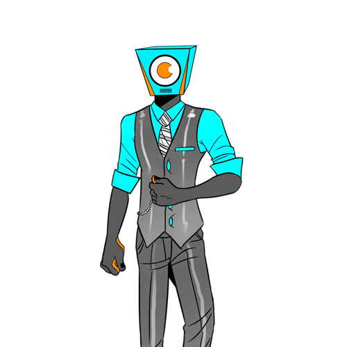
I also wanted to make the no capes joke, but Kelheor got there first !

But, on a serious note - if you want blue to be the main color, then definitely no cape. Since blue and orange are contrasting colors, and they're so saturated, the orange cape draws the eye away from the main acting areas (face/eye, hands) of the character. It kinda makes me stare at the crotch, which I don't think is intended :sweat_02:

I think those small accents of orange carry just fine without the cape. The palette overall is strong, though !

I like the cape idea because it makes the character look more goofy and humorous since he's supposed to be a mascot. At first I thought the cape was out of place but when looking at it more, I also like how the colors go well together.

I think the cape does soften him. It's cheesy like the McDonald characters or the Burger King.

And without a cape he reminds me of the hot version of Colonel Sanders.

My personal preference is for the cape because he looks more like a mascot to me. Like a silly corporate add on.
I guess it depends on the brand in-universe.

:joy: I don't see this at all lol

Yeah I went with those particular colors because I thought they'd add a playfulness to the business attire, but you make a good point about where the eye lingers lol

1 month later

closed Jun 28, '22

This topic was automatically closed 30 days after the last reply. New replies are no longer allowed.