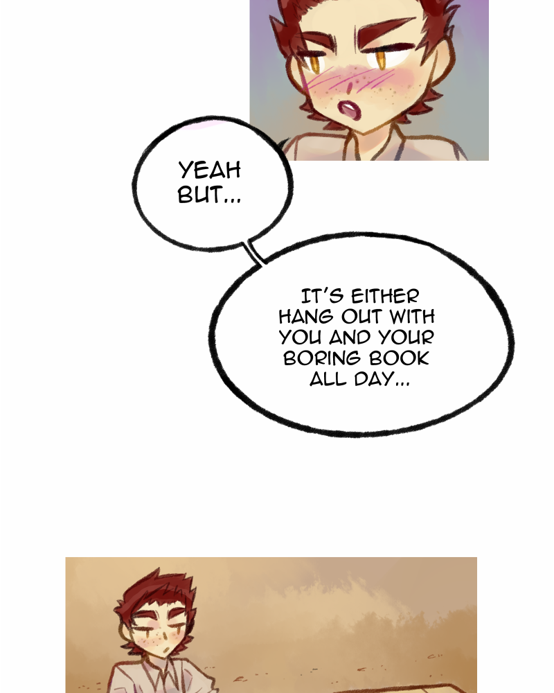
I think as long as it fits to the comic, it's acceptable to change the font. My comics changed a lot with years, and I also changed the fonts. Now it looks much better, so... why not?
If it looks better then I see no reason not to change it, especially if the change isn't wildly different. If the change is wildly different and you're worried about it being jarring you can wait until the end of a chapter or major scene and people will generally be fine with it.
I also don't see why not. Even published comics change fonts in the middle of the run sometimes. Here in the internet, we even have the advantage of being able to edit the older ones.
My reading experience surely wouldn't be bothered by you changing fonts, but if you feel insecure about it, and since you are fairly early on in your run, you can always update thos 5 first updates to match the font. I don't think it's necessary, but you can.
Personally, I have to admit I recall finding your font choice a little distracting when I first started reading your comic. I feel either a handwritten font, or a more traditional sans-serif comic font would give it more polish. I doubt most people would mind the change- especially since you're only a few episodes in.
I am definitely trying to find a better font before the next update. And as someone who has read the comic it helps to hear your opinion. I hope to make the reading experience smooth and enjoyable as possible. If it is distracting, I think there might be a lot of worth in going back and redoing the font.
I've changed my font a total of 3 times in the comic and I was way into the comic by then, it started with my handwriting from ep 0-23 then i used a font that looked handwritten from ep 24-43 but had issues with it so I had to change it again in 44 and I've had that font since. So compared to me changing your font at the start of the comic is totally fine, it's actually so much better to experiment with fonts now rather than (like me) thinking everything is fine and changing fonts constantly later.
I have to agree with @yozhikisblue and while I think your new font is better than the old one I feel like it still stands out a lot from your art, I highly recommend using a rounder, san-serif, simpler font than your new choice, or at least experimenting with other fonts before making a choice.
Here's a list of really good free fonts for comics to experiment with if you want?7
I personally use Fennario and it's been perfect for me, I wish I found it earlier honestly.
I think the new font feels too big and heavy.
you switch font and went all capital letters. it might be ok if
you use a smaller font size?
Papyrus (the original font) works better I think, but be warned, it's a bit like Comic Sans in that it's one of those fonts that type nerds hate by default.
Trajan (the new font) only belongs on Roman inscriptions and posters for Hollywood blockbusters with an inflated sense of their own self importance. In this case it jars and brings a bit too much attention to itself.
Finding a font that complements the art is always hard work - but I really do recommend finding an all-upper case font that resembles handwriting. Or to guarantee a perfect match, use a font generator like Your Fonts to create a font from your own handwriting.
http://www.yourfonts.com/3
I would have to agree with @Pandastrophic, @ramiek and @andrew17 about the new font choice. It feels a bit too heavy and out-of-place. A lighter sans-serif font- especially one that looks more handwritten,while preserving readability- would probably work better here.
By the way, here's a very quick primer on the difference between serif and sans-serif fonts and how they're used (graphic design focused, since most font-based discussion online will be, but still useful for comics): https://about.easil.com/support/serif-vs-sans-serif/1
Thirding or whatever that it's not bad at all to change the font. But the new one really does not suit imo.
I gotta agree that I'm not wild about the new font as a dialogue font. Ideally you want something that matches the art well. Usually this means something that looks like it could have been hand written. Serif fonts like this have a sort of computery feel. Personally I'm not wild about using different fonts for different character voices but if you were to do that these kinds of fonts would give a sort of stiff robot like feel to the character.
Fortunately there's lots of places you can download new fonts. Personally I'm partial to Blambot.com since the fonts are designed for comics and a lot of them are free. I use a free Blambot font for my comic.
This is still a serif font? I mean, you can use any font you like, and it's readable. But it still is going to have that computer-wordprocessor kind of look I was talking about. The link @Pandastrophic posted to this blog post3 earlier has several fonts that would look nice.
I don't mind when things change in a comic.
I think if you are sticking to typefaces found on your computer/device, you should seek out a humanist sans-serif font. Sans-serifs are easier to read in short blurbs (like in comic dialogue) and are more comfortable to read on the screen (it's the opposite with serif fonts). Humanist fonts are derived from letters formed by the hand and look more calligraphic in nature as a whole. Some more script-like fonts could work as well so long as it's legible for long reading sessions. You basically want to find something that mimics hand-lettering.
The one I use most is Humana Sans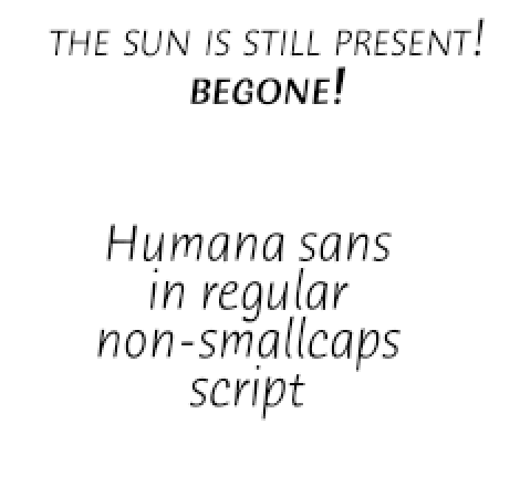
The letters are slightly rounded and the whole font is at a slant, suggestive of handwriting.
I've also used Tekton Pro and Ride My Bike Pro in previous comics.
But as stated above, I do recommend looking at Blambot.com for fonts. All of their normal dialogue fonts are handwriting inspired and you are free to publish with their fonts too (some type houses want money if you publish with their fonts). I am currently using their typeface Hometown Hero for one of my stories.
I've changed fonts mid-series before after finding out that what looked great in theory didn't work out so well when the book came out. In a web comic, I would advise making any changes after a break in the story, as a change mid-story can be a bit jarring. Or go back and change earlier installments to the new fonts.
Regarding recommended fonts, I've got a couple of points to make. First off, I find Trajan to be an acceptable font for the title of some swords and sandals epic. However, I think it looks a bit overblown especially as a dialogue font.
The other font's serifs also make reading a bit harder for those of us with vision problems. While I have used similar fonts sparingly for date or location captions, I wouldn't use it for dialogue.
I also tend to not like dialogue fonts that look typeset. They're all right for novels, but not that good for comics because they almost never complement the art. I know most of us are typing it in. However, I prefer fonts that look a bit more hand lettered. Comic Life's Lint McCree, Blambot, and to a lesser extent Antihero are my favorite fonts because they suit a lot of comic art styles and are also easily legible even without my glasses.
Yeah, that's something to consider. Some of your readers may have visual impairments, so please keep them in mind when choosing fonts.
I'm not too familar with downloading fonts, so at first I wasn't sure/able to set up a new font. I really didn't know how, but now that i figured out how to, I'll be able to try out more fonts/test your guys suggestions. I did see the fonts you suggested , but didn't know how to use them.