13 / 13
Apr 26

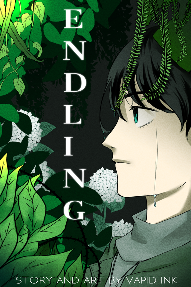
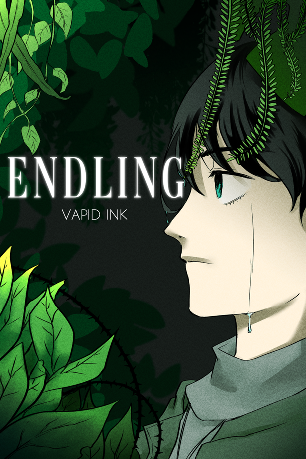
Looks like I'm going with the horizontal one, thank you all for your feedback!

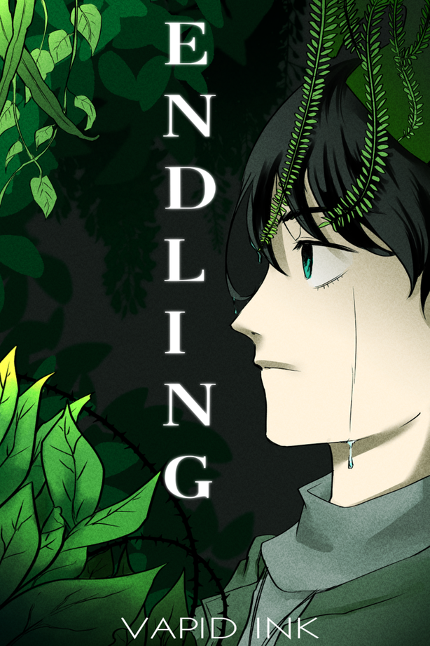
Yeah, I struggle with fonts and title placement. Anyway, I had some people advice me to simplify the background a bit, darken stuff, and maybe try a different placement and font for the title, but I'll include the OG just in case. Thank you to everyone who gives their input!

  • 1
  • 2
  • 3
  • 4

15voters

Votes are public.


  • created

    Apr 25
  • last reply

    Apr 26
  • 12

    replies

  • 336

    views

  • 1

    user

  • 11

    likes

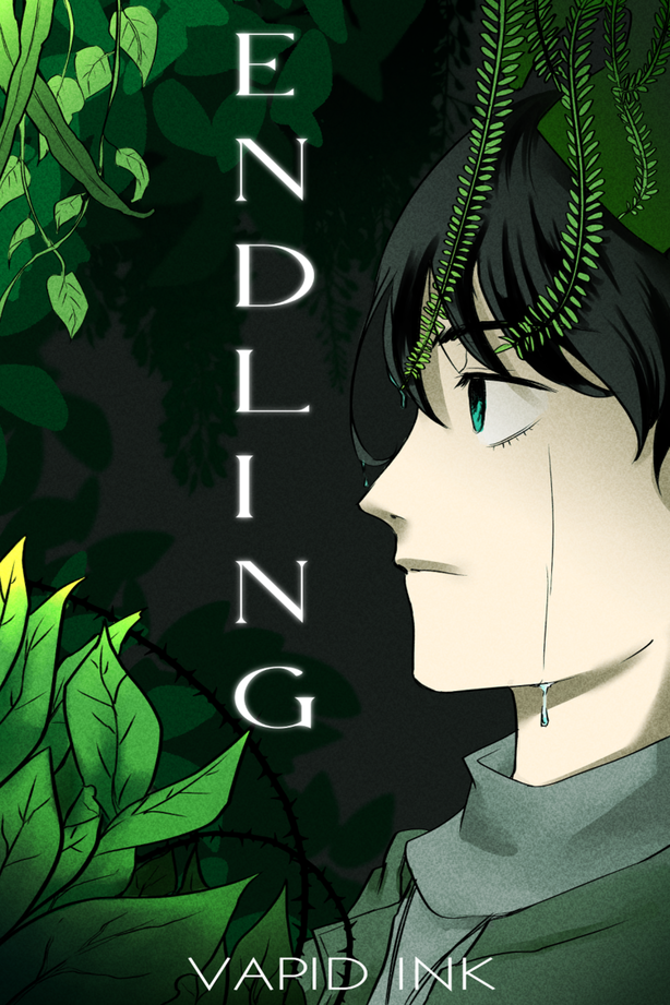
I feel like the vertical text is a little hard to read, but horizontal it doesn’t fit very well and leaves a lot of empty space. I think it might be best to go with vertical, but the letters need to be centered in a way that leaves a space around it. In all of the vertical examples the letters are much closer to the top than the bottom. Although it doesn’t have to be perfectly centered, I think it needs a little more room to breathe at the top. ^^

Oh, good idea! I definitely see what you mean now that you mention it. I'll try to move the title down a bit and see how that looks, thank you!

Yeah I agree, the vertical is hard to read. Using the horizontal format either at the top or the bottom will look the best.

Okay, did two more edits that are hopefully a little better.


I prefer the first one with the horizontal. If you do end up going vertical, it may be more readable if the text was center aligned instead of left aligned. Also, if the font had more hang-over on the capital I. It looks weird since it doesn't take up as much space as the other letters.

And, unrelated to the typesetting, is this person supposed to be crying? Because the tear doesn't look like it's coming from their eye.

Yeah, I forgot to align it earlier. :sweat_02: And no, it's not a tear, there's a couple more drops on the hair. Thanks for the feedback!

I personally wouldn't put the tezt so close to his eyes. (in the horizontal version)
It doesn't give the text enough room to "breathe". I would eitehr change the location of the text or shirnk it in size. Though I think shrinking might cause legibility issues.