To get straight to the point (details below, though they aren't necessary): I hired a friend to color one of my comic pages. While I liked certain aspects of their work, there were several fundamental flaws, along with other issues. So, I decided to recolor it myself, using their general color scheme but making what I felt were essential changes.
What do you think of the adjustments I made? My friend's version is A, and mine is B. Do you agree that the changes were a needed improvement, or do you think my friend was on the right track?
Please be honest—no need to spare my feelings, and my friend won’t see this anyway.
TECHNICALLY, EVERYONE WHO RESPONDS TO THIS IS GETTING A SNEAK PEEK OF MY YET-TO-BE-POSTED WEBCOMIC SERIES, SO... THAT'S SPECIAL!
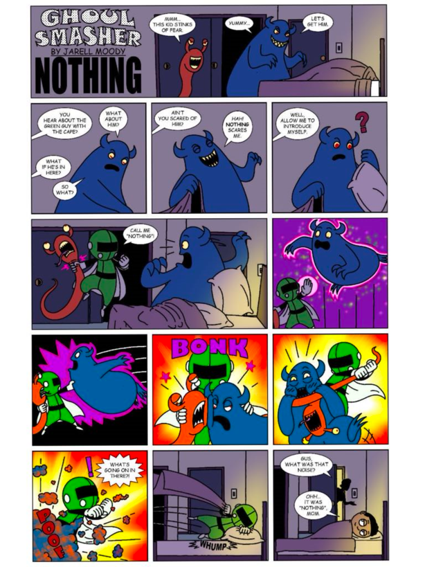
A.
B
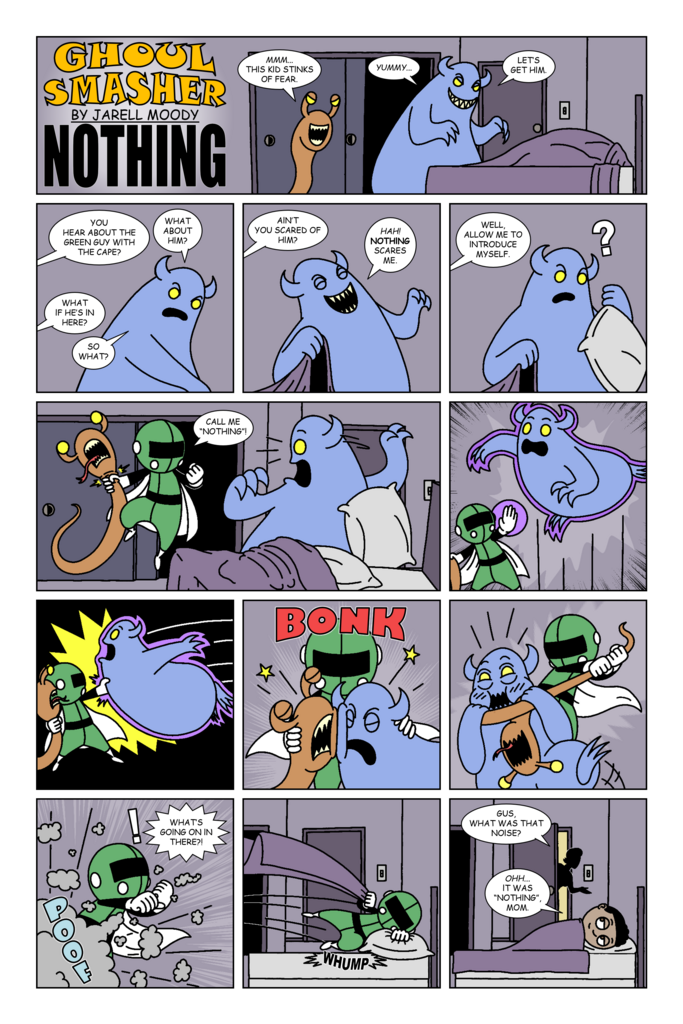
Extra Details: I'm not a colorist—I prefer working in black and white, but I want to have "special monthly installments" that are colored. I know my coloring job isn’t perfect, and one thing I plan to adjust is adding more gradients to the background. I was aiming for a Sunday Newspaper Comic Strip style, which typically uses flatter colors, but I still feel there are areas that could be improved. If anyone has advice on how to add interest and dynamism with color without overdoing it, I’d love to hear it.
That said, I don’t think my friend has a strong grasp of color theory. For example, they used a dark blue monster in front of a purple background and colored the “BONK” sound effect in magenta over a red background. Then, for the climactic "POOF" panel, they colored the "POOF" sound effect a somewhat dark red and placed it over the cloud, which they sprinkled with orange, muddying it. They also added a translucent black layer over some (but oddly, not all) of the panels to emphasize the dark setting. I also wasn’t a fan of some of the liberties they took, like adding pupils to the monsters' eyes and putting a nightlight in the room.
While I did appreciate their instinct to use a more dynamically colored background for the action panels (something I wanted but hadn’t asked for), I feel like the fiery reds and yellows brightened the nighttime setting too much. Plus, it might just be me, but it made the fighting seem more serious than it is.
Please don't consider my preferences/criticisms when giving your opinion.

