You could also say that it's a matter of knowing which areas are the right places to make 'detail' - knowing which areas to detail completely, and which areas to keep simple and untouched.

The bottom panel in this page could have easily been filled with more and more trees in those white gaps, but they instead chose to leave those white gaps, and even fill the trees on the right fully black to accentuate the sense of depth - it looks really nice and 'detailed' despite the ommissions, and we still have the impression that it is set in a forest.
The reason I say that composition, the clarity of your figures, and the linework are most important in monotone comics is because black and white is the only thing you can work with.
Though composition is still important, the main draw of colored comics is the colours themselves - it's vibrant, can set a wide range of moods, and draws people in.
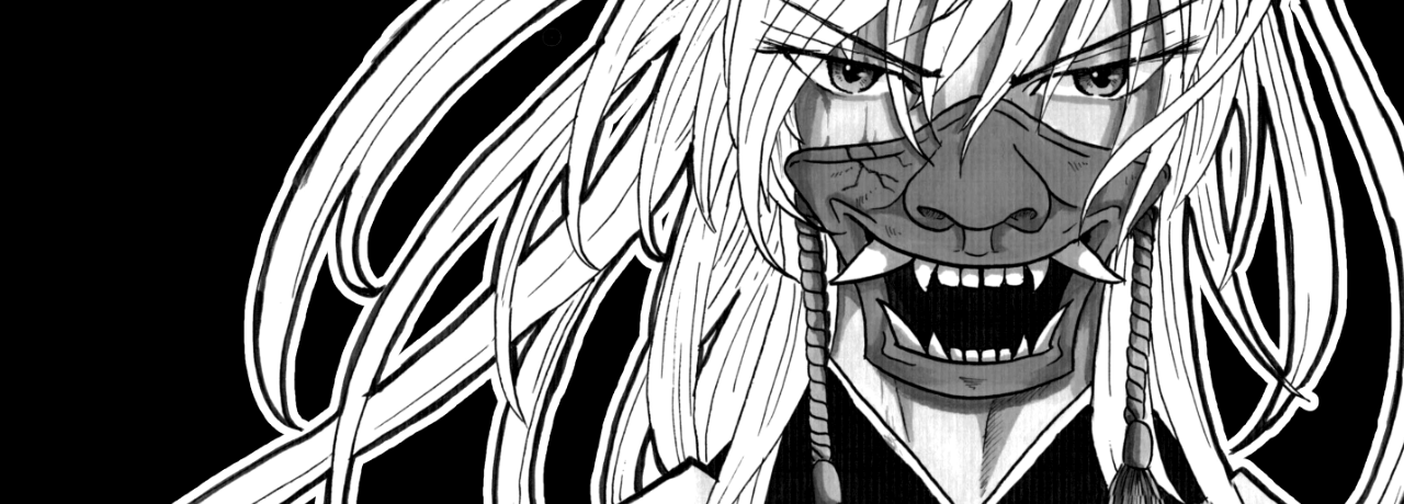
With monotone comics, the only thing you have left other than lines is the composition itself - you have no colours to depend on, albeit you still have grey tones and cross hatching for different values.
Despite this, the advantage of black and white comics is that when the composition packs a punch,
it packs a punch

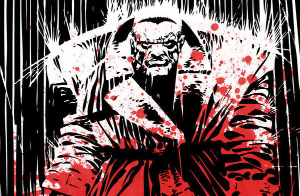
This double page spread from the original Devilman has etched itself into my mind forever - and in relation to this topic, I could never see this page looking good in colour. Go Nagai made use of the fact that he only had black and white to work with - in general, monotone comics are really good for drawing visual contrasts, as done here with the white shape of the girl, and the black of the antagonistic 'witch hunters' that dominate the image.
Basically, any medium is fine, just know the advantages and disadvantages of each one. Monotone comics may be limited, but you can create some amazing things with just black and white - plus, it's quicker to produce!