
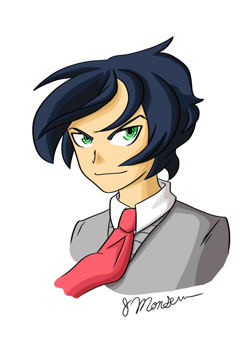
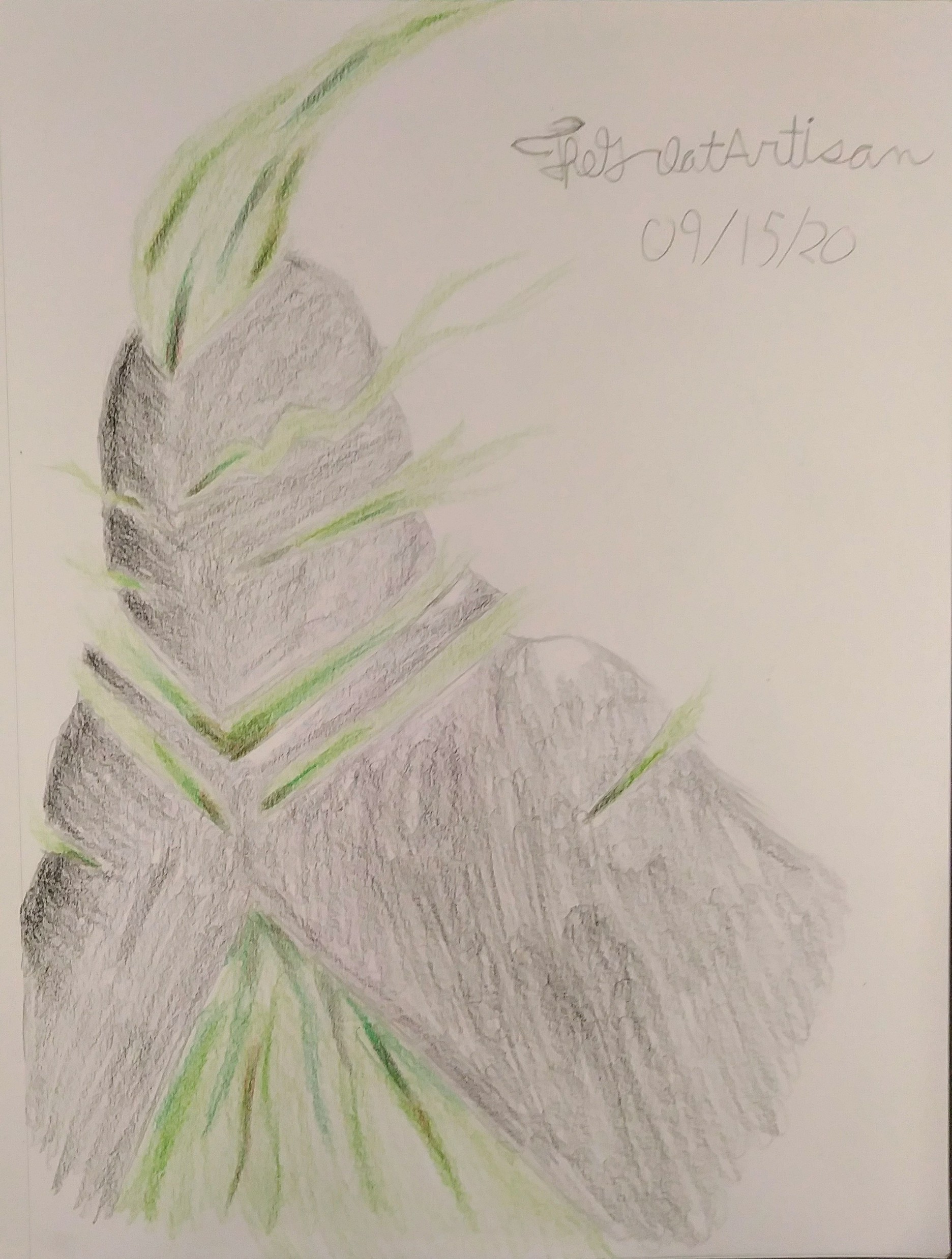
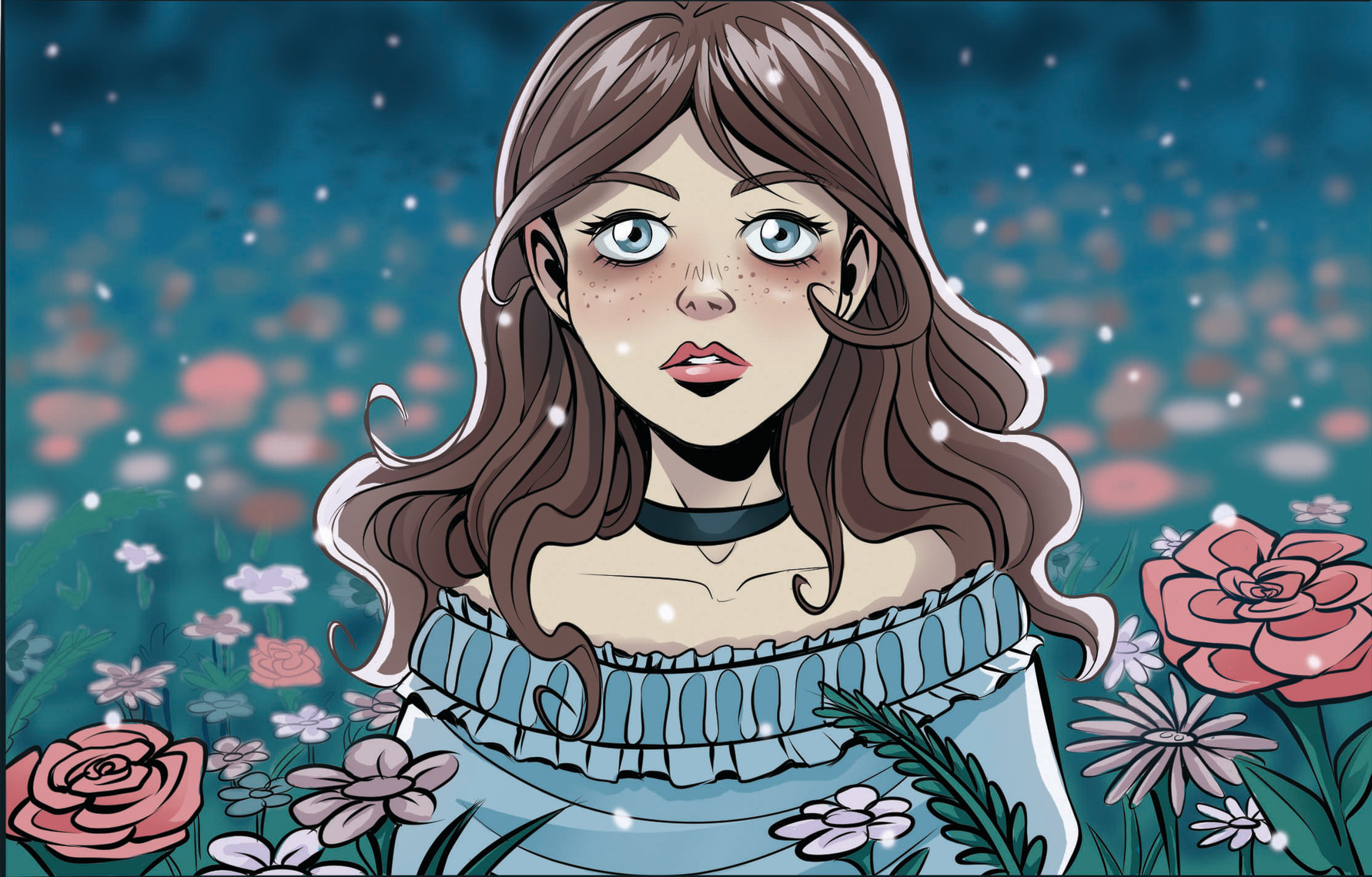
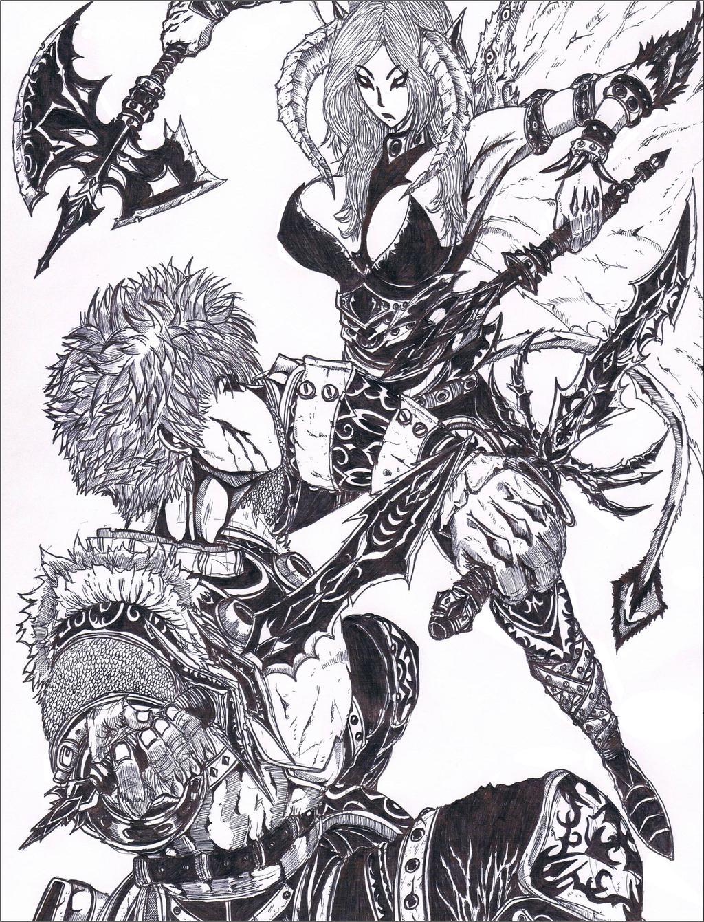
https://media.discordapp.net/attachments/521518342268387328/760595004967878656/image0.png3 what my fanart/ "normal" art looks like
 1
1
what my pages look like usually
im also not sure why the first one wont embed but the second will
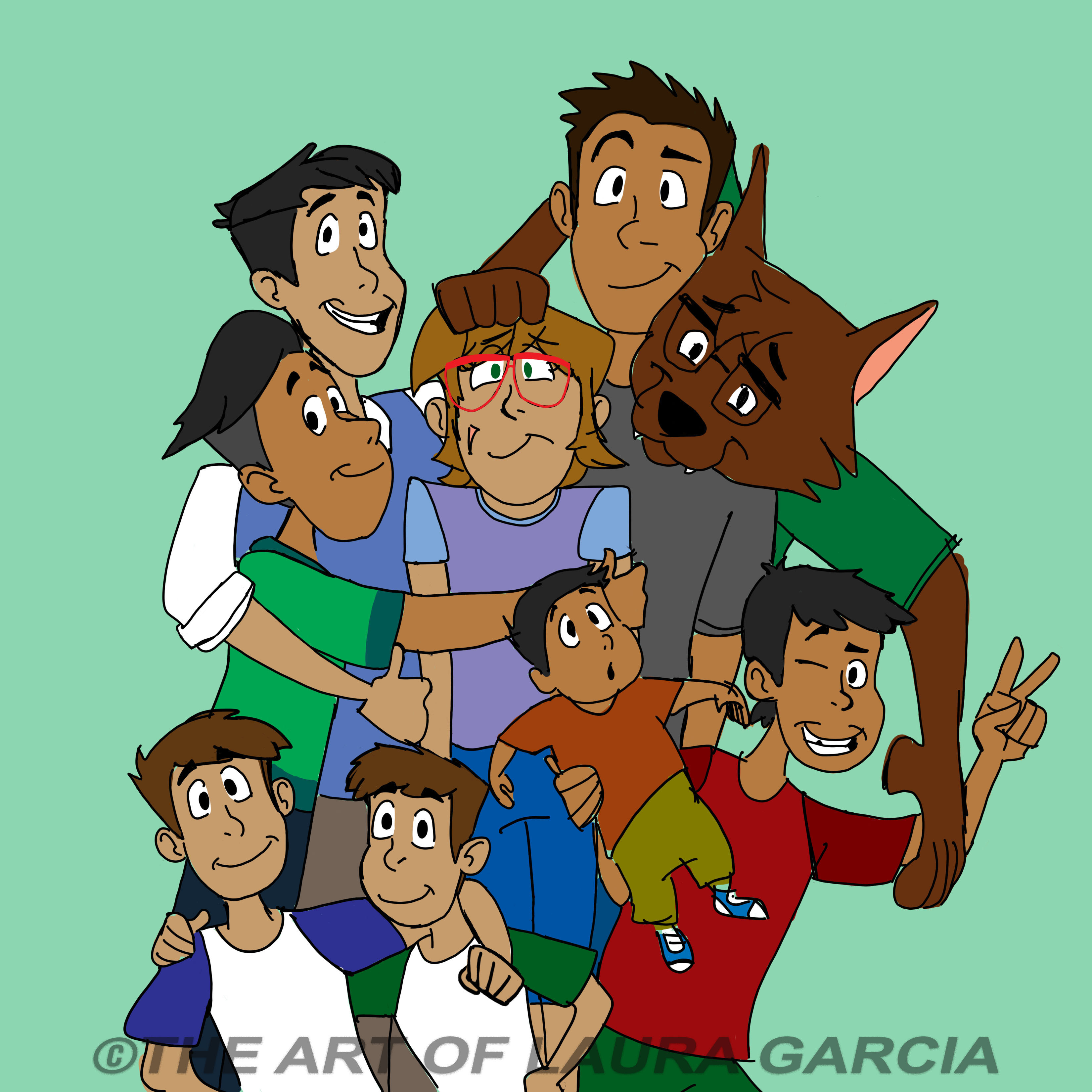
I always feel confused about whether I have a "style" but since I can tell work that's made by me I guess I do... I like to go a bit heavy with the line art and keep shading simple. And tend to make characters look soft/cute even if they're supposed to be scary  . But the nice thing about personal style is it will always be changing - keeps it interesting.

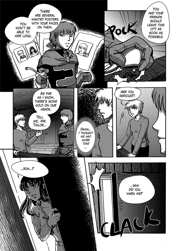
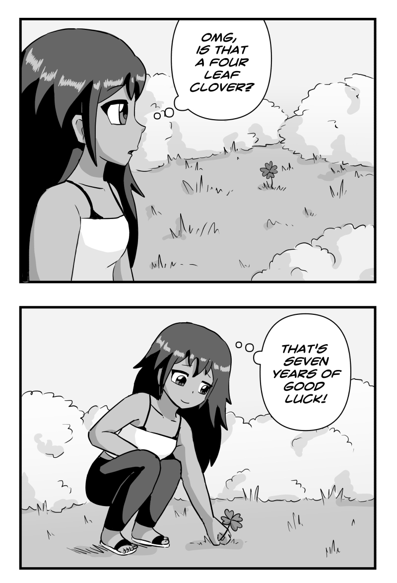
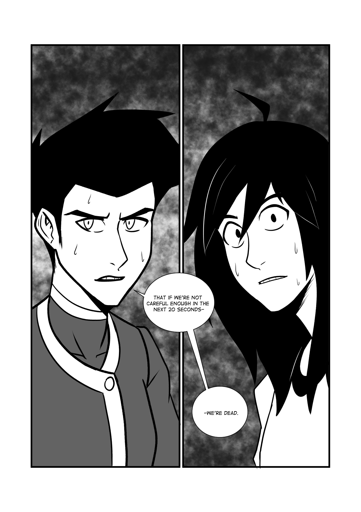
Different styles, huh? Well my comic looks like this:
Very strong colours, a manga-esque feeling to the proportions and a bright edge highlight.
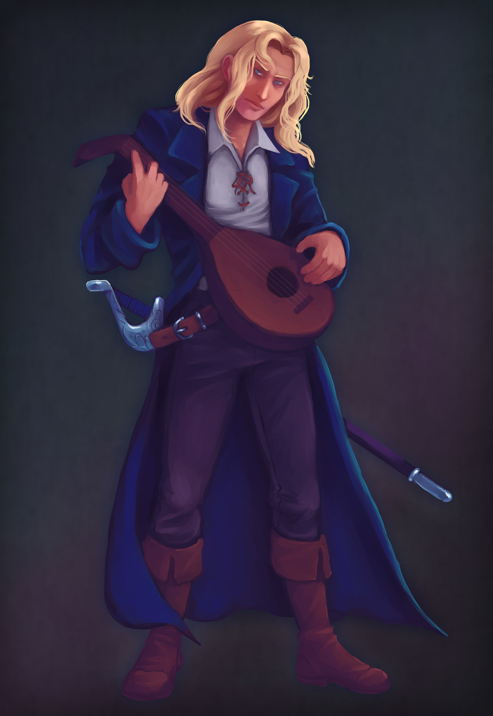
But the majority of my past commission work came in two flavours.
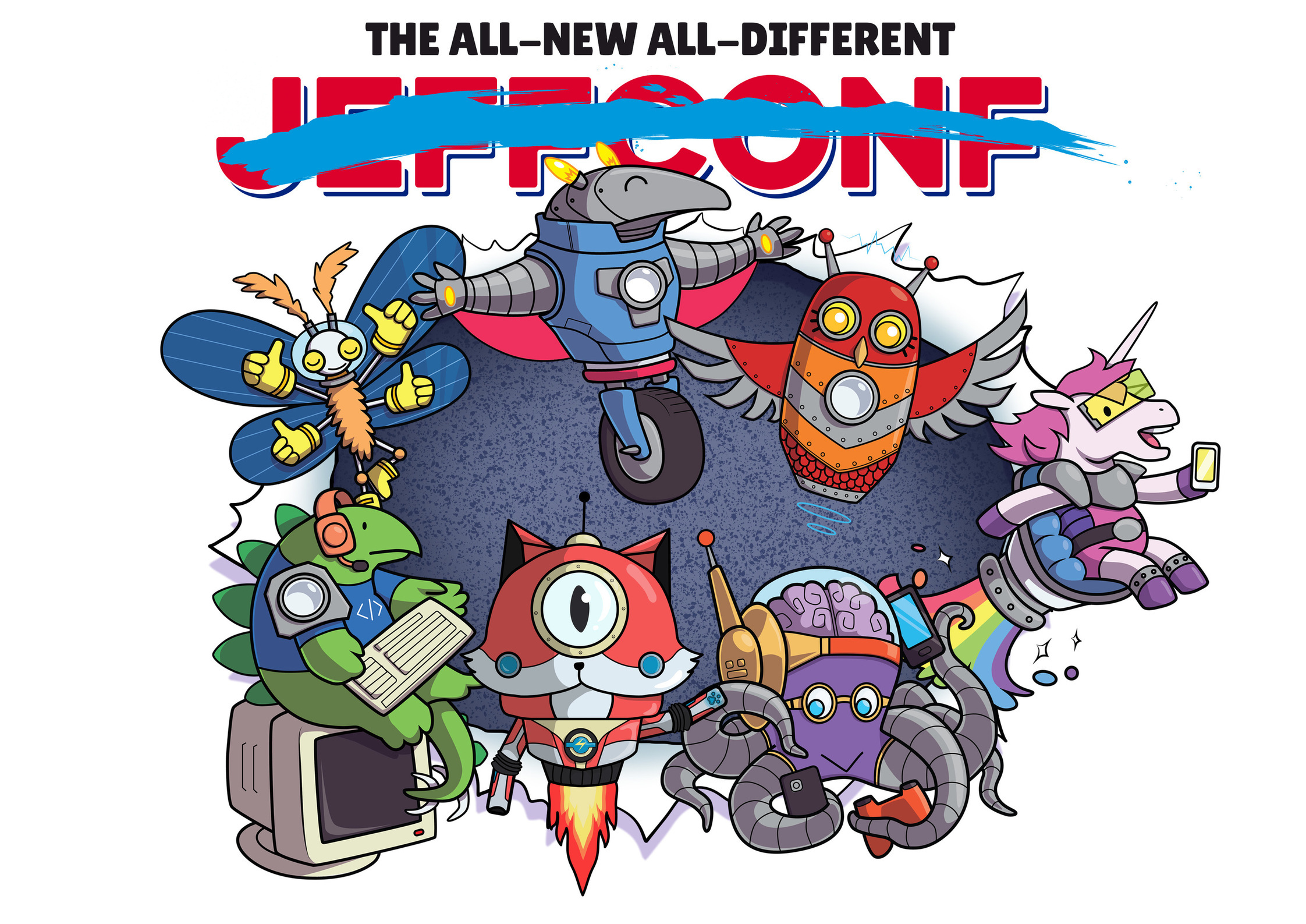
Cute simple cartoons to make techy stuff like tech conferences and podcasts less intimidating:
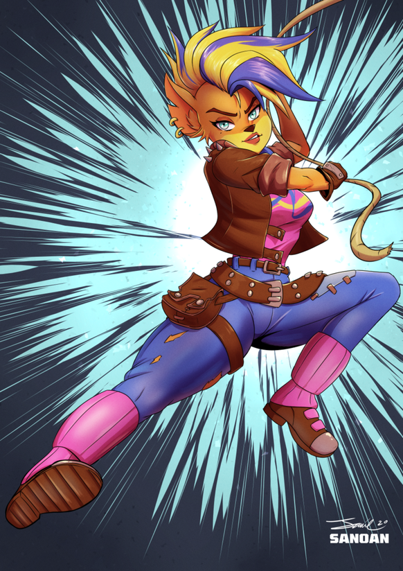
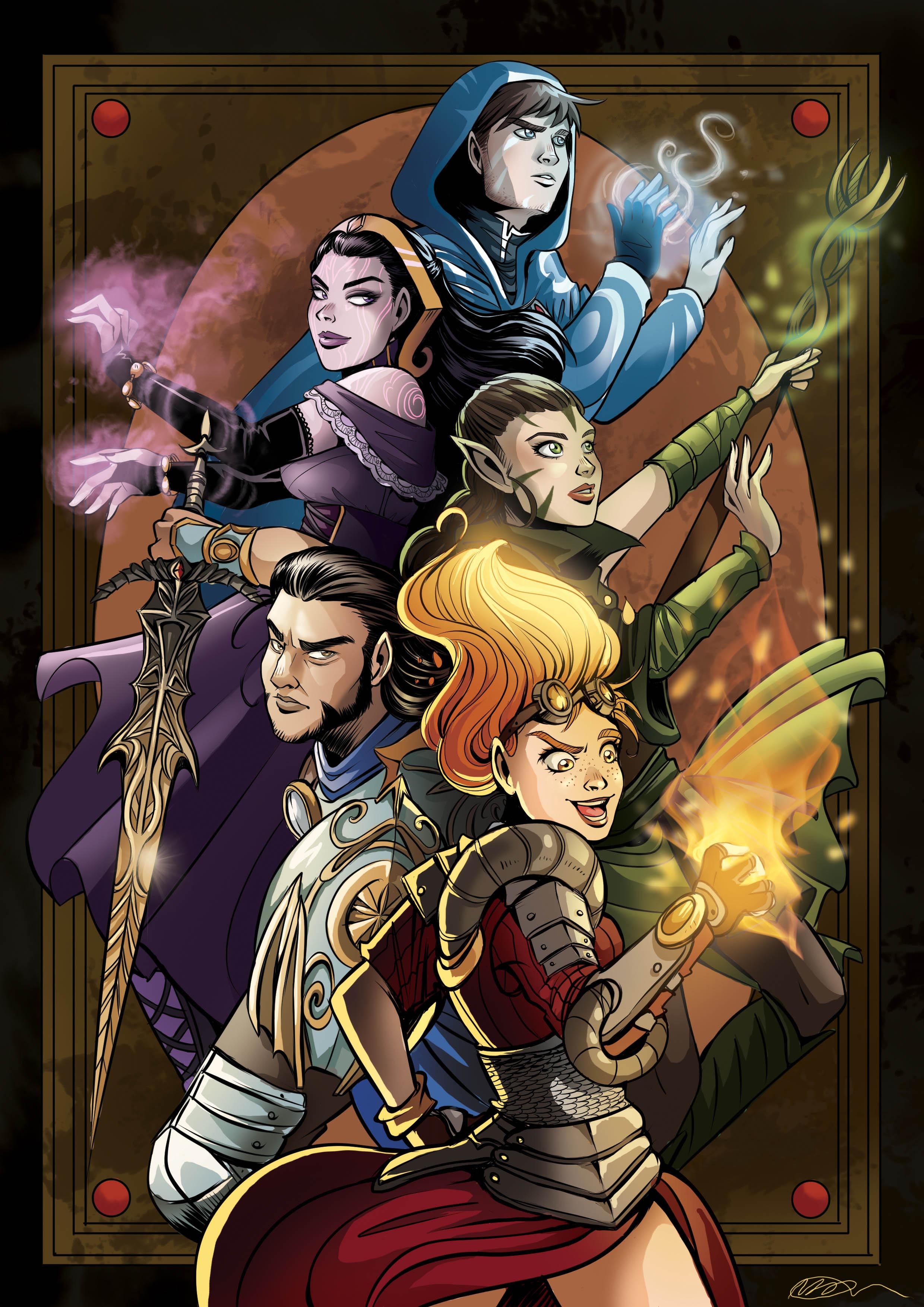
Aaaaand digital paintings of people's tabletop RPG characters:
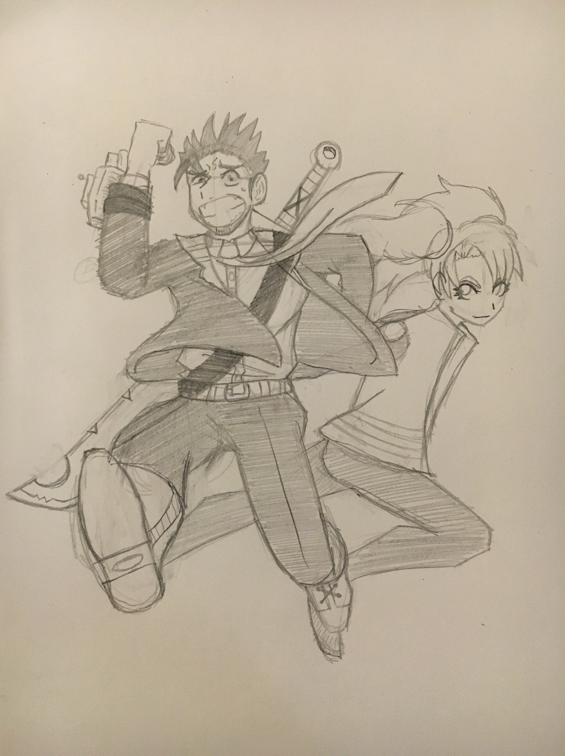
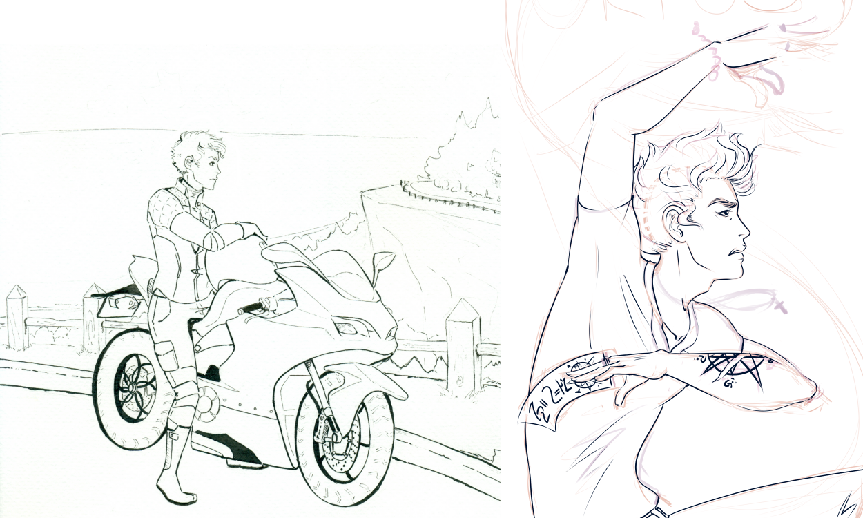
I bounce... a lot between styles. Growing up I originally leaned towards realistic anime (I call it "the weeb" and my friends get offended on my behalf, but... it's... anime-inspired, there's no getting around it). I think if I had to specify what is my "default", this would be it. Left one is traditionally inked hence there's more errors, right one is a digital WIP. My painterly shading has always sucked, and one semester of art studio only marginally improved it, so most of the time it's like ok line work and just last-minute slapped-on colors 
As I got older though, I liked cartoony styles more and more, so I pushed myself in that direction and ended with this style for my comic (which I will begin uploading tomorrow !!! ) (I am so excite) (link if you care: https://tapas.io/series/Engram/info1) :
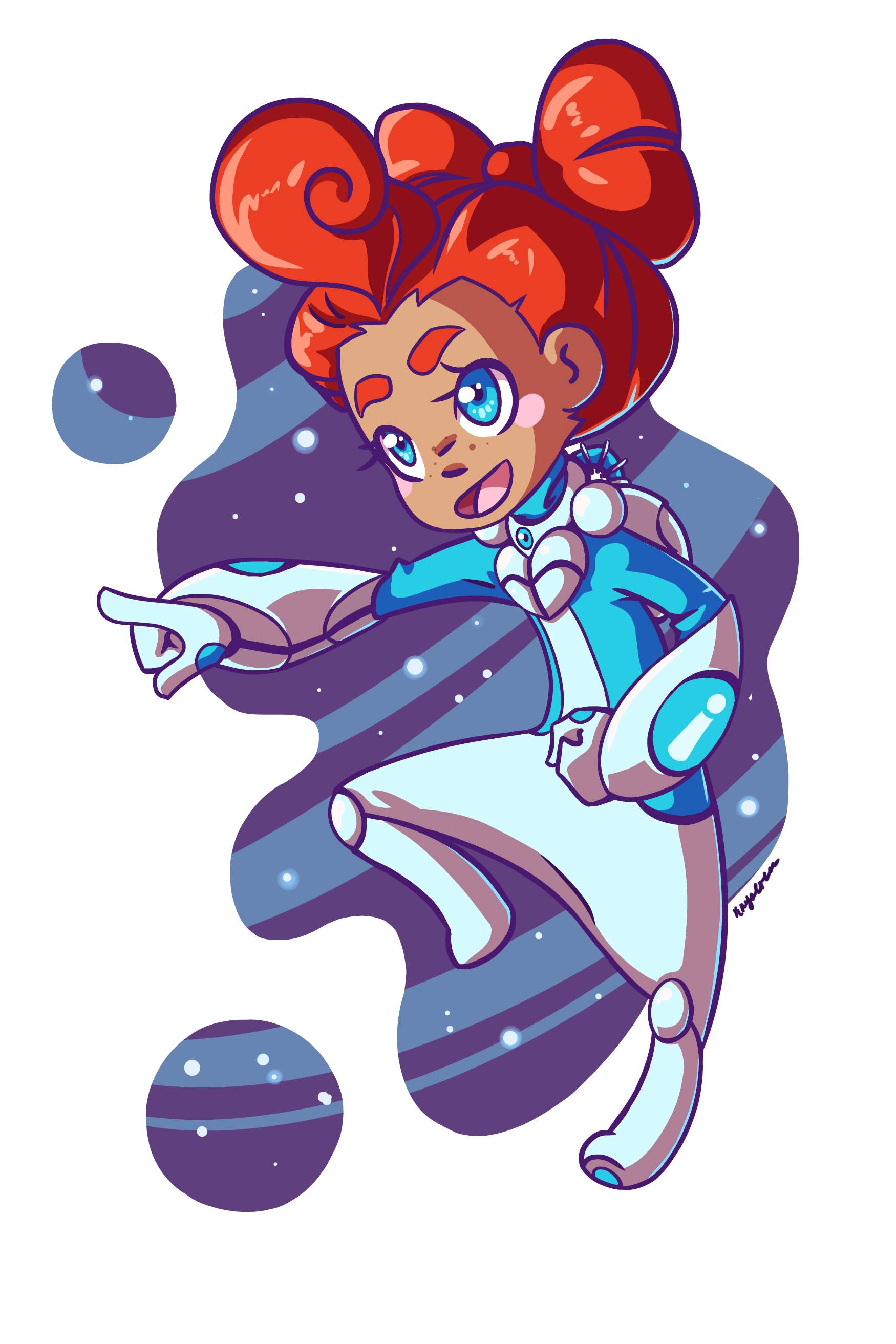
I call this "the pizza" because her body is shaped like a wedge and she's bendy like pizza cheese. This is my "less is more" style and I got rid of a lot of details on her space suit for a more streamlined look. I also simplified the HECK out of the colors and finally surrendered to shading on a multiply layer because it makes it a lot faster.
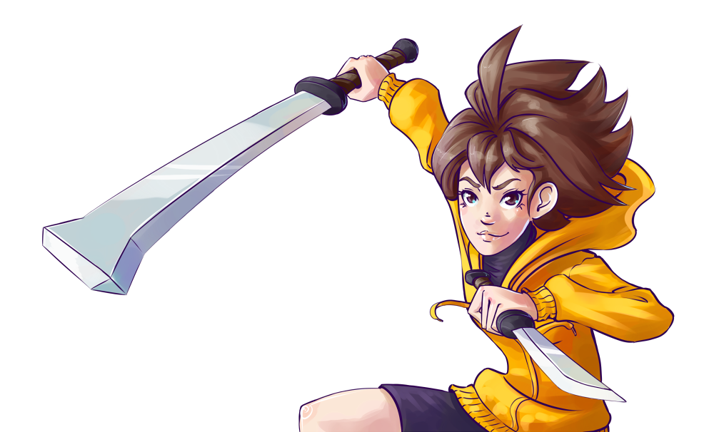
And then the rest of the time I float anywhere in-between the pizza and the weeb depending on my fancy. A friend of mine asked me to draw him some character art for his smashbox, and asked for it "in my style" and I almost just copied the original anime style lol. Ended up making some fixes last minute to make it more mine. He wanted Linne from uni:b


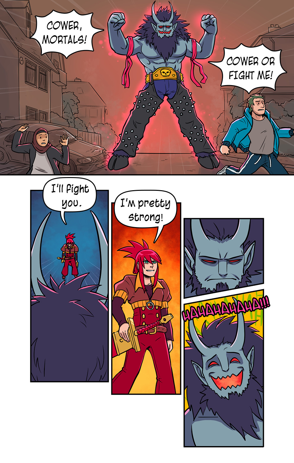
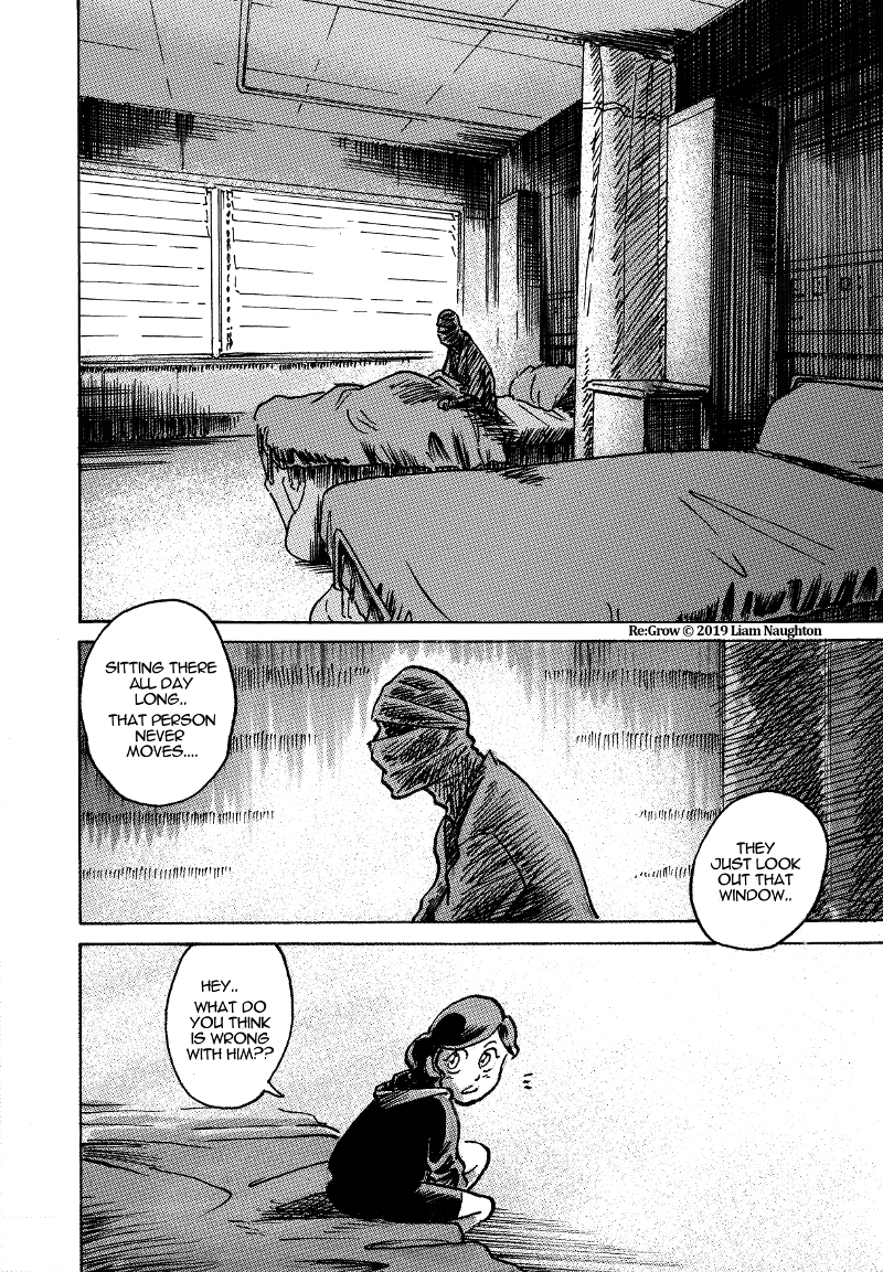
I think, my style leans towards classic "shounen" with clear lines, panelling and screentones. All the better for a fantasy adventure comic, eh? 

For more pages please check out the comic itself =) But beware, the first pages are ooooooolllld ^^"
I'd like to think of my style as a fusion between Manga and Franco-Belgium BDs. I look at Akira Toriyama and Yoann Chivard as two artist but also Tome et Janry. That's not to say I don't take inspiration or guidance from more artist those are just a few prevalent examples.
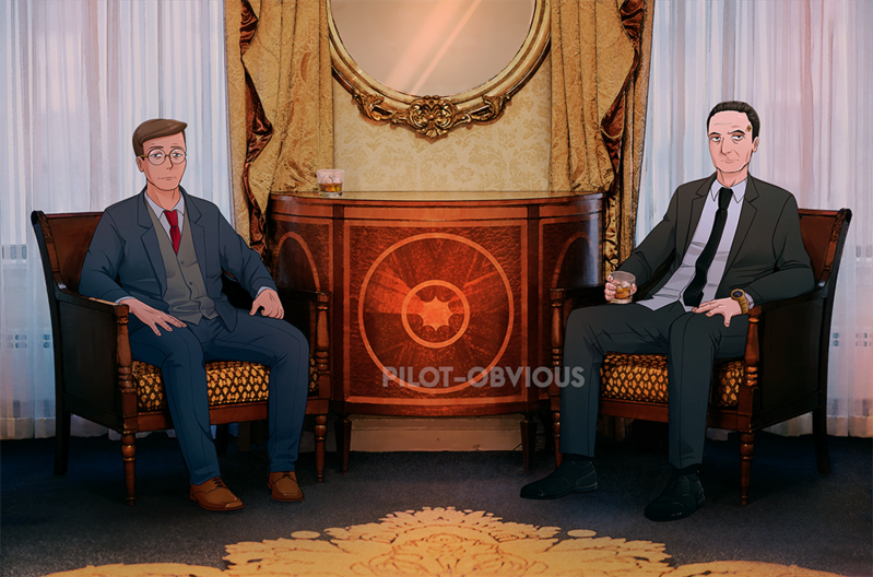
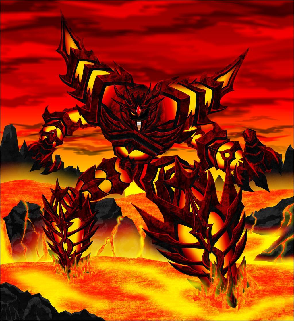
Here are some random examples.

My style definitely has strong manga/anime influences, although in recent years I've began incorporating more western cartoon sensibilities as well, and I think have landed on something that feels distinctly "me". Lots of room for growth and change, of course, but I'm pretty satisfied with where it's ended up 
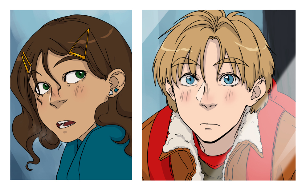
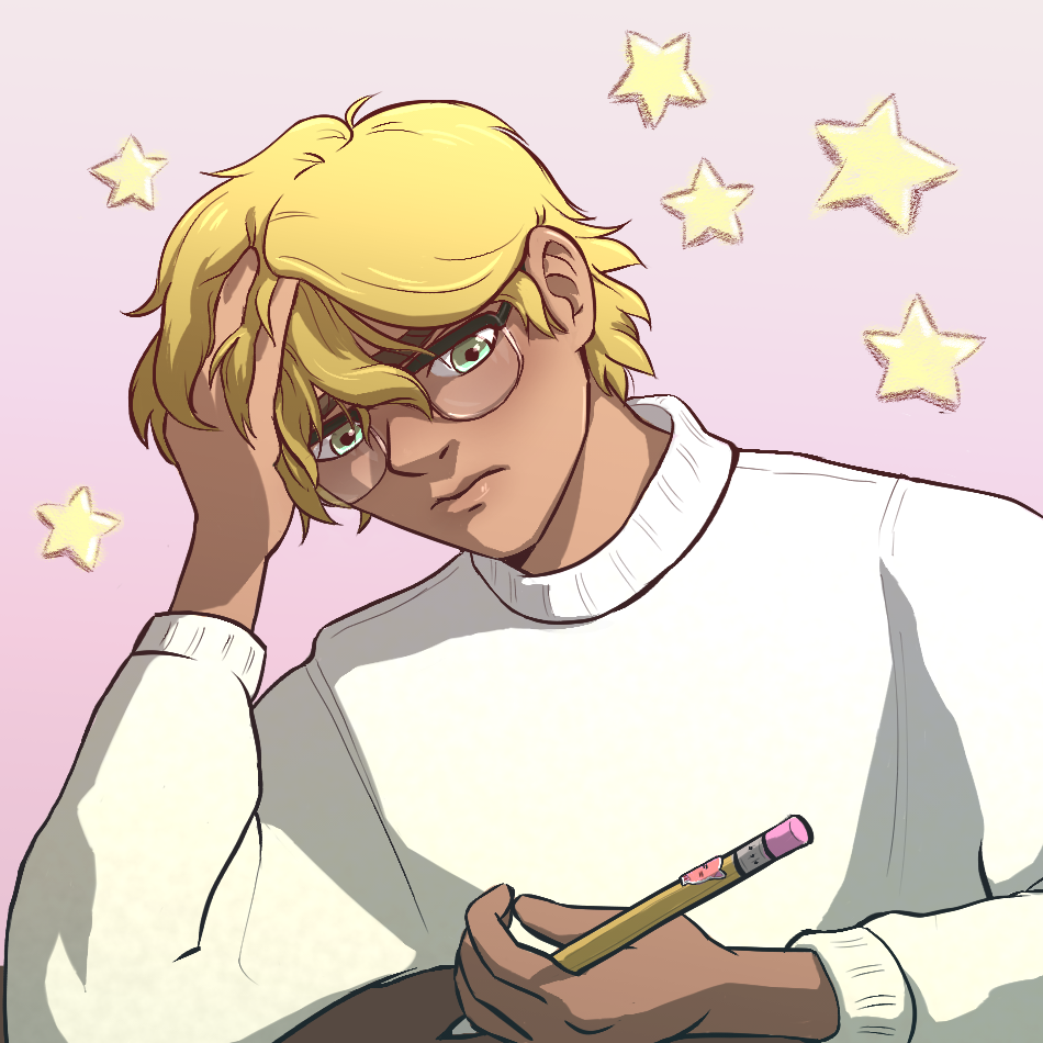
Here are a few recent character illustrations:
(the ground shadow doesn't make sense on this one, I realize lol)
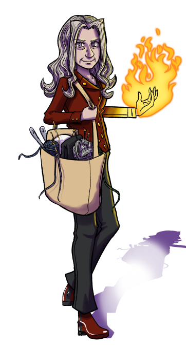
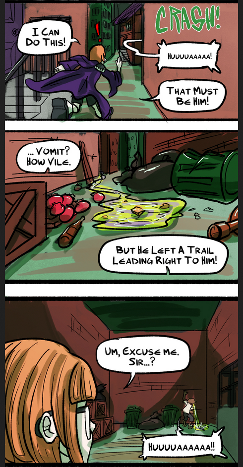
And a small excerpt from a recent comic:
(spoiler tagging because it depicts cartoon vomit... in case anyone doesn't wanna see that lol)
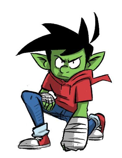
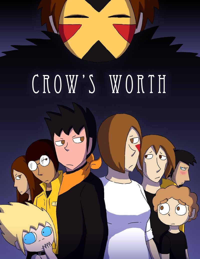
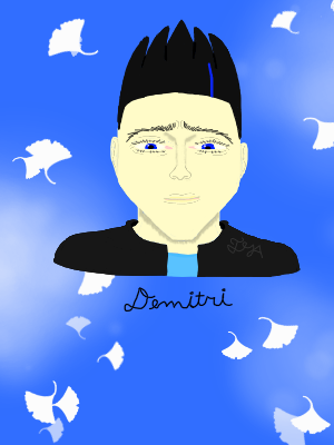
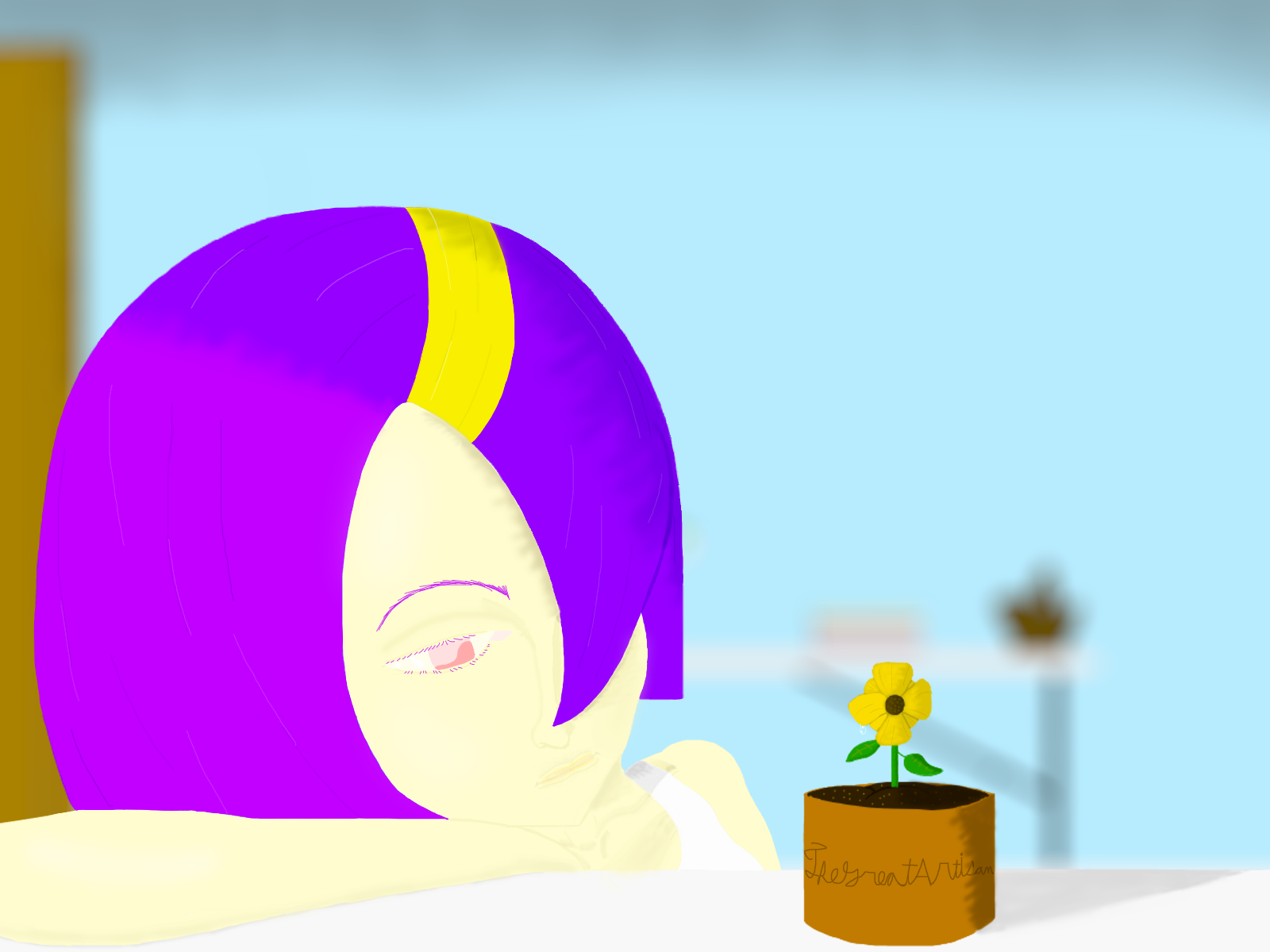
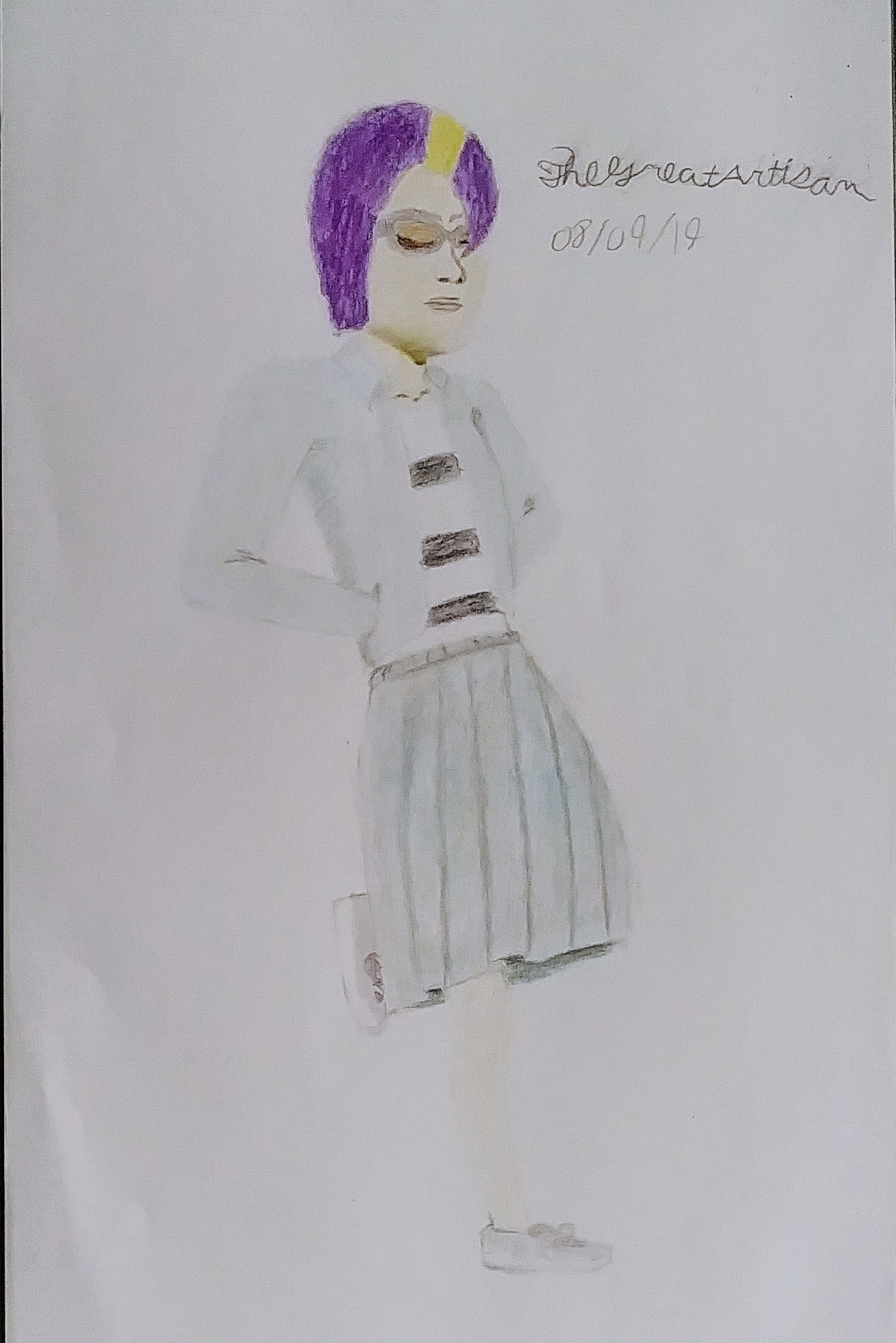
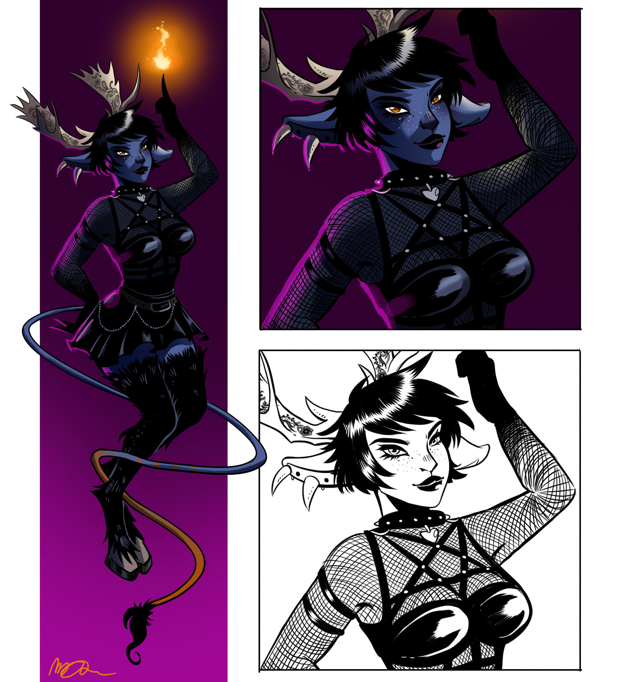
I have several styles
The one I am using now is called "the Crow". Everything is very geometric. The children have round heads. Characters have thick limbs. Pupils are large enough to show color.
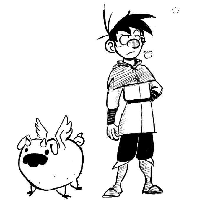
There is another one called the Mr. Noodle. They have thinner limbs, dotted eyes, and larger heads.

It also allows for characters to be pushed to a more cartoony form, like with Gum Man here.
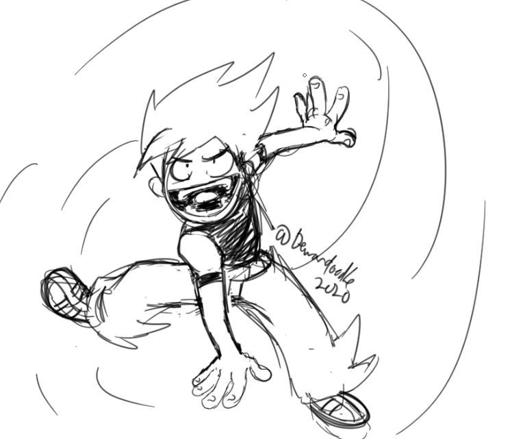
I have an anime style (which doesn't have a name yet).
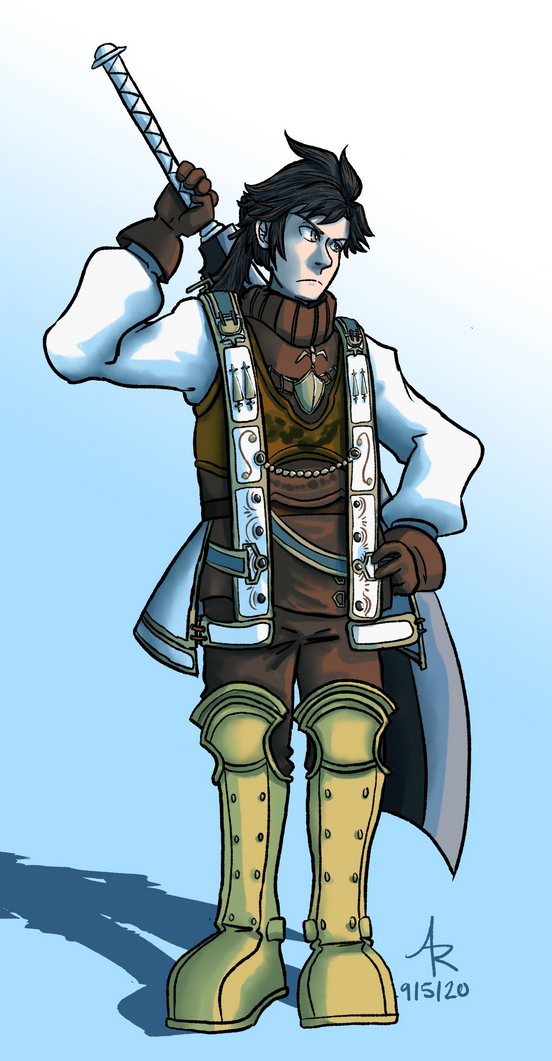
I have a fourth style but I haven't used it in a comic yet.
Purely an anime artist here ;p
I usually go for single multiple layer cell shading
 1
1
but I sometimes go for a more soft-shaded painted look on a weekend

My illustration style and comic style are a bit different as the illustration style is more refine compare to the kind of rush style of comic style. I usually put like 75-90% for the comic art and dont worry too much about refining.
appearance wise, they lean more on the manga style with a hint of western influence. I been looking at Avatar as a source of my style's inspiration.