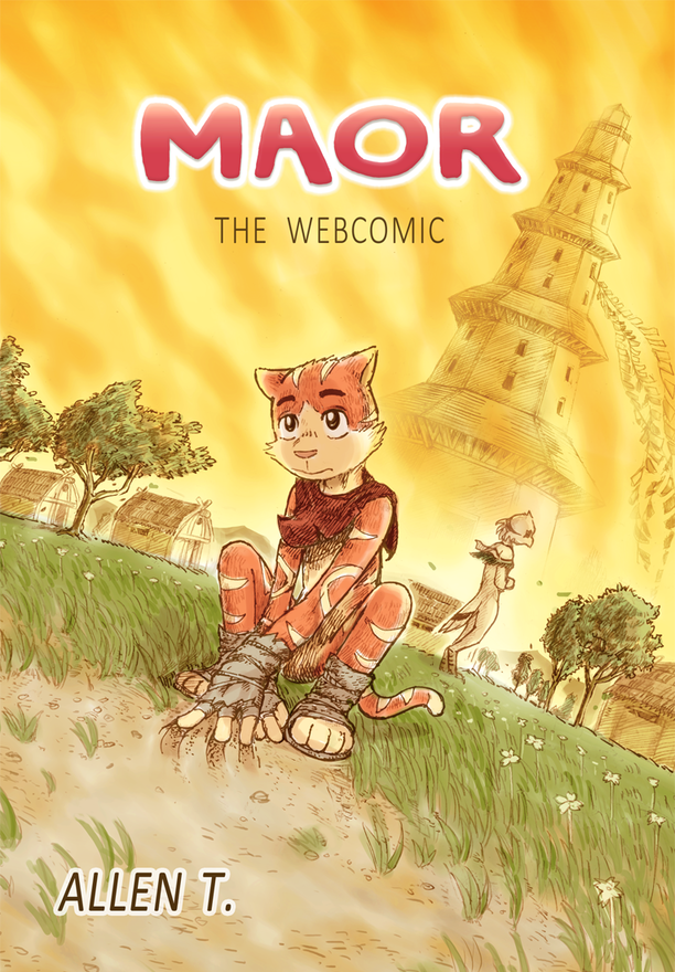
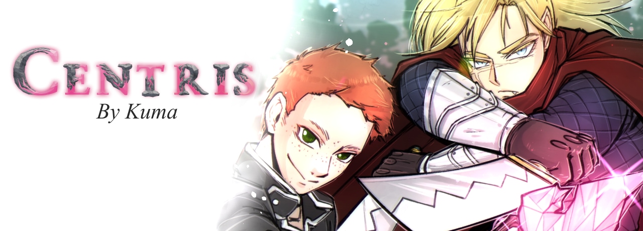
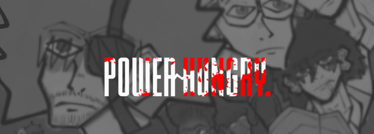
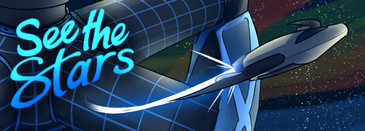
Oh this one is lovely, the colors are great and it just looks like good fun overall! My only advice would be to make the logo a bit easier to read, I didn't even see it at first glance.
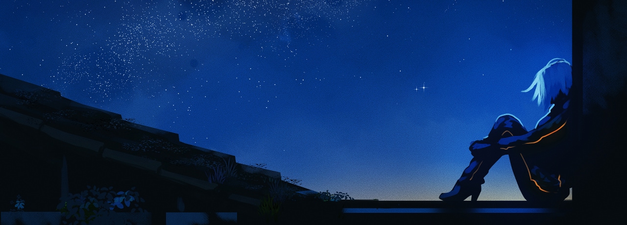
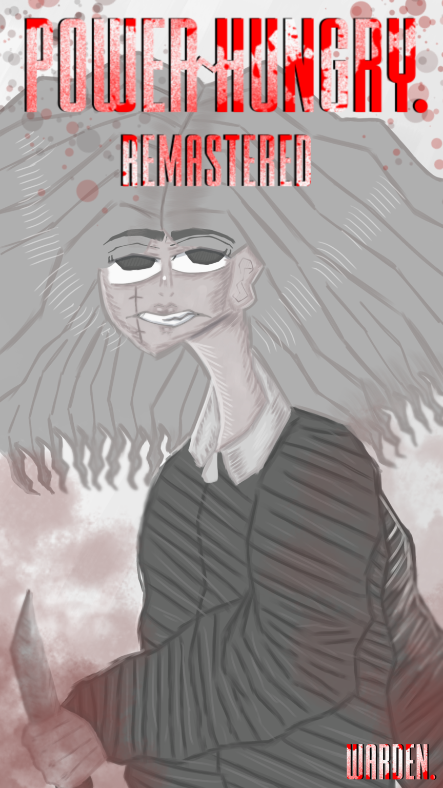
Hmmm, I would add some more art in the background of the character, it could be useful to give more info about the story at first glance, and also make the character pop out more.
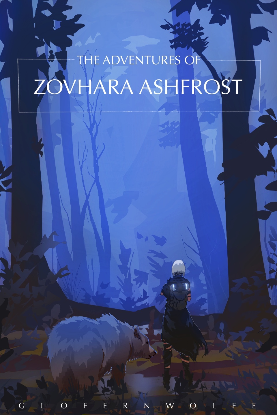
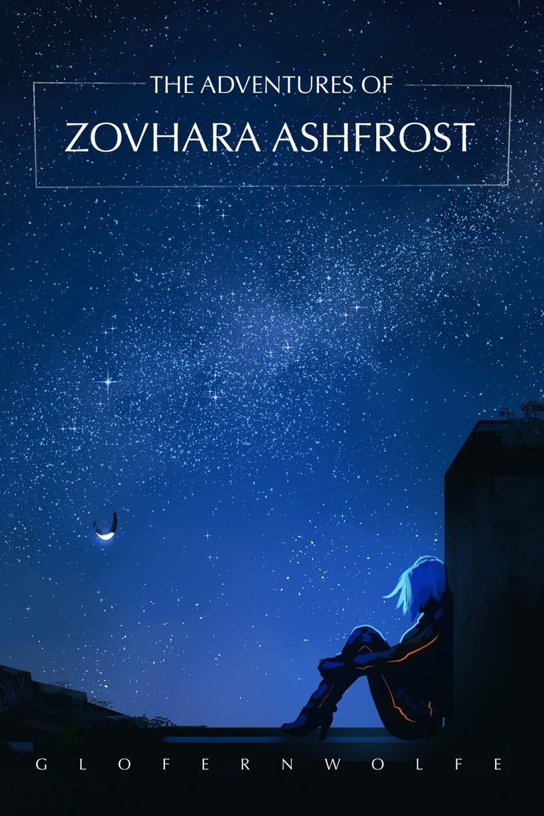
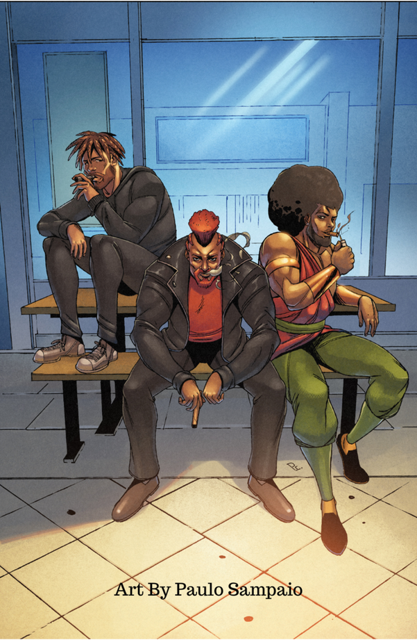
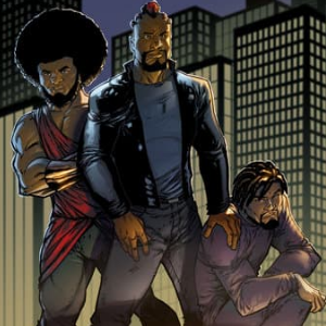
These are pretty neat, very pro looking, I could see them at an actual bookstore!
These ones are also pretty neat, I especially like the design and the logos! The covers as a whole look like they were made by someone with quite a bit of experience under their belt!
Thank you!
The cover is pretty nifty and I like the wordplay, with the title "linked" and we see the character chained in the cover. My advice would be to not leave the space above the characters heads empty, and to get the cover closer to the characters expressions, since they seem to be a tad far away, but I overall like the idea.
These are great! Simple, charming and to the point! Everything is given its own space, and the elements pop out and look interesting, good job!
The picture is a little bit too small to give it a good look.
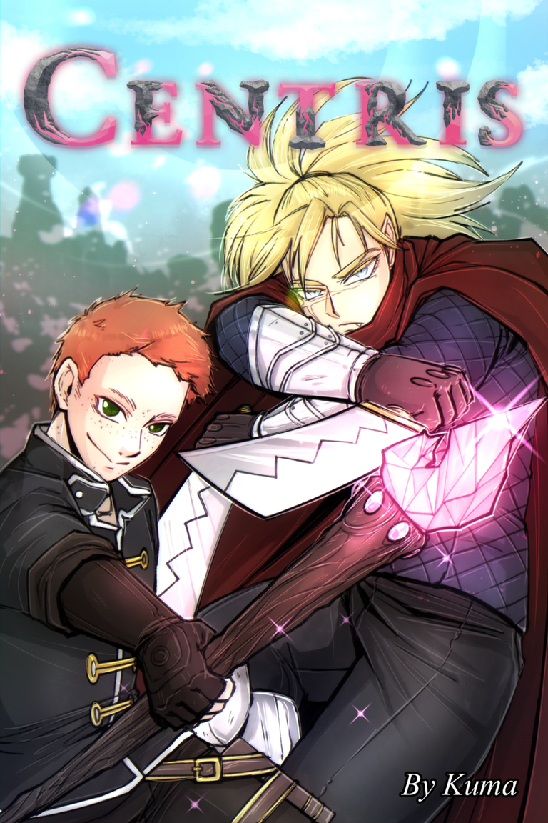
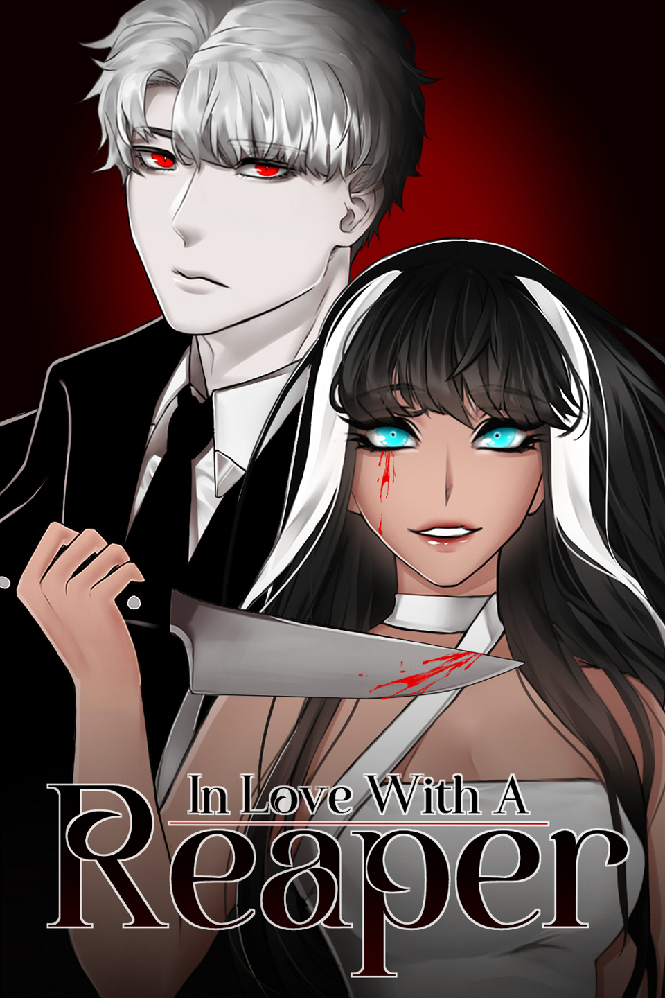
The art is pretty good, it really pops out! My advice would be to use a font as a base for the text, It's a tad hard to read.