Alright. This one took me forever ... or at least it felt that way.
Feedback: “Frequency Overload”
NAME and SYNOPSIS:
First I read the title and thought to myself: “Hmm sounds cool let me click on … OOOOH GOD my eyes.”
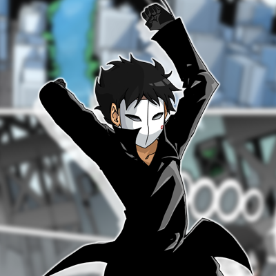
I realize now that it's supposed to be a tv laying on its side but damn does it make for a visual clusterfuck. It kinda looked to me as if a really angry dude is blankly staring at the ceiling holding a notebook tightly … with some creepy thing laying next to him.
But yea. Use some vectors for that thumbnail and give it some love. Maybe make a layer set to screen and one to glow dodge to get that screen effect to pop. I’m pretty sure if you just made the TV square and had it standing there normally it would be more instantly recognizable. Give it some antennas.
The Synopsis was alright I guess. I’m no native speaker myself but I think there was a small grammar error in there somewhere. Or at least one that got mistranslated.
The premise I’m getting from it is that it’s supposed to be some kind of trapped in another universe type story? Maybe? Or some brainwashing stuff maybe? Ah who knows, it’s a mystery aniways.
Then I jumped into the first chapter and oh god I think that’s almost as hard to read as my first one. I’m reading this on a giant screen, zoomed in to 150% and I’m having trouble, now imagine someone on a phone.
ART:
Oh dear lord, I don’t know how to classify this art style. It has something reminiscent of old nineties cartoons made for music videos but with a vaguely nickelodeon / french cartoon vibe. But it’s still volume one right?
Also that paper background texture. I don’t know man. There is something almost intentionally unpleasant in that one. Are you putting that thing onto the canvas before you start drawing? Because either it's playing tricks on my eyes or your characters seem to kinda lean into the pattern a lot which messes with the proportions.
When it comes to perspective, early on I’d say points for effort. Abuse the system using the 3D backgrounds. Quite a bunch of them are free and you can be used as a sort of guideline, you can still overlay your own style on top of it by right clicking the 3D asset after adjusting it to your liking, sort of like using a virtual camera, then selecting LT layer conversion and extracting the lines. After that you can just use the perspective you get as a guide and do your own thing.
Chapter 3 starts with some GIF’s. I like the style. One can do pretty nifty things with those. Makes for some good source of fourth wall breaking.
Hour two in captivity:
The art is improving … so very slowly. The text is still small.
How long are those volumes? At this point this feels either intentional or at least very consistent …. I respect that ….
The little animations from time to time just make me wanna make more content for tapas and use the living crap out of that feature.
Wow, so That was it. All 46 episodes. Man I’m not looking forward to that second read through to be honest. The art got slightly better in a sense that line quality had become more consistent and the tone kinda stayed the same even if it was held together by the surprisingly gritty color scheme due to a dull colour palette and this nauseating paper texture permeating through the whole series.
Got some hope when I saw the fist GIF but it has so far only been used for the rare special effect and once for one pretty sleep transformation / animation. That looked kinda dope.
While the characters designs are actually fairly well done and distinct I can’t say if I can phrase this in any other way than: “Yo art sucks bruh.”
But there’s a good foundation there. You seem to like playing with things like luminosity layers and animations. The colors in themselves were well chosen and they stay very coherent throughout the run, would just be great if it were backed up by some more legit line art.
The text is … way too small. Some panels are pretty tiny but there’s sooo much space left in the gutter. If I’ve learnt something so far from making comics for webtoon it’s that readers are either too lazy or can’t be asked to use landscape mode.
Don’t tell yourself that you have to keep it the same style throughout the entire series. Make one change at a time and your audience will thank you for it.
At least the panel composition would be pretty awesome if there was any semblance of perspective within it.
On the other hand if you took all your panels and then just ditched the side by side ones … maybe made them a little bigger, so they cover more of the screen, you could pull off a cheater transition. Make the whole thing more vertical and it’s at least more legible.
STORY:
I can already see the only advantage of smaller text. More natural sounding conversations, God how much I miss those.
Oh god, do I have to?
Ok … this is actually not so bad.
The writing is believable since it's mostly colloquial language rather than big deep philosophical dialogues.
The kid characters are all good kids and behave like such.
They do normal kid stuff, which is I assume getting into a convenience store and then hanging out at that other kids place, with the troned kid, or the two stoned kids?I don’t know man, one of them had super red eyes but the tall dude looks pretty stoner’ish, maybe a skater? Ah whatever. Quite wholesome so far.
So the glasses girl is the main protagonist. I like the choice, she’s bright, active, believable and kinda derpy. All good traits for a protagonist, I’d say.
She finds some book and a spoopy invisible ghost dude with a paper bag for a face … either that or it's the literal suitcase from pulp fiction. I like him, he’s got a nice carefree attitude.
There’s also this thing with the radio waves. Waves come, monsters appear, the kids around the block squad use the book to find out how to fight the monster … oh my god is this actually well written?
It’s a monster of the week series but it’s better than half the random shitter stuff I suffer though on a daily basis.
The characters all have their own distinct personalities and behave like reasonable people all without overdoing it with exposition.
By the eight, could it be that whoever made this knows their stuff but just can’t do lineart for shit? As I said the colors and designs kind of work, and well … it’s just those lines man, but I digress.
Alright. Huh … surprising … the second read though was not actually that bad …
Or is Stockholm syndrome kicking in?
CHARACTERS:
Here we go. There are:
Glasses girl … a.k.a the black one. She is nice. A real good kid doing good things. I think her family situation involves something along the lines of living with her uncle. But damn is she expressive. That’s what I call a personality. All the signs of a hero right there, who ever thought her up really did their homework.
Sunglasses girl … a.k.a the white one. If she’s a stoner she is one of those that would probably never share their weed. That one has an attitude. I think she’s supposed to be the cool one in the party … it shows … in a good way.
The dude … a.k.a the downer. I think he’s supposed to be the muscle … but he comes off like a complaining backseat gamer … which at this point I’m fully willing to claim is probably intentional aniways. I like him.
Overall not bad … not bad at all.
As soon as that art improves and the pages get a bit more legible without me having to devote an entire 30 inch screen to the comic to read it this could actually be decent.
Use some vectors / a vector layer for lineart. Makes erasing stuff easier and you can edit the lines after drawing them, so stuff looks cleaner. Watch some more cartoons then pause when you see a certain scene that compels you and draw whatever’s on it for practice.
Use reference, it’s not cheating.
Drop the paper background or get a cleaner looking one. … please …
… please ...