1 / 14
Dec 2020

What are you thoughts on it?

I think the most common example is the white text on a black bubble for something demonic or magic. Often with a different font for impact. But some are used more often.

Sleepless Domain, for instance, uses a different colour text for every magical girl, of their main colour, although this can a bit difficult to tell between them when the colours are too similar, especially with such a large cast said large cast forming bigger and bigger groups. I do like the idea though, perhaps with a smaller group of special people who speak in colour.

One of the more interesting, unique ways I've seen it done is in the visual novel Umineko that (I haven't actually gone through it in a while, so I might be remembering wrong) has Beatrice declare she will speak in red text if she is lying and I believe later Battler gets the ability to speak in blue if he speaks a truth. This worked really well with the mystery part of it and was used pretty sparingly. It's something I'd quite like to use some day.

What do you guys think about using different coloured speech in comics? Pros and cons? Yay or nay? Any good ones you've seen? Any bad ones? Have you done it? Do you want to? Does it put you off a comic if you see it?

  • created

    Dec '20
  • last reply

    Dec '20
  • 13

    replies

  • 1.6k

    views

  • 14

    users

  • 23

    likes

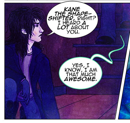
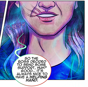
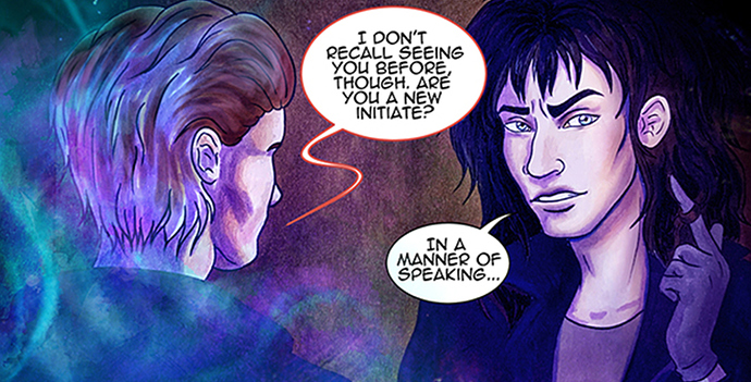
I experiment with it often in my stories, usually when referring to demon/non-human beings. Some will share the same speech type, some will have their own, and some can change in between them.

I definitely think they have their place, especially when you want to get creative and express tone shifts in different ways.

Though, it can becoming distracting if you don't always know how to use them. For instance, when I first started using them, I was really experimenting and changing up fonts and speech bubbles. At times, it got muddled, especially if the panels were already vivid. And sometimes, it was just too hard to read. But once I figured out a rhythm, it becomes more clearer.

These days, for demons, I use black bubble on white text. For more celestial beings, it's blue text on bubble or their own personal touch.

Me too. All the humans have black text in my comic, but all the goddesses has color corresponding text.

I say their fine. I originally did it with different colored text on low opacity speech bubbles to represent which character was talking; but changed it to black text on different colored, low opacity speech bubbles so it's easier to read and it still represents which character is speaking.

In my comic, each character has their own color speech bubbles when they speak. I have a decent-sized cast, and it helps me keep track of who's speaking, especially if there's more than 3 or 4 people in a panel or on a page. I don't know if it's helpful to my readers, but I know it helps me.

I don't really plan to change the color/font of my text much, except for a character who is going to talk in black bubbles and white text when he's having one of his visions... but I'm definitely going to experiment with different colors for bubble outlines :smiley: My story features shapeshifters among other creatures, and with two characters in particular, I'm gonna need a way to make it clear that their voices can go through some pretty sudden changes... so, instead of using a different font or text color, I figured I might use a different balloon outline to let people know which voice is being used at a certain point.
These two characters have yet to show up, but an example with another shapeshifter can be seen in the first few pages of my comic:

Here, the shapeshifter is using the voice of the person he's currently impersonating. But as soon as he starts to transform...

The balloon outline starts changing color too :smiley:

...Until the transformation is complete and the balloon outline fully changes into a different color.

I'd rather not play too much with text colors because I'm always afraid of messing up readability, so hopefully this method should be a little more subtle, but still noticeable enough to understand that something is happening :smiley:

It can be distracting if done excessively, but a really cool feature if done well. There's also a few video games that use distinctive fonts for each characters. A few I've noticed are Undertale (Sans is in Comic Sans and Papyrus is in Papyrus) and FN@F4, where text colors are used to distinguish the characters in the 8-bit cut scenes.

For my own comic, I'm going to distort the text when Shilo speaks in his ungloved form to help mimic his synthetic and uncanny voice in the written form. Originally I had just hand-written the text with creepy lettering, but I think this time around I'll glitch the text out.

I’m not a big fan of it and I feel like I should be able to trust my audience to know who’s saying what without it if I’m doing my job correctly.

I also feel like this large blocks of color on a page can look a little... sloppy? I’ve seen on several occasions where a colored speech balloon will look completely out of place in pages with a lighting change. Like, it’ll be a very cool-toned lighting for a nighttime scene and then there’s this BRIGHT PINK balloon cutting through the page and it just looks a little off to me.

I’ve definitely seen it done well, for sure. But for me, I know that just a plain ol balloon will always work no matter what so it’s not something I’ll generally mess around with. I don’t necessarily need to rely on my readers having to memorize what character is what color so I just try to maintain absolute clarity on my end.

I like it as long as it's still readable. When done well it's (in my opinion at least) a good way to suggest there's something special about the speaking voice or what's being said. I use it in my own comic for robotic characters (different shaped/colored word balloons) to suggest a mechanical/computer-generated quality.

I am not really enjoying it and even find it distracting. I believe it's tied to me reading manga most of the time, so when I see a coloured balloon I immediately assume it's something otherworldly (as previously guys wrote, demons or celestials and such).
So far I've only read 3 comics with coloured balloons and I really disliked it in 2 of them :sweat_smile: In the third one the author uses pastel shades, so I don't think about it too much.
It seems that after some time I should be used to this when reading a comic and tie the color of bubbles to characters, but somehow it never happens? They are just there, either having too much of my attention or having too little because they are blending with the background.
In the end I think they only should be used to specifically show some unusual way of speech. Maybe they would actually look better in black and white comic, who knows :slight_smile:

My comic has colored bubbles and text, and for emphasized words i make the font a more vibrant color instead of bolding or italicizing. It's meant to emulate those gbc zelda games where important words are colored, since my comic happens inside of a video game. I think it fits in with my style since I don't do lineart, it would be jarring to have strict black and white!

I have seen other comics, especially ones that are heavily video game inspired, do this before. I know they do it in homestuck when referring to the Green Sun or Lord English and it was rather effective of recreating rhat feeling.

I also see a lot of comics use colored balloons to make a "who's talking" situation easier to depict. It's pretty effective! I use the colored balloons in such a way myself. I find it pretty useful when I want a panel to focus on like an object or scenery.

In my story, each character has their own coloured speech, to each their colour is what I mean, but their colour might get darker or lighter depending on the situation; I use slightly lighter colours to indicate surprise, and I can use a darker colour than usual if a character is trying to sound deeper/more menacing...
I mean, I did it for only one character in my story so far but yeah XD

If it's plot relevant, I really like it--but it has to be plot relevant to have a different font or to have a different color to the bubble. That and it really needs to not rely on color because like...people are colorblind and we have to consider them when we make art. But if it's switching from black on white from white on black or if it's changing the font for certain God-like entities who don't have much speaking lines--go for it.

I also think it's helpful if you have a page where you don't see faces, but there's dialogue--having a slightly off-white bubble isn't distracting and it helps clarify who's talking. I feel like that's a common practice that a lot of comics use and it works well.

Now if it's every single character? No...nono...that's just a font catastrophe waiting to happen. That and having font that's white on black is harder to read so you don't want to make it a majority of the page. It's a sparing thing, like using spices.

My comic has one character that uses a different color than the rest. It's because it's an A.I./hologram.