206 / 245
Jul 2019

Okay, I may be a bit confused on your ordering and stuff, so bear with me. I'm going to focus on critiquing your first three episodes (intro part1, intro part2, 3rd)


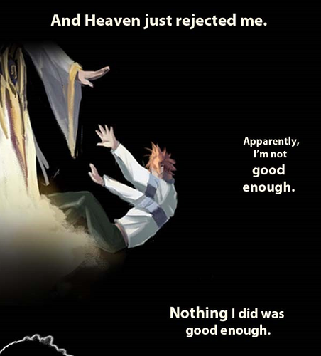
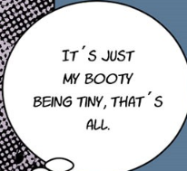
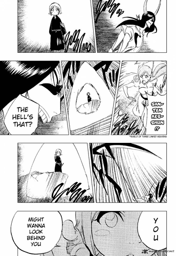
So the first thing I'm seeing is there is a lot of chaos in the words.You have a lot to say amongst these images, which will quickly overload your viewer for an intro. This sometimes leads to awkward placement, such as above. Your words should be centered between these two images. I recommend cutting down on the narration, leave it to the viewer to deduce how he's feeling from your word choice.

Instead of using these three pieces of text for narration, shorten it to something like "But apparently I wasn't good enough for heaven." You can see a good example of short and sweet narrative in the first episode of SubZero5.


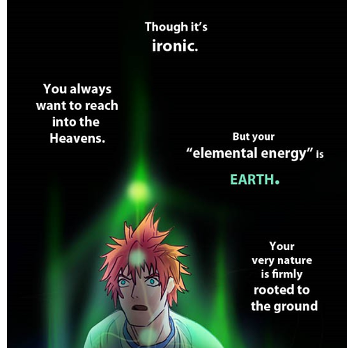
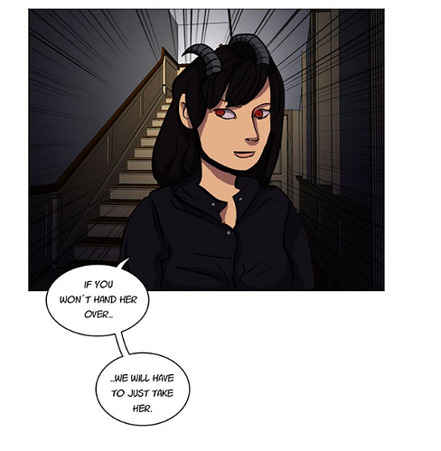
Like for example here, you have some great illustrations that are doing a good job at expressing your story and the emotions the character is feeling, but you're piling tons of text on top. A single line above this panel that said "Though you desire to reach for the heavens, your energy is that of the earth."

In general, when creating a Featured webtoon, we have rules about how big the space between panels should be. I recommend you pick a value (Around 300 pixels is recommended for simple panel transitions, it can be longer for things that have godly narration in between or a scene change) and stick with it so your Webtoon reads consistently.


Like here you have a space, and then no space between the two panels. This reads quite messily.

After reading the first three chapters, I like how you were trying to show us the story though action, but it was kind of belittled by all the narration. You have way too much text, you should have probably 1/4 of what you had in the comic. It is a visual medium- Show us, don't tell us. If your main character is shocked about finding a user of the mysterious element he hasn't seen before, do not narrate in his head a whole exposition of the backstory of elements and stuff. Just show him slowly walking through the alley and maybe being like "This feeling..." "...Could it be? No, it doesn't feel like an element I've seen before..." Then show the guy surrounded in purple and all your viewers will instantly know the element is shadow.

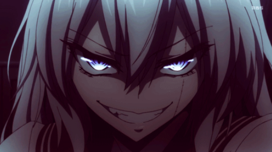
Your art could use improvement, IMO at the quality featured desires right now you are a bit below it. I am confused sometimes though because some of your panels are quite good, good enough I could see them in a featured webtoon, but other panels are completely in the uncanny valley side


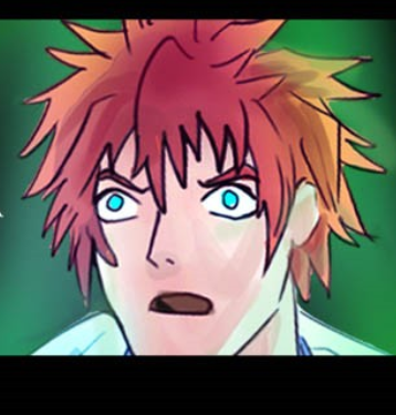
like the top face is excellent, but just a few panels down you have this close-up shot that falls clearly in the uncanny valley with janky lines (that is quite big, i could excuse it if it was like a tiny shot of him in the background looking wonky)

I think you should focus a bit on improving your artwork, or at least, taking more time with it. A Webtoon original expects the top-face quality in every single panel. I think you have a good idea how faces and bodies work in certain angles, but you haven't studied figures and faces extensively to know how they work thoroughly.

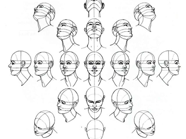
Practice doing studies like these. And do quite a bit of figure drawing too.

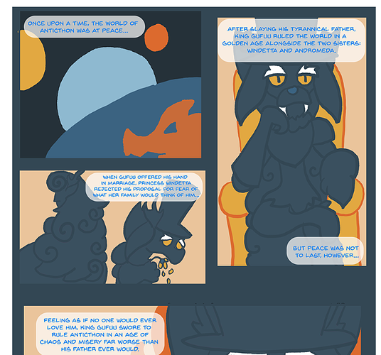
As for the story, as you already stated, you don't have anything crazy new but I don't know if there is a Webtoon that has this story. However there are a lot of stories in YA novels and TV that focus on elements, and I don't know something popular having a similar story would effect choosing a webtoon to be featured. I think your story is solidly on the middle line- It will not detract from your chances of being featured, but it also will not add to your chances of being featured.

Anyway, good luck ~

Hmm I had a feeling I had too much text, and because that's what you emphasized the most, I guess that's the biggest flaw. I do have a lot to say and it can be hard to tell what's important to me may not be to editors/readers yet.

I understand your confusion on my level of art, for that I apologize, so please let me clear it up. I personally was aiming for certain "key" angles to look more impressive and didn't spend nearly as much time on other panels I thought were "less important". I thought maybe the readers wouldn't care as long as it doesn't happen too often, and I didn't want to spend more time than I absolutely needed to get my message across. We put way more hours in to creating than most readers spend looking at it, but I guess my cutting myself some slack in the drawing showed through as inconsistency more than I thought :sweat: oh well, at least apparently the art is feature quality when I do try. Since my new intro is long, I admit at some point I reeeaallly just wanted to get it done and not keep my readers waiting, I'm quite anxious I'll lose them :weary:, but now I realize rushing through things created the wrong impression. But regardless, I'll still take the figure drawing tip, and I'm always up for practicing and leveling myself so I'll do that!

I was wondering if my painterly style versus line art style changes would affect my chances? Since this intro is newer than the chapters that follow (which has a painterly style for a few chapters till it goes to the recent line art style again). Is it worth redrawing them so that the style across all chapters are the same, even before the promise of a feature?

Anyways thanks for the tips.

@Cabbage Thank you again for all the time and effort you are putting into these reviews. They are reeeeeally helpful, and this thread became by far the most helpful and informative on this forum! We are looking forward to your review of our Hexameron very much, hopefully our request wasn't lost amongst the others.

The style change will not help your chances of being featured, at most they will overlook it if other parts of your series are good enough, but one thing that is valued is consistency so a sudden style change will be a problem. I would however focus on other aspects before worrying about the style change.

As for the art, this isn't something I was really ever told during my editing process but I had it drilled into my head extensively in university while learning to put together portfolios:

People will remember you by the worst piece you present, not the best.

This is why even series' that have beautiful animations or comic panels get one wonky frame, it's screenshotted and passed around the internet and laughed about. You need to make sure that even the very worst you produce is still above a certain standard of quality.

first, i would like to say, thank you for telling me that bubble was cut off, i'm going to fix it on Webtoons soon, i have already fixed it on Tapas

as for the elbow, i was so confused as to what happened there, then i looked at the Tapas release (which is traditional page format) and found out originally; a panel actually covered that, so yes i am glad someone pointed that out to me...

only things i still cant grasp is pasing and the very very hard one... colour theory. i actually have a friend coaching me on that but i know that one will be the harder one to overcome since i really cant grasp the understanding of it, like in a visual sense, you show me a colour nightmare and i would see nothing wrong with it kind of sense but i am takinng these into consideration despite me never going for featured

like the others have said, panels is a bit of a cherry on top thing that I suggest to people who seem to have the skills to accomplish it on top of other things you need to worry about for comics. I do see that many Cavas comics seems to have a lot of white space. Like enough that when I scroll it almost is a bit of work haha, which is something you definitely don't see in Original works. In my experience, people who use smaller korean panels still are just as likely to have large white space so I don't think it's to combat that particular problem.

Regardless, imo panel shapes can be some of the most fun things to do and you do get readers noticing it (I played with it much more in my other comic "Normal." and would get comments complimenting it). Not necessary though. I think your comic is going to go far to good luck on it! :slight_smile:

I don't really think about getting featured because I'd turn into Ahab trying to hunt his whale. I don't even think my kinda comic really has much of a chance to be featured as it's more of a hobby for me and gains steam slowly - tbh I much prefer it that way.

I genuinely think more linear narrative based stories with a more Manga based art are favoured more but not to say other artists work don't shine through, it's only what I have seen consistently for a time.

Going all the way back to the main source question; I think when it comes to gaining a following it really comes down to managing your expectations and doing what you can at a manageable level to put it out there so as not to consume your life, if that makes sense. I've been on and off Tapas and barely broke 100 but have increases in subs by 10 each month on average since january

Don't obsess over growth and enjoy the work you do and relish in the ones who appreciate it.

Don't obsess over getting featured. What you get out of the experience of producing work and the engagement from those who do appreciate it is what matters more than numbers and a digital spotlight (even though yes it would be a marvellous thing I won't deny). Hope this helps somewhat

Okay, I finally updated my comic, and it now has three episodes. I think that's a good number for a critique, yea?

I'd really love some thoughts, this is my first comic!

I was wondering how genre specific your work has to be/how closely does your story have to fit into the genre category you've chosen? What if you have a work that has multiple genres and doesn't neatly fit into a box?

How your story fits into a genre is irrelevant. They want good, original stories above all else. There is just a trend for certain genres not only having really similar elements among stories but having far more competition combined with far less demand from WT.

My story didnt fit into any genre well. They just picked one for me that kind of encompassed one of the themes and rolled with it.

Well, though i want to make the corrections of my webcomic, I will feel bad for my followers with a new reupload ( this is my second upload). They have been supportive in these difficult moments I'm going through . And erasing everything so webtoon can see me again? I guess I'll still make my corrections on the next chapters.

Maybe you could just finish it out with the improvements so you get really good practice with them. Then just come when better with your next story

Naw. I think "reimagined public domain superheroes" is a bit too weird for a Tapas plug. Especially once Stardust starts making with the surreal horror.

Sorry for the wait.

Since you said you're not aiming to get featured I won't critique from that angle, just in general. Also, might I say, 94 updates in the scroll format is incredibly impressive.

My first suggestion would be to use a different font-

You are bubbling great, and the font is in a fine size, but this font has some weird spacing which caught me off guard. It's a tiny detail though.

So I think your coloring is great. The backgrounds are also great. You have good paneling (though I think all the spaces in between the panels could be decreased by about 100 pixels) .. I'd say the thing I am taking the most issue with is the expressions.


Like in this scene, the zoomlines and text make this seem like it's a really dramatic moment. But the character is looking to the side, with a half-smug mostly normal face? For this kind of shot, if you want an impact you should almost always use a face-on shot (it's very intense), and make sure the expression is clear. I can't redraw it because I have no clue how to mask my style drawing faces lol, so here is an anime screenshot with a really exaggerated expression that I think has a similar tone:

Note how even the shading works to enhance the expression. putting shadows over the top of a face always will give the character a "dark" expression.

The expressions being so mild lead to a lot of confusion for me, since the main character never looks alarmed, and none of the "enemies" look like they're on a mission. It looks like this is a daily occurrence to them, as mild as getting milk from the grocery store. I kind of thought the setup was that she is constantly being hunted down, and when the enemies broke in it was like a "Lol, here we go again!" kind of thing where she cheekily taunts them and escapes easily (Like Ash and Team Rocket), but it ended up kind of being a big dramatic thing and she got captured. Making sure the characters faces, expressions, and body language match the tone you're trying to portray will go a long way.

I'm going to go ahead and skip to the latest episodes since IMO art needs the most work here, not that your art is bad at all... I think you just need to zero in on some stuff and work on improving it.

So what I think your STRONGEST thing is your coloring. Your coloring is at a very proficient level (featured level, definitely), I don't have much critique for it. But your anatomy is very off sometimes, which kind of defeats the really nice coloring. I recommend taking some life drawing, or just going outside and doing quick sketches of people walking around. Try to do some detailed muscle-maps of the body. Doing the really complicated stuff I think will help you sort of morph the skills you already have into a more proper understanding of the human body.
Good luck!

So first off, I want to say that I personally think the premise and style of this comic is quite cute. It feel like it has a lot of motivation/passion behind it. Something about the art style that is reminiscent of the cartoons I'd watch on Saturday mornings. This is just my personal opinion though haha, so I'll be getting into the more objective critique.


So right now from the first page I think there is a big issue with readability. Three things

-The gutter space is the same blue as one of your characters, which leads to confusion for a reader. Try making it white or black. I think white and black should be used for 95% of comics, I haven't really seen a comic that pulls off an oddly colored gutter well but I'm sure one is out there so I leave that 5%.

-The text is in a saturated color. I think you should make the bubbles not have any transparency and leave the text as black. Right now the text color is just blending in and I'm having a hard time reading. Readability is super important.

-The panels are quite confusing. When paneling, you have to make it very clear to the reader which panel is 1, 2, 3, 4... Or else a reader will give up quickly since understanding the comic is too much trouble. To do this, try to refrain from having panels that sit on top of each other (your first two here) being completely parallel to another panel. In general, I recommend checking out some american comics or manga and basically copying their layouts.


Here's a random page I just yoinked from BLEACH. See how all the panels stay on the same line horizontally? We know which is first and which is second (noting that japan reads right to left) because we naturally read from the top to bottom. The panels also have tilted "action" lines during fast/tense scenes to get the reader to understand something is going on. But the panels are very neat, clean, and even.


Here's a really quick reformatting I did of the panels. It's not perfect, but if you wanted to keep your original page layout, this would be extremely easy to read for any viewers.

Anyway, I think the biggest improvement that can be made, reading the rest of the pages, is the three points I listed above. All which point back to readability. Text color, bubble color, and paneling. I notice your panels often have inconsistencies like this:

Consider perhaps getting Clip Studio Paint if your budget can afford it. It's about 20$ whenever it's on sale. It has a paneling tool that makes paneling incredibly easy (its what I used to make the panel fix above)

Anyway, good luck ~

Ah, thank you so much! Thankfully, the reboot of DRGN is coming in a few weeks, so I'll be sure to take that feedback to heart! (This comic was mostly just a proof-of-conept/learning exercise more or less.) I've definitely decided to work more on readability in the future. (I ditched the color coded text in favor of color coded speech bubbles instead.)

I can't wait to share the reboot with you when it comes out!

I don't think so. I really need to work on everything especially anatomy, and a schedule.