1 / 12
Aug 2019

Alright so I've been cranking out some pages for my new comic Removed15, and I've been doing basic shading on all my pages by just putting in some gray on a layer with a lighter opacity. I use this method since it's quick, because a big priority at least for me is being efficient with my pages so I can get them out quickly. However, I haven't really been liking the way my pages have been coming out lately, and I'm considering just switching to flat colors. I'm also considering doing partial cell shading, such as only on backgrounds or only in the case of dramatic lighting.

Here is the most recent page I finished with and without cell shading, any opinions/advice on how to shade quickly and nicely or even just a quick vote would be appreciated!

  • Flat Colors
  • Cell Shading

30voters

  • created

    Aug '19
  • last reply

    Aug '19
  • 11

    replies

  • 4.9k

    views

  • 12

    users

  • 26

    likes

  • 7

    links

I personally think either option could work; your linework and flats are clean and easy to read, so too much gray shading might muddy things up the colors. Something that has really helped me with cell shading is using a color other than gray on multiply. It might help ground your characters and give your drawing a little life. Hope that helps? :3

I really think that the shading in this particular panel is necessary so it looks like their feet are on the ground. But you don't necessarily need to do it every panel. Your comic is how you decide it to be youknow? If doing shadow gives you no joy then nix it.

Now for your question of how to do quick cell shading shadows. For me, I have a love hate relationship with the process of cell shading, but when I do cell shading, I like to do clipping layers. (here's a visual to describe it.)

And if you already know how to do clipping layers you can disregard this, but this is just how I do it (there's a lot of ways to do it), but I start with the linework and fill all the colors in in with a smart paint bucket so every object that I know will have a shadow is on a different layer from the objects directly next to it (excuse the face color, it'll be fixed later. This was just to get the selections together so it just acts as a base color.) so the hands are a different layer than the coat, which is a different layer than the face, the neck, and which is a different layer than the hair, etc.

And this is something that should be possible in all digital drawing software (not sure about gimp but I know even procreate can do this). You can do a clipping layer on top of the individual layers, so anything applied to a clipping layer, will only affect the layer directly below it. It'll look like this in Photoshop
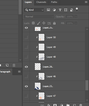
So see all those layers with the arrows? Those are clipping layers. The ones without the layers are the different objects I've isolated to one layer (you can see I'm chaotic neutral and I never label my layers) this particular image had like a ton of layers, but because I made them, it went a lot quicker to draw in shadows. Looks complicated, but is simple once you get used to it (and, using clipping layers you don't run the risk of accidentally merging down your layers. They just stay seperate layers forever)

So, for instance, the shadows and light on these hands were just a clipping layer above the hand layer. (and both hands are on the same layer to save time)

And you can do the same for drawing light with clipping layers. It'll ignore all other layers and make a nice clean light source.

this is what the layers look like for this effect. It looks complicated but it's pretty simple. It was just three layers.

then, many layers later, you get work like this that looks like a hassle and it kind of was, because coloring linework always is a pain, but has very neat and crisp shadows because of clipping layers. And, by using ctrl+click on those original layers, I could select multiple areas at once, so I could put that pink hit on his jacket and his hair at the same time.

But ya, highly recommend clipping layers--took me 10 years before someone told me they existed and it was a huge game changer for my shadows.

Cel shading is a term used in 3D art, where you adjust the shade on a pixel depending on where in the threshold the much light is hitting at that spot.
This is not cel shading. It's just color variant shading.

Also note that you can use the grey shading with a lowered opacity, but you can also set it to "overlay" or "multiply" instead of "normal" flat style for appearance, and that'll change how the gray behaves - like making it appear more green and a natural color, instead of gray.

I'd argue that flat colors can work! But you need a strong sense of color OR some interesting line-work to make it come off as more polished.

For example in With Great Abandon3
The line-work gives the panels energy and a life of their own. The only real shading are some choice areas, but the characters for the most part are unshaded.

And then on the color-side, in Fridge and Bear3
Dots puts an emphasis on colors to set the scene with a few screen-tones and textures scattered throughout. Again the characters are largely unshaded aside from a few choice 'black' cast shadows.

as for my own work, I have a comic (Sarota Springs) that is 98% flats. I rely on color to really establish a mood or time of day.

Same same! This is what I was going to recommend as well (and what I do for my comic). Basically you can use the same technique you are currently using with the gray which, as you've already figured out, is much faster than using unique shading colors for each part of the panel. BUT if you use a color instead of a gray, and use layer styles like "Multiply" (not sure if this exists outside of photoshop, probably?) you can get a little more mileage out of your shading.

For my comic each time the scene shifted to a new location, I would just select a new shading color that was kind of the "majority" color in the background, tweak it a little (to make sure the shadows aren't too dark or too light) and use that color for the whole scene. For example:

First scene used a dark red, similar to the ground/rock color

For the city areas, I switched to a gray similar to the ground

here a brown like the walls

Blue like the night sky

Yellow like the grass

green like the trees/grass

and finally back to gray. For these later cave scenes though, I actually use 2 shading layers: The first one gets applied over the entire panel (just a light gray shade). I erase out where the fire lights up but otherwise everything is shaded darker than normal. And then I do another regular shading layer with the same color on top of that.

Just one way to do it, but it's quick and looks pretty okay :smiley:

Personally, I think shading is necessary in most art style.

I don´t think shading is neccesary, but (as @joannekwan already mentioned), you will have to have very strong lines, athmosphere and understanding of colour.
I would recomend to you to keep shading for now. Be brave, use a strong shade and put bick and expressive shadows. From there you will automaticly learn a lot of light and shadow placement - understanding, that you will need if you decide to eventually settle on flat colours!
Another Tip: try to never use "black" or "grey shadows. Use a strong colour on a multiply layer. It will give so much more athmospehere to your drawings
For example, I used a redish purple for this one:

Here´s some comics that you could study for their shading, I find them very impressive!


Keep it up :slight_smile:

Problem with the gray overlay is that it doesn't really convey much shadow. It's too light, and without checking the values it almost looks like it's a lighter value than the green it's being cast on. As well as shadows don't work in pure black and white scale. Light actually has tons of colours bouncing around! The sun's rays are gold, so if you pay attention to light coloured pavement on sunny days you may actually notice blue shadows being cast on it. Blended painting styles get a ton more complicated but a simple rule of thumb for cel-shading is that shadows need to be tinted slightly towards the opposite colour of the light being cast. So for gold, that would be violet. Make sure to test your work by desaturating it, there you can see pure values and check that your shadows are creating a strong contrast against areas that are subjected to direct lighting.

6

Colored multiply/overlay saves comic artist lives. It's always better to have at least cast shadows if you can't invest too much in shading, because if your linework isn't extremely advanced, the viewer loses all sense of position and shapes. And the colors add to the mood, which then works into the emotions you want the page/panel to display.

I think you'll need to add shading, but use slightly darker colors. At first glance, I didn't see a different between the pictures. I think that if you give more contrast when adding color, you will get more depth/dimension in your art without needed to do anything fancy :slight_smile: