
What is your honest feedback of my completed silent manga? There are 4 short episodes. Thank you for your time.  ️
️
created
 Apr '23
last reply
 Apr '23
- 8
replies
- 1.2k
views
- 1
user
- 9
likes
- 1
link


What is your honest feedback of my completed silent manga? There are 4 short episodes. Thank you for your time. ️
General impression is that this is a well-drawn comic, and the plot is easy enough to follow, but there are some things that bug me about the panelling.
Something that hits me as immediately bit unintuitive is that the comic tells me it reads right to left... and then follows that with a sequence of panels where the protagonist and point-of-view character is consistently walking from left to right, over the course of the rest of the first episode, which encourages the reader's eyes to follow her moving from left to right.
The only time I think people should draw comics right-to-left is if they've been raised in a culture that writes and draws right-to-left to the point that their natural instinct is to draw and write comics right-to-left and it feels awkward to flip it, especially if the comic was originally in a language like Japanese... but these panels the composition naturally flows left-to-right. It feels like you naturally draw your panels to read left-to-right so... just have your comic read left-to-right, which more people are comfortable with on this platform.
The panels are generally well-drawn, but it feels like some panels are drawn based on what's more impressive-looking to draw, not what clearly tells the story.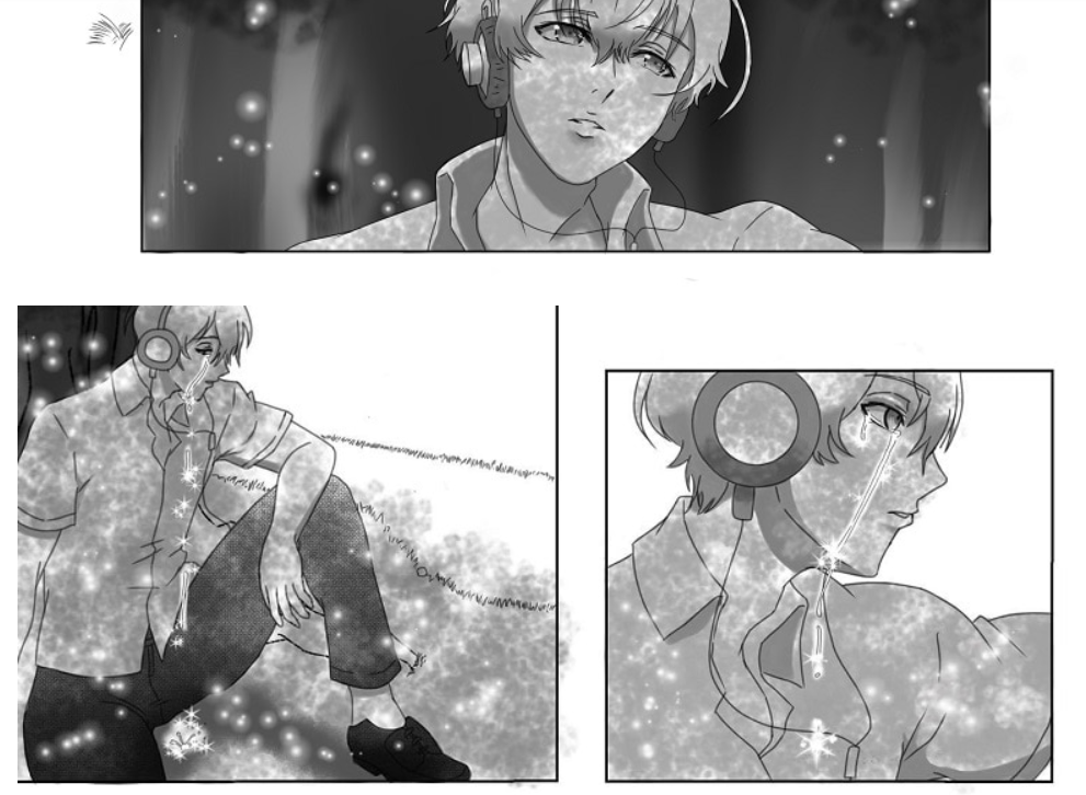
When I first read this sequence (and again, he's consistently looking off to the right, so I have to fight against his gaze drawing my eyes to the right to read these panels to the left), I couldn't work out why there were two almost identical panels of him crying. It was only after scrutinising the panel I saw the droplet on the ground, which was probably the point. I feel like small panel showing just a close-up of a teardrop hitting the ground rather than the full figure would have been clearer. in getting across that his tears are the focal point.
I'm not sure recapping the same panels at the start of an episode like in the third part is necessary on a comic this short. It's not bad practice on longer long-scroll comics with spaced-out update schedules, but there isn't that much info to recap here. An establishing shot of her sitting bald-headed in her room would have been enough to re-establish where we were at.
The story and stuff was fine, but a little dull. There wasn't really a twist or a surprise. When you tell the story in text it becomes:
"One day a girl was walking through school having a pretty normal day. She walked out into the yard and saw a boy listening to music, and he started crying. Where his tears fell, flowers bloomed. He smiled at her and pointed to the sun, then gave her one of the flowers and walked away. When the girl got home from school, she removed her wig, false eyelashes and false teeth, and looked sadly at the sun... Suddenly! She grew hair, teeth and eyelashes! She knew it must be the work of the magic boy and his flower."
I feel like this story is kind of trying to both do too much and too little. There's a lot that needs to establish that doesn't exactly come across about the boy, like... when he pointed at the sun, I didn't really get what he was trying to tell her. Is he from the sun? Why was he crying? How did he know she was ill? Why was she walking to the yard? But then it also lacks a message or twist. The girl wanted her illness to be cured, she did absolutely nothing, just hung out with this guy for a few minutes, and it was cured by magic. It makes sense in terms that I could follow mostly what happened, but it lacks a point; it's not really saying anything about having an illness that affects your appearance, or about showing kindness, because nothing really cost anyone anything here, and the negative effects of the girl's illness aren't visible at all; she looks perfectly healthy, can walk etc.
So as general advice for future stuff...
It wasn't bad on a fundamental level though. Please know that if I'm critiquing things like your panelling and story themes, it means the drawing is generally solid and I could follow what the story was, which is a sign you did well! Keep it up! 
It's a perfectly respectable short. The art quality is consistent, and the story line can followed, despite the lack of dialogue. I'm not clear on the background of the mystery boy, but I'm okay with that because it's a short.
I mostly agree with darthmongoose. I would like to re-iterate, though, that we wouldn't be giving nitty-gritty criticisms if the comic had any major problems.
My brain really wanted to read the images left to right, and there was no text to remind me to read right to left.
The recaps were unnecessary because the episodes are fairly short.
What I would like are transition panels of her hair gradually growing in. I feel like that would get the point across more clearly than going from bald to long hair (it took a second to realize that she hadn't put the wig back on). Maybe make the natural hair look slightly different than the wig (like the hair part being in a different place or the hair being a touch less styled) to reinforce that it's her real hair this time.
Thank you for your honest review. I will keep in mind about the panelling and about your advice in short comics. Your advice as always is really helpful. 

Extremely short.
I couldn't really get into the character's shoes since it was very short. Your summary gave me more information than your whole 4 chapters.
You need to let your user get to know your characters so they can empathize with the pain of what the MC is going through.
I see much potential in the story especially since it is silent. Everyone can understand it which it is why it's so important to make your readers empathize with the situation.
I actually follow a yuri webcomic on webtoons about a ghost girl who is in love with a living person.
That webtoon is silent as well.
I found it brilliant how each episode showed you more about the characters. In just a few episodes you could feel empathy toward the ghosts situation.
Ofc, the author made slightly longer episodes than yours thus more information could be conveyed to the reader. The author of that webcomic stopped posting which is sad.
Anyway, my point is the sick girl in your comic needs a little more screentime. Since the mysterious boy is just a mysterious boy I don't feel he needs extra time.
To go about it you could have done a normal school day for the girl being with her friends being all perfect. Laughing with her family, stuff like that. Then quietly going to her room while probably feeling bad physically. The next day she leaves and the readers can only see a wig but not her condition. Having another normal school day again but going to the infirmary. Each day going to school while forcing a smile and slowly getting the reader to see how truly sick she is.
Personally, I would have made all this the dream of the boy. Making it the reason he cries and pam that is when the girl shows up.
Receiving the flower with a smile and then you finish the story just like you did.
You don't have to do it the way I said. But I do suggest you do extend the screentime of the girl to make us (the readers) further empathize with her situation. This could probably be done in a couple of more chapters maybe 4 or 5. Basically 25-30 pages of the whole story in total.
Ofc not counting repeated pages to remind the reader of what happened. The page numbers mainly depend on how much info each panel in your comic gives.
P.S. I don't mind the right-to-left. I am extremely used to it. As for how to write it for tapas I think manhwa style would be better (up to down). But that is only for tapas and webtoons.
I feel I need to jump in here to specify, it's less the panels being right-to-left that's the issue here. It's the panels being arranged right-to-left but with compositions that consistently lead the reader's eyes from left-to right suggesting that the creator doesn't instinctively think about their storytelling or flow in the right-to-left direction, and making the read direction feel unintuitive.
Also... nitpick, but Manwha is just Korean print comics. It reads from left to right (like the Korean written language). The top to bottom format you're talking about that reads top-to-bottom is called "longscroll" or "webtoon", but it still reads from left-to-right, it's just the majority of panels are arranged vertically.
Sorry to jump in with a correction, I just think it's potentially damaging to tell a promising creator to continue to work in a format that's having a negative effect on the readability and accessibility of the work and would make it harder to get professional work or build an audience in the future when they're so close to a standard of being able to do that. I am also very used to reading manga (and also I have a degree in Japanese and speak the language fluently...), but I'm a firm believer that original english comics should only be drawn right-to-left if the creator's work genuinely reads better that way.
Totally fair. No worries about the correction. You are right about it.
Just mentioned it since my brain when it sees black and white it just goes to "is this manga?" mode.
It becomes a pain when I try to read regular comics.
Since Manhwa style is always the same my brain automatically adjusts.
P.S. Had forgotten the word "longscroll" so I just went with Manhwa style. Since I usually associate the word webtoon with "Webtoon" (webpage/
App) I avoid using the word.
| Topic | Category | Replies | Views | Activity |
|---|---|---|---|---|
| Would love your honest feedback ☺️ | Reviews | Feedback | 4 | 156 | Feb 14 |
HELP! I cant find a novel 
|
Reviews | Feedback | 0 | 126 | Sep '24 |
| Hey guys need support and feedback | Reviews | Feedback | 2 | 264 | Jun '24 |
| Opinions on My Super Hero Webcomic | Reviews | Feedback | 1 | 131 | Nov '24 |
| Looking for feedback for my book tapas.io | Reviews | Feedback | 7 | 159 | Feb 17 |
