1 / 13
Apr 2021

I’m making a new cover for my novel and comic ‘Netvor: A retelling of beauty and the beast’ However I’m going to chop the title down to ‘Beauty and the Beast’

Please forgive the rough sketches and if you could let me know which one you like best!

COVER #1

Playing on the themes of fun adventure showing the full beast + some mischievousness

COVER #2


Or without the rose

Simple the minimalist cover displaying the main theme

COVER #3

Kind of a mystery, would be darker with colouring, won’t show the beasts expression to keep it mysterious

COVER #4

The angstiest cover, revelling in all that good secret drama.

COVER #5

A little more fantasy/fun Han the rest light hearted, kind of inspired by labyrinth, but just a little

  • Cover 1
  • Cover 2
  • Cover 3
  • Cover 4
  • Cover 5
  • None?

24voters

Votes are public.

  • created

    Apr '21
  • last reply

    May '21
  • 12

    replies

  • 540

    views

  • 6

    users

  • 12

    likes

I totally messed up and accidentally hit the publish button- it should be good now if you’d care to vote!

I like #2 or #4, as long as the heads/phone on 4 are large enough to be clear on Tapas. I like the simplicity of 2, though I feel like 4 gives me the most insight into how this will be different from your standard Beauty and the Beast. Those are the two that I would be intrigued by if I was scrolling around.

Thank you for the input! Big enough font is always a struggle especially for the little pictures we get on the site/app, I personally always notice how drawn I am to minimalist pictures like hand holding and random stuff like that so I thought I’d take a stab at it!

I like the first one because it shows off the cool creature design!

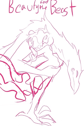
Yeah, I'm totally a fan of the first one bc the creature design would be a boss cover, but I think your heroine standing next to him and touching his arm or maybe standing in front of him and looking his beastly face in the eye would be cool too bc she is such a woman of action from everything that I've read so far I keep thinking more about her facing him head-on.

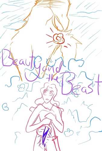
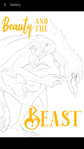
I like the symbolism in 4 because it combines his beastly looking side with his more human looking visage and that fills more true to the nature he wants people to see vs what he currently is.

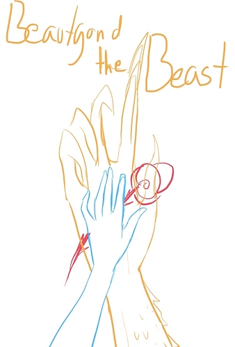
I think the minimalist one without the rose would be legit for the novel version of the story too.

You are on it and I love it. I so need to redo my cover for MM! too :purple_heart:

Awe you know my characters so well and we haven’t even seen that much of them yet TvT Such great insights, and I was also thinking of 2 as a thing for the novel or at the very least a thumbnail somewhere-

I look forward to your own update on the cover since now that the two main leads have met!

A bump for the afternoon crowd! If anyone else cares to voice their opinion! Trying to gather as much as I can!