8 / 16
Dec 2020

What it says on the tin title. How did you decide on your cover art? Did you over think it or just go with whatever came to mind? How much thought did you put into it?

For me, I have an upcoming series as some of your might know, and I spent a lot of time considering the cover composition and eventually got it down to two. One was just two people and their cat. If you look at popular covers, a lot of them are just two people interacting (often gazing lovingly or similar). But, when I considered it, I also wanted something that felt a bit more actiony and also got across that there's a team, not just these two characters. So I made a draft of the six together. But this also lead to issues of fitting too many people in a small space. And that's not even going into things like the title (I went for something simple in the end with just a bit of a fancier font). I did eventually pick between the two (I'm not saying which) but for me it was a pretty long process of drafting and redrafting, compared to my first comic where I knew what I wanted straight away.

So, how did you guy do it? Did you take time considering or did you just know? What sort of things did you take into consideration? And what do you look for in a cover?

  • created

    Dec '20
  • last reply

    Dec '20
  • 15

    replies

  • 726

    views

  • 15

    users

  • 61

    likes

  • 1

    link

Such dedication. . .

I just think "Hey this image I draw can be a cover" and fit it to be one.
Most of images I use as a cover in the past never actually meant to be drawn as a cover.

Spent a good amount of time on what I wanted, and went through a bunch of different drafts of it. I wanted it to be the series name as a logo and feature the main character, but the roughs I made weren't what I wanted. I sat down and had an idea to make a more minimalist version of it, which is the cover I have now. However I feel like it might have a more negative effect on catching people's attention when looking for comics, because I feel it might be too simple. I'm planning on making a different cover that still does its job of showing the main character while being visually interesting. I might even feature the other three main characters on it. Who knows.

Well, for my cover, it was originally just weirdly everywhere in terms of expressiveness yet still fit with the story; but as time went on, I redid it to fit to the story more and keep everything together. So it was a little combination of considering and just knowing, more on the just knowing part.

What I took into consideration was: the elements and principles of design, theme, etc.,

What I look for in a cover are: the design, theme, balance, a sense of mood etc.,

My covers are very carefully planned. All of them feature one character that represents a tarot card of the Major Arcana. The character in the cover is the main protagonist of the adventure. The meaning of the card is related to the plot and to the character's role in the story.

They are mostly monochromatic taking the signature color of the character.

They are surprisingly very easy to draw because I don't put any adornments to keep the cleanness. They are my favorite part of making the comic LOL.


I like your covers HGohwell. :grin: (and I'm noticing there is an update with Louis and Ari!!! *Runs to read.)

Honestly for the cover I have now, I sat down in my sketchbook to draw some thumbnails and pick which one was my fav and best fit the story the volume was telling. I ended up going with the first one because it just checked all the boxes for me:
1) It had all my main characters at the time
2) It communicated the genre
3)It gave insight into the character dynamics.
Now, I have redrawn my cover since then, but the only thing I did was add another character, so not much changed. I'm still doing thumbnails for future covers because those chapters are less straight forward for me than for the chapters I'm working on presently.
I also do chapter covers, not just volume/book covers and they're mainly of locations and set pieces and not of characters. I have it that way because the chapter covers are lineless and favor background work over character work.
What I look for in a cover is, a good use of space, pleasing colors or values, communication of genre or tone, and balance of detail and simplicity. Busy covers with poor color choices are hard to look at which is a turnoff. Simple covers with little to nothing going on feel lazy, but this can work if the cover is communicating a sense of loneliness.

I like to do American comic style covers and pages. I want mine to convey the type of story and characters I'm making. I also promote the comic with these images, so they have to be as good as I can make them. I try to show the attitude of my comic and characters through expressions, outfits, poses, colors, and environments. I typically only do covers if they are lengthy chapters.

These are from my current comic:

As far as picking who and what to put on the cover, I pick who I think would be fun to showcase, or maybe if it's a new character, maybe I will show that character instead. Also, you could pick an important moment from the story to show on the cover. Sometimes spoilers on a cover can be exciting, which is more of what I did in the covers below.

Here's some old covers I did for a comic game I used to work on:

Oh, I absolutely put a lot of thought into my covers. It's important if you want to sell your work! I admit I might overthink some of them though...

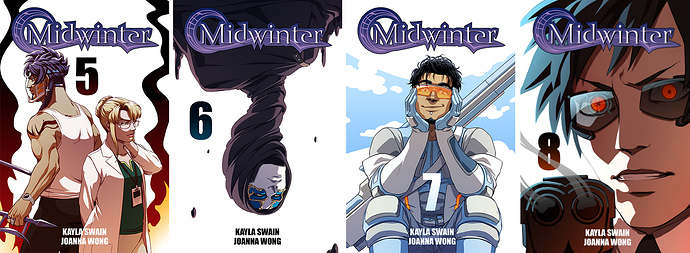
Since I print my comic, I do both issue covers (about 40 pages) and volume covers (200 pages, paperback book). With the issue covers, I can get away with just doing a single character and keeping it simple. They still look good but it doesn't tell you much about the series.

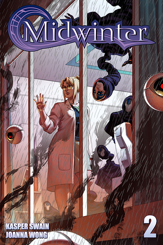
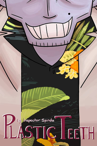
Then there's the volume cover that compiled all 4 of these issues:

I wanted to communicate a lot more about the situation in the story, focus on the character that had the most development, and instill a sense of unease with the looming threat she doesn't notice yet.

Volume covers always take me longer than I think. I struggled a lot trying to figure out a concept with this one and finding an interesting composition... the lighting was hard to pull off too and it just had a lot of effects. And part of me still favors the issue covers a little because they're more relaxed :confounded:

I feel like it's important to touch on character, world, AND story in a cover when possible though, so it's something I'll keep striving for and I hope I can get better/faster at it.

Thank you! I'm sure I've told you before how much I love your covers, the tarot references and especially the gorgeous stained glass effects you use on some of them. And if I haven't recently, I have now.

Jade Kingdoms went thought a lot of covers...but has recently been changed to something very subtle. The main character of my novel is a very melancholic character who's endured much oppression. It's why I kept her pose simple and let the colours speak of her longing for a free life.

So for my comics I like to think of something that could represent the general feeling of the story, both with the images I'll use and the composition and coloring it will have. Usually I make some previous thumbnail sketches until I finally decide on one.

For RedZone-137 this cover idea came up after thinking about that: how could I represent the general feeling of the story? I thought drawing the characters on an abandoned plane, most of them looking at the sky could well represent their dreams to be free from the shelter they are currently living at. Of course there is one character who is not looking at the sky and that also has a meaning.

I also had the problem of fitting too many characters in one cover but thought about giving more importance to the background than to the characters themselves to, as well, represent the overall feeling of the story :slight_smile:

a cover for me has to go with the story of that chapter, its like a preview of the story to grab you attention


the first chapter i show the main villain looking at the planet earth with an evil grin,and you just know things are not gonna be happy

With my WIP, I usually think the covers through, often inserting possible symbolic elements as there should. Perhaps because the story relies on drama over action.