I try to keep in mind all the different areas of the face that could be different on a character.
Skintone: Obviously human skintone varies from very dark brown, though all sorts of different browns (varying not just in lightness or darkness but in how golden, red or blue they lean) through light tans but also light pinks. Not all people of any given race are the exact same colour; hell, there can be a lot of colour variation between even siblings sometimes. I try to give characters a variety of skintones even when depicting people of the same race.
Face shape: I often find art tutorials go way too far and have the faces all as like perfect circles or squares and stuff. It's more subtle than that, but some people have a very narrow jaw or pointed chin, others a very square chin and then there's stuff like cheekbone width or forehead height. Also not having the jawline sag or get heavier at all is a classic newbie mistake when drawing old people that always leads to "looks like a young person with lines drawn on their face".
Nose: Noses are awesome. Like seriously, this is the most under-utilised area for making characters look different in comics in my opinion. There's so much you can do with noses! length, height of bridge, width, tip shape, whether they point up or down... Don't sleep on noses.
Eyebrows: There's a bunch of options here, like thick or thin, arched or straight, the overall shape and whether they're neat or bushy.
Eyes: It often helps to look at real people for inspiration here. People can have all sorts of eye shapes. Just try things out and play around with both the shape of the upper and lower lid and how it affects the expressions, plus things like lines around the eye.
Mouth: I'll admit, I personally am not incredibly inventive with mouths, but in some styles, they can be a big part of a character's overall look. Some people do have a distinctive mouth.
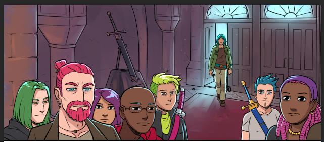
Examples: Here's a bunch of unnamed random knights I put into a panel. Even though they're basically NPCs and they're all people roughly the same age as young adults, I put a little effort into making them all distinctive:

I take a similar approach with the main cast, where I try to vary up things like eyebrow shape and thickness, eye shape, nose shape, size and height and skintone so that especially once you add the hairstyle and colour on top, you get a distinct look to each character. Rekki, being the main character, is the only person I draw with her distinctive thin and completely straight eyebrows, because I want her to be unique looking.
Fun note: Jules and Urien share the same eye shape and nose shape as well as skintone because they're siblings. Their facial expressions are often very different though, and being a beefcake, post timeskip Urien in particular has a much heavier face than his sibling.
Overall, just mess around with things, and try not to worry about making characters attractive. There are lots of ways to be attractive, and sometimes a character you design to look "interesting" will be perceived by the audience as more attractive than one you design to be "pretty"! Jules has kind of a horsey long face with droopy eyes and a big, slightly hooked nose and a very pallid skintone and yet seems to get the most readers going "omg I love them. Damn, they're so hot!" out of the entire cast. 