nope. no. nopenopenopenope no you stop that right now.
I know it sounds cliche, but you are never going to get anywhere trying to imitate other people's art styles. You do not 'get' an art style, you don't need to acquire one, you already have one. Your job is not to 'get' an art style, it is to find the one that's already there.
I recognize you might be referring specifically to the technical aspects of brush and pen settings here, but your phrasing sets off every red flag I know of when it comes to inexperienced artists trying to improve, so I'm going to rant about that for a minute.
There is definitely a lot to be learned and gained from examining the technical aspects of other creators, and you most definitely can just straight ape specific details from any artist whose work resonates with you. That's part of how you 'find' your style; you apply layer after layer of other artists to your own work, taking the nose from artist A, the line weight from artist B, the color palettes from artist C, so on and so forth, and as you work more, those layers will slough off a little at a time, and you'll be left with the pieces that 'fit' you to begin with. Something like a patchwork quilt of the things you love, coming together to make something new and unique.
That being said, I spent years of my artistic career attempting (and failing) to 'be' another artist, usually a new one every couple of weeks. I got very tunnel-visioned on the notion that 'if I could just draw like that artist, then...', and the thing is, I never came up with the end of that statement. I felt a powerful compulsion to try to imitate every single detail of their style that I could, and it drastically hampered both my development and my self-image as an artist.
Finding that line between being able to learn from another artist and becoming obsessed with imitating an artist you admire is hard, but it's very important to do. Don't try to have their style wholesale, find the pieces of their style that naturally resonate with you, and graft them into what you do, piece by piece.
Your job as an artist is never, ever, EVER to be 'as good as' or 'better than' or 'just like' any other artist in ANY capacity. Your only, and I mean ONLY obligation as an artist is to be better than you were yesterday.
Okay, rant over.
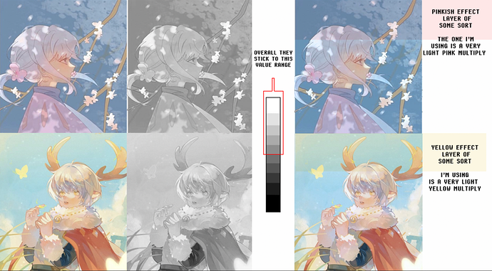
If you were merely referring to the technical aspects, I'd say it's about a 70% chance that image was drawn in Procreate, 30% it was done in Clip Studio. Photoshop simply doesn't have the tools to create naturalistic ink-wash effects like that without some serious doctoring and photomanipulation knowhow.
Paper Textures and crunchy brushes are your friend for getting that rustic feel (but, refer to rant above: you are by no means obligated to utilize that style just because it looks nice to you. You can accomplish things just as beautiful in countless different ways). You can more easily control your colors if you learn to use the sliders instead of the standard color picker (and the aforementioned advice of working on a neutral grey instead of pure white can help a lot to prevent oversaturation), and brushes or adjustment layers on gentle blending modes (such as Soft Light or Overlay) using a low-saturation complimentary color can help push down and mute colors that are too loud.
play with brushes (you can download like hundreds of thousands of them for free if you search around on Deviantart) and find one that has a 'feel' you like. The exact marks that the brushes give you are far less important than how it feels to draw with it; does it get thicker and thinner in the way you expect? Does it fade out the way you intuitively expect? Does it make the mark look nice and interesting automatically, or do you have to fight it to make it look the way you want? Finding a brush that does that is more important than one that has the exact right texture built into it. (Clip Studio is also really good for this because it has so many more options for the movement of the brush in addition to the actual marks it makes on the canvas)