Here's my most common corner cutting things for the comic.
Copy paste things (like background objects) I don't want to keep redrawing.
Using screentones instead of shading by hand.
Using hard silhouettes/shadows as much as I can for 'dramatic effect'
Using panel templates instead of making them myself.
I don't have a specific limit on this, but I try to limit the amount of CTRL + Z'ing that I do while doing line art. I've seen first-hand as well as after watching other artists how much time can be lost chasing "the perfect line". I'm a little more particular in illustrations, but for comics unless something looks really wonky I try to accept one of the first few attempts and move on.
Just this week I've started utilizing symmetry rulers more for certain things, particularly background details where possible. I was amazed at how fast you can detail out a brick wall or just complete a background in general when you only have to do half as much work.
Appropriate amounts of copy/paste. I'm not the type that has like stock versions of characters from different angles to plug in or anything, but anytime a background is exactly the same or characters are standing in the same location with small changes I'll copy the base over and modify it to fit the new panel.
Recently I've started playing around more with custom pattern brushes. I have a grass one that I'm not entirely satisfied with just yet, but was good enough to add some texture to a recent episode and didn't look half bad tbh.
Starting to be choosier about which panels get backgrounds. Prior to my current project I would usually give almost every panel a background, even if kind of a simple one. While I do think that looks really good, it's also mega time consuming. I don't skimp on establishing shots or showing backgrounds in larger panels, but I've started to take advantage of simple or gradient backgrounds more and more where appropriate.
I've begun simplifying my shading considerably after looking around at other popular webcomics. I was doing detailed, illustration-grade shading in my previous comic but a lot of the time the individual panels were small enough that a lot of the intricate details were lost. I reinvested the time I got back into adding an additional lighting layer(s) though~
@nathanKmcwilliams It's always for dramatic effect, of course XD
@Rhonder Oh yes! Copy pasting backgrounds is a complete life saver! Each time that you can get around with doing that saves you so much time . I have the same problem with doing all backgrounds for all panels, I really should start to prioritize which panels really deserve one and the slap a nice gradient on the rest.
Yess. My main thing with this is that I've started cutting this corner but am still trying to figure out the best way to do it that looks... good, with the rest of my panels xD So these first few eps that I've been approaching with that mindset have some jenk design decisions in that regard. BUT it saves loads of time and I figure I can figure it out better as I go
I think this is a really interesting discussion! Often we spend a lot of time as artists on a single panel, that will be viewed for one second
I don’t like ctrl+c ctrl+v, as its often too obvious. Instead, draw the background really well once and then skip it The reader will keep it in their mind.
I make my comic in black and white which also saves a lot of time. But I think this is up to the artist, if you love colour, you should do a coloured comic. The same goes for style, do you want to draw a lot of details or not? Every little thing adds up!
Biggest time saver I use is 3d models for my characters, so I don't spend hours trying (and failing) to get proportions/positions/foreshortening right. I pose them, plop them into a layer, then sketch right on top of them (straight up tracing them doesn't really work though, I TRIED).
Also recycling frames... I won't use the same one twice in a row, but I will bring one back from a few frames ago, zoom, and change the facial expression to get through longer conversations without spending over the allotted week on each update.
And speaking of zoom... once I've got an establishing shot in, I'll do a lot more close ups so I don't have to spend as much time drawing more than a character's head and shoulders for at least a few frames.
I make a lot of actions to save time on coloring. I made a thread about it once upon a time, eventually I might do a video because it just...oh man it saves me a lot of time.
basically if you know already the layer set-up you need for your characters, just make an action that makes all of those layers in one click. (it's kind of farther down in that thread where I get to that) Then, you can just focus on the placement of the shading rather than the boring set-up (that and this ensures that all of my layers are labelled, which is very nice since I'm juggling so hundreds of files when I'm doing a comic and so if I go back to something I wrote like...5 weeks ago, I still know which layers have everything.)
The colors, the gradients, they're all set up and ready to go, so that way I'm just using colors from the library, and I'm not having to try and remember what color something was the scene before. It's nice and helps me stay consistent.
Caveat that I lean on this too hard on the current comic but I don't think most readers notice backgrounds much on a scrolling format comic so...
Hand-waving with Gaussian blurs, gradients on glow/multiply layers and correction layers make bgs very fast.
The other thing I have is a file with title/sign-off and my panel template all ready to go - saves so much time and helps with consistency. When it's time to work I just have to go to the line layer and get drawing.
I second what people have said about copy pasting backgrounds, and I also trace a lot of mine. I made my main character's house in a 3d model software (I used one called Roomsketcher, google sketchup is also good and there are a bunch of others). Then once I have my thumbnails worked out I can take a picture in the model and then sketch my characters right into it.
Then I can add in details like the stuff on the table or posters on the wall. Saves so much time I would have spent figuring out perspective and proportions, and probably looks better in the end anyway. If I can't get a 3d model that looks right I use my own photos. Here's my roommate's truck, which has cameoed in quite a few chapters now.
(yes I know I forgot to turn a coloring layer on)
It's really useful. How closely I follow the photo varies, a lot of the time with buildings I kinda just use the photo for a perspective guide and end up drawing a totally different structure. But definitely has improved my backgrounds.
Here's a fun thing: In Errant, the only things that usually are fully shaded are skin, eyes and teeth (and even that is simple cel shade). Everything else is a flat colour. There's another layer above it transparency locked to the flats on "add" mode with a simple edge highlight on it. A lot of people don't notice this until it's pointed out to them. I came up with the style as something to balance speed and an interesting visual look similar to things like Enter the Spiderverse. In early style tests, the comic was fully shaded, but it was way too time consuming.
The backgrounds are just lineart, a quick and messy colour wash and some white pencil highlights on edges. It really speeds up the process while giving this overcast, damp atmosphere that works for the British setting.
For anything complex, I use 3D models or photos and roughly trace to make them fit in with the style while avoiding perspective grids. I also sometimes copy-paste backgrounds or props I've already drawn, sometimes as a guide to ink over (if the scale is different) or just straight up drop them in if I can. Excalibur, for example, I cannot be arsed to redraw from scratch every time.
Oh, and the Clip Studio panelling tools are a massive time saver. Just make a frame and slice it up and you're good to go with consistent gutter widths even on diagonals. Saves me a lot of time.
Clip Studio also has the "Close and Fill" tool, which if you set it up right can neatly fill in any area that is enclosed by a black outline. It can be pretty effective for getting your flats set up, especially on bitty things like the binding on Rekki's sword hilt.
I'm afraid I don't have any time-cutting advice since I pretty much do my linework on paper.
However, a shading technique I've been trying for the last couple of weeks is making a new layer and filling it with the flat colour that you want to use for the shading. And then I erase the parts I want gone instead of adding shading.
So in short, I use the eraser tool for shading instead of colouring it in. And it is a little bit faster for me. (Cell shading)
So far, it's mostly been copy-pasting spaceships... but eventually I'll need to draw them from different angles, so I can't rely on that forever, haha. I'm also only four pages in, but there are a few things I've earmarked as useful shortcuts.
- Copy-pasting background elements. That dashboard in the ship interior has only been properly drawn once, I've just grabbed elements and rearranged them for every other panel.
- Simplifying my illustration style. (Which basically involves not over-rendering everything.)
- Using line art on the backgrounds. At least for artificial structures. I'm not sure if I'll keep this, because I really love painting environments, but it's been a lifesaver for interiors.
- Grids and drawing assist. And perspective guides!
- Copy-pasting previously used panel layouts. I haven't done this yet, buuuuuut I will.
- Tracing my own photos.
- Using posing apps on the iPad where I can't find a good full-body photo reference.
- Specialised brushes. I'll be making my own set as I go along, for recurring interior features which keep popping up.
I make my webcomic on Procreate, and I've been averaging about 6 hours per page so far, start-to-finish. Given the style I've chosen to pursue, and matching my working time against how long the industry pros spend per page, I think that's pretty balanced. That time will go up as I start introducing more characters to each page, but I still think it's a reasonable pace.
Especially considering last year, I was spending exactly the same amount of time per page on a friend's comic just as a colourist!
@cookyroach That's a resource I've seen many times. I think it can work really well in B&W comics, also it could lead to some interesting panels in color ones with showing mood by putting a plain color as background!
@nathanKmcwilliams I believe I'll be joining you soon in that path XD
@rajillustration Oh! I hadn't thought about the quick actions option. It's true that the little set up things piling up can lead to a big waste of time
@migxmeg YES!! Gaussian blur is the best help when it comes to quick easy backgrounds. I would be mad already without it XD
@darthmongoose You really nail that simple shading though, it fits the overall comic so well! I've been on edge of doing something similar for my second project but I'm afraid of loosing the appeal of my actual style with that approach
@dualdragons That's a nice trick! Sometimes I use that when I'm feeling lazy to contour the shading areas, it's quite helpful tbh
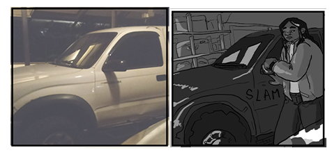
I'm gonna second what others said about using 3D models to work with complicated poses/perspectives and backgrounds. I rely on a 3D model converted for The Sims to draw Adrian's Harley Davidson, and sometimes I make my own custom poses to use as reference for panels. I rarely do straight-up tracing with characters, though, since I find sims models to be a little too blocky for my taste, so what I usually do is just making a rough sketch of the mannequin in the pose I need and then draw everything on my own. Sometimes sims pictures I already have are just used as a placeholder instead of actual thumbnails, too XD
I also copy-paste backgrounds:
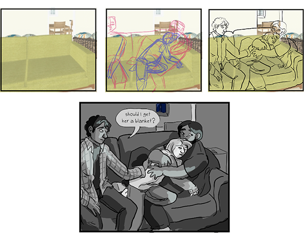
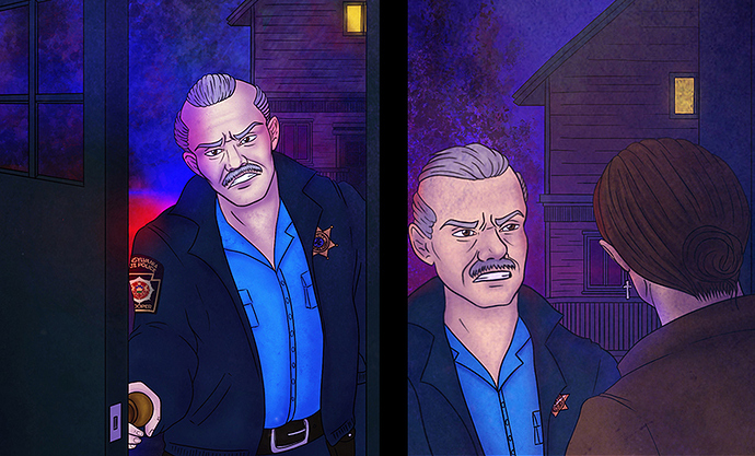
And I don't really bother with "proper" perspective on small/unimportant background objects. That house on the background is completely flat, there isn't any proper depth to its windows or decor, but honestly it doesn't matter because it's so tiny and balloons are gonna cover a good chunk of it anyway, so why bother? XD
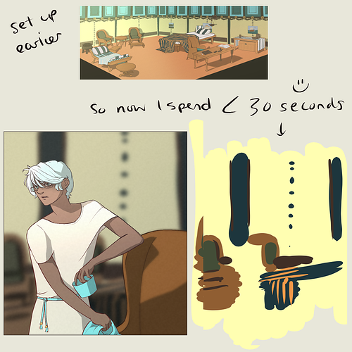
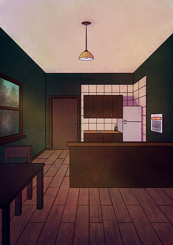
Another thing I did (though I have yet to use it) was to create a full page view of Adrian's kitchen, so that I can copy-paste, cut, crop and use parts of it for my backgrounds:
I also did a "night view" of the same room (read: re-used the same illustration and changed the colors to make it look like it was night, lol) and I plan to do more views for the rest of his house, too.
Copy-pasting is also used for stuff such as:
- Police sleeve badges. I have a separate transparent png of that sleeve badge so I can just copy-paste it into a panel and then use the warp and perspective tools to make it fit on the sleeve.
- Adrian's face tattoo. It has an uber complicated design and, being on his cheek, it's always visible, so instead of redrawing it every single time I just copy-paste it.
As for other tricks I use...
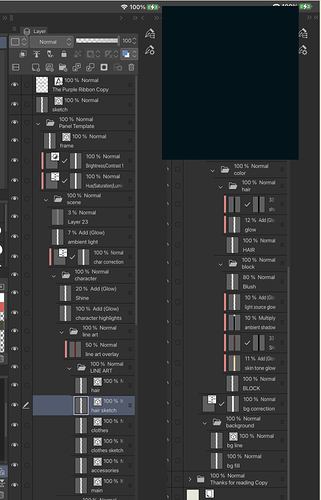
- Character flats are all on the same layer. Character shading is all done by masking the flat selection and creating a new layer set on "multiply". Only backgrounds (and, occasionally, foreground elements) are done on separate layers.
- If the environment has a different kind of lighting (see the blue/red police lights), I create a new layer, set it on "linear light" or whatever and brush whatever color I need on it to make characters "fit" into the scene.
- Textures and special brushes: instead of drawing uber complicated patterns or spending ages drawing stuff such as rocks, grass and so on, I either use textures (as seen in page 2 of my comic) or special brushes. The "Hartz", "Sword Grass", "Aurora" and "Snow Gum" brushes in Procreate have been saving my life so far.
- Lineart? Which lineart? Stuff such as trees and leaves don't have a proper lineart. I just use the aforementioned special brushes1, maybe add a couple of black sketchy lines with the procreate pencil tool and call it a day. My first page was originally done in watercolors and used a similar technique, so I'm trying to keep the same feel in digital as well.