
This is the main character of another webcomic of mine as I was drawing her in March, 2016: 1
1
This is her as I was drawing her in June, same year:
I like the progress I was making, still, I need to draw better boobs.
This is the main character of another webcomic of mine as I was drawing her in March, 2016:1
This is her as I was drawing her in June, same year:
I like the progress I was making, still, I need to draw better boobs.
My original plan for my main character:

Then she changed to this for my first chapter:

Now her hair has gotten bigger and she looks like this:
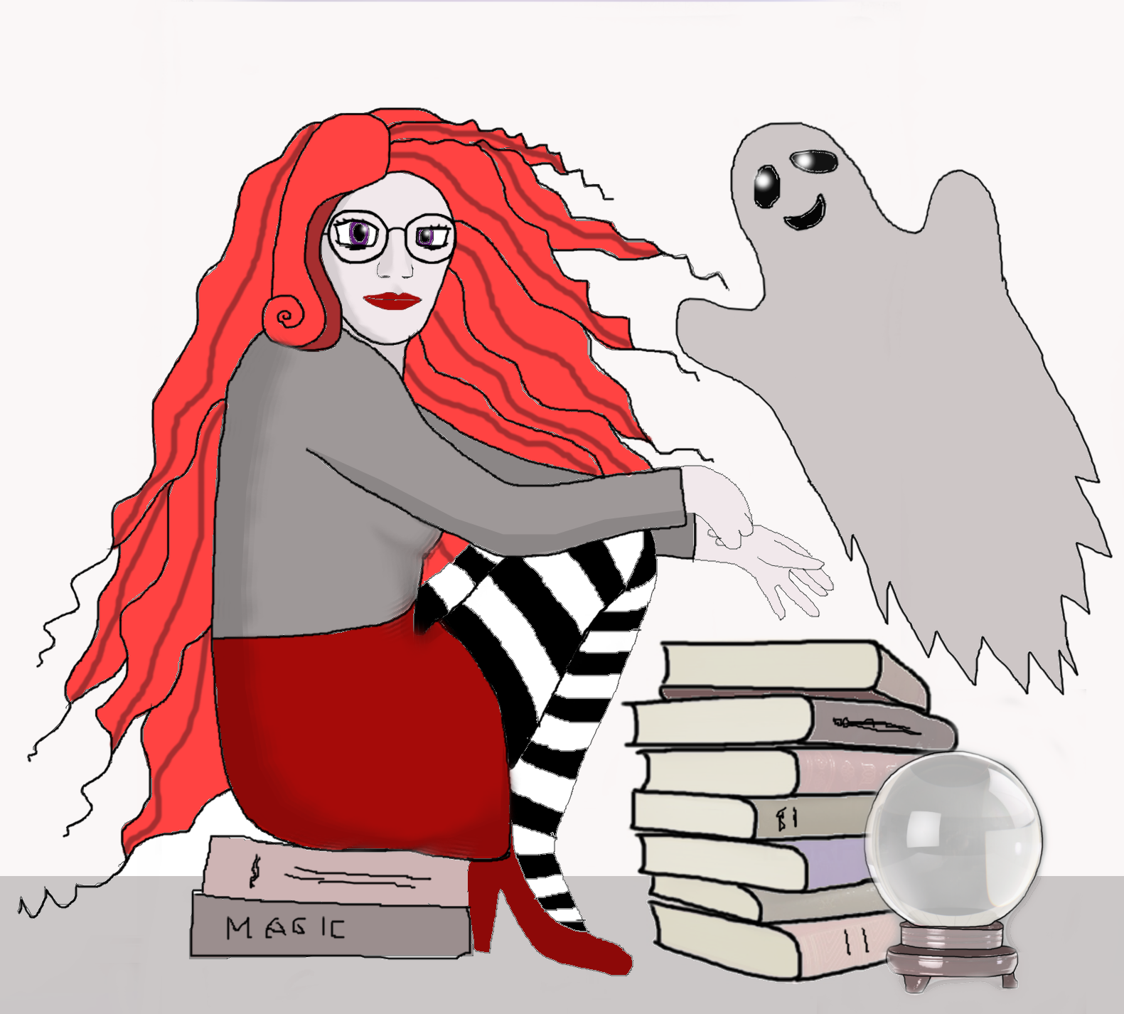
My comic: https://tapastic.com/series/magicadvisor1
@haleymewsome your comic is adorable!  I subscribed!
Oh goodness, haha Riley has definitely changed a lot. And Creep has changed some, but not nearly as much. When I started drawing them in high school Riley was scene because... well I was in high school and that was cool back then. Both the boys had really bad hair. 
Then early on in college their designs kind of evened out to what they are now, but still way too pale. 
But by the time I set the final character designs for the comic they looked basically as they do now.
The only thing that's changed since then is my drawing style improving a bit.
These are couple of pics of The J-Man's evolution I uploaded last year for the 100 sub special.
First real sketch of The J-Man. He has a small mask, circle symbol, and more "Disney" look.
One of the last images of The J-Man for the original mini-series in High School, and on of the first all digital images. Most of the suits look was done by then.
The newest pic I made at the time of the original upload, representing the character from around the end of Book 3: Partners. 
The latest incarnation of The J-Man that will stay after Book 5: Between Two Fires Pt2 ends. The belt now has a "J" buckle and the inclusion of seam lines, inspired by the Marvel movie costumes. Also, my big head has been mostly fixed by now.
My comic has 2 main characters but only one of them had any design changes.
Wanda was inspired by a pencil sketch I dd after comic con last year and later coloured.
When I started seriously thinking about the comic and began practicing, her design slightly shifted.
When I doodle from time to time I like to simplify it and change up the colours, but I try sticking to the second one.
One of the first drawings of Markesha from Kamikaze when she FINALLY got her basic design mechanics down.
This was done by team member Alan.
Then Havana came in. These are some of first drawing she did of Markesha. 

Then we switched her up a bit more.
And then immidiately realized that this was WAY too cartoony for the story we were trying to tell. SO, we went back to the drawing board and tried to find what the opposite of this soft style would look like.
We drew inspiration from a few different places, including Aeon Flux, GI Joe Renegades, and the Avatar franchise. We took the soft curves and made them sharper, more angular and harsh. This was the result.
After that we realized we needed to dial it back from the HARDCORE extreme a bit, and settled on her final design. 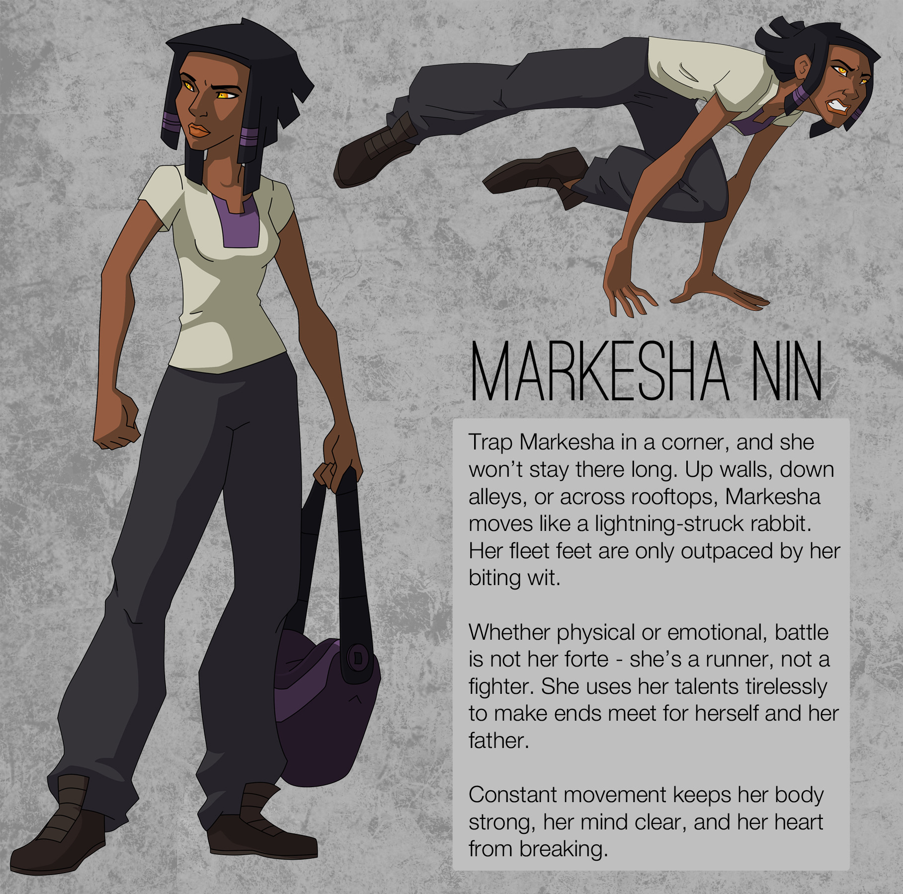
It was a long process but one my team and I thought was needed. And we love the end result! 
One of my main protags, Velvet has gone through some changes over the years. She even had like twintails (and was smiling) at one point:
looking at it now, she looks so young at her early stages now shes so mature... my precious child
Ooh interesting topic haha
Actually my whole story changed , but the original Characters looked like this:
1. 2.
2. 3.
3. 
then they changed to this


My Whole story actually got re-vamped and split into two stories just so it would work. XD
1 and 2 from the original were switched out. 1 was originally the main character but in the new comic he's a secondary character (Atm) where as 2 was a support character and is now the main.
3 over there was actually split into two different characters. His over all look is still Simon (Guy bellow him) but I took the two tone hair thing and a few other features for Mel:
Funny thing is this was all mainly subconscious haha XD
Wow, this one is cool because it actually looks like she grew older as time went on! I really dig her fierceness in the later pics. c:
the main character of my comic is a little girl named magda. she hasn't changed a ton in the year since i drew the original(bw) pages but there are definitely differences! (plus i think my art has improved a lot lol)

the other protagonist was originally a dragon ??? i lost the concept art but here's the first drawing of her as a human vs her now

pretty sure the biggest change is my art aha
I have a few characters that have gone through a lot of changes over the years, but this collage of Selbjorn's (Two Kings) changes over time I have on hand. A different character was supposed to have a beard and I flat out forgot until after Id published some of the work but I resigned myself to 'whelp! I guess now he's got no beard!' 
I think this collage is actually to 2016
My character Candy/Candice is about a decade old since I started drawing her in 2006.
This is how she originally appeared in the comic that was a very early version of Capefall:
This is how she appeared in the short horror comic Blood Zombie in 2008:
This was my experimenting with different designs in 2008-2009:
This is her current watercolour version from Capefall (2013-present)
My main character has evolved somehow. The main idea for her design hasn't changed at all but she underwent many of my style changes. I went from anime to a more cartoon-ish design.
2010
2012
2013-2014
2015
2016
Well, a fair bit! Originally, Low-Tier Jane was made on a whim as a joke, but then I really like the joke a lot, so a sketched out a character real fast to show my friends. I got a positive reception, and I had an idea for a comic, so I drew the first strip once again on a whim. Redesigned her a bit there to flow better. Nowadays, her design's just sort of changed over time unintentionally. I usually use the last strip as her current reference for this weeks strip, meaning that any small changes stick/are dropped arbitrarily.
It's kinda funny. She started with eyebrows, lost them, and eventually got them back.

| Topic | Category | Replies | Views | Activity |
|---|---|---|---|---|
| Lost Tapas Novel | Questions | 0 | 112 | Sep '24 |
| Wait, do readers actually come to forums? | Questions | 2 | 344 | Apr '24 |
| Hi, how to I make a story board? | Questions | 1 | 278 | Apr '24 |
| Is there a ratio to you guys’s subs to views? | Questions | 4 | 367 | Apr '24 |
| Moving to Japan to make manga comics | Questions | 16 | 673 | Nov '24 |


