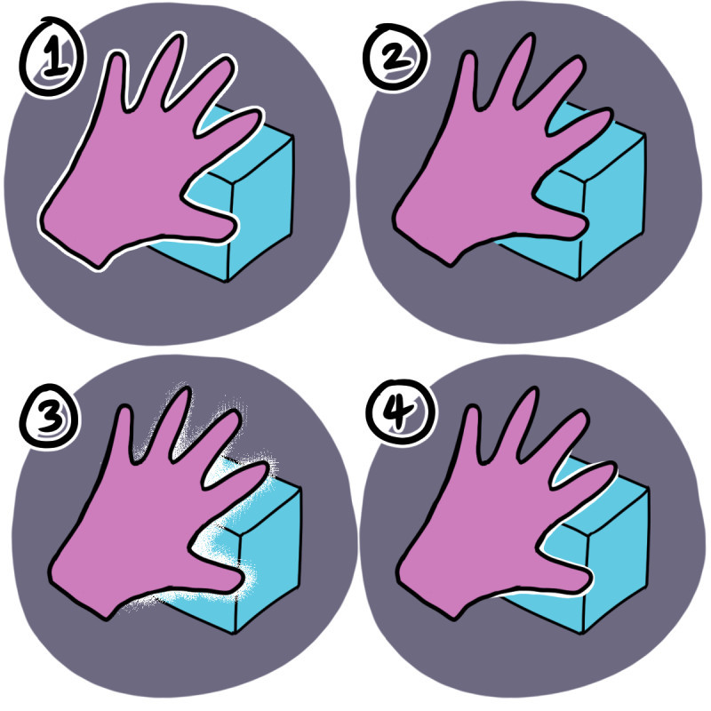
It basically comes down to the style of your drawing/comic. I can give you an example of how I block out tangents/backgrounds in my comics:

Methods no. 1 & 4 are how I do it for my black & white comics, but for my coloured comics I mainly use no. 2.
I use method no.3 when I really want to emphasise whatever's in the foreground.
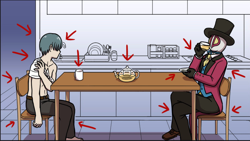
In the example below, I used method no.2 all around the people and stuff in the foreground. (As indicated by the red arrows.) This works well with backgrounds that are mostly monochromatic.

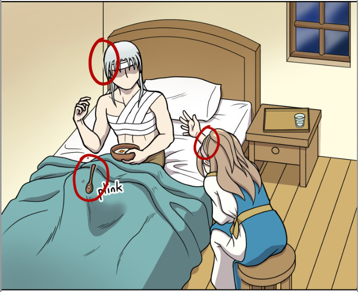
But for backgrounds that are fully coloured, I don't use method no.2 too much because I found it could be distracting, so I use it in places that really matter, like the guy's head below. (Circled in red.)

I also erased the outlines around the spoon and part of the girl's hand behind her head to make them stand out.
You may notice that there are other tangents and mistakes left in place. That's because I was working under a deadline and in my hurry to move onto the next panel, I missed those. I'm a pretty detailed-oriented person, but if I did not notice those mistakes at first glance, it's likely that readers would not notice it either.