Please excuse the roughness of the sketch and shit phone photo. Hopefully my scribblings are communicated well enough though it has been a long time since I've drawn action.
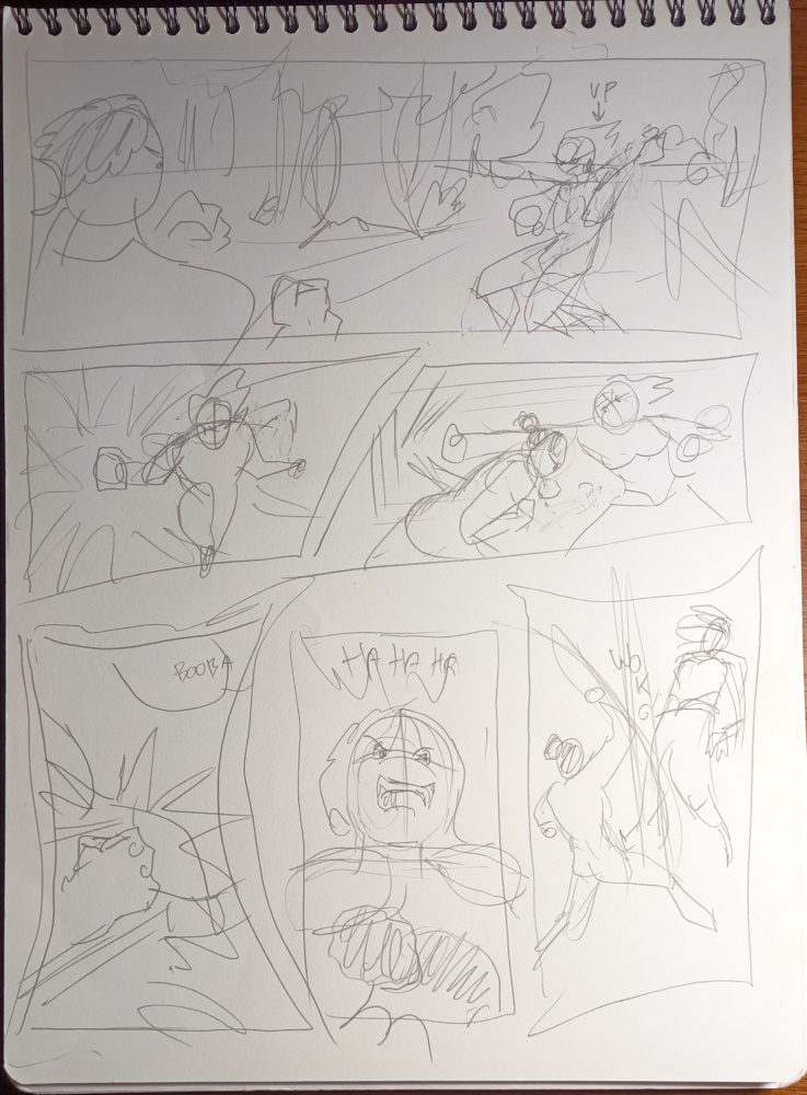
Not knowing your story I'd say the main issue is hiding the combatant's faces. It might seem realistic in a way but, I mean, they're having a kug-fu match in a forest.
Panel 1 needs more dynamic poses. And I think it would benefit greatly to have the vanishing point go to behind the woman, who I assume is the antagonist for this battle. The horizon line is at the hero man's level. I assume she's more of an amazon than him but @Lensing up above laid the heights out for you.
Panel 2 & 3 are part of a sequence, right? Punch is thrown. Punch is ducked. I flipped the hand assuming there's nothing saying she's a lefty. Also by using her right you keep her face in the picture. Showing over confidence on her part. Or perhaps confusion that she missed? Also his hair, tied up as it is, should be moving as much as hers.
Panel 4. I feel the impact of the punch is weak and unclear. Show more torso and give the impact more FX so everyone can see exactly where he hit. Also don't forget to use the same skin tone for his fists since you left that out.
Panel 5. She's sneering at his hit right? "You got anything better?" Have her looking down at him since you didn't establish him taking a step back. It shows both her attitude and the positions they're in.
Panel 6. An uppercut flows better from the positions you established them in before with him lower down than her arrogant stance. He went for a low hit, now he's going high. The lifting her off her feet shows that, yes, he did have have something better.


