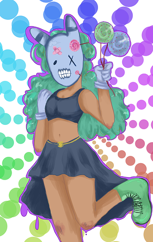
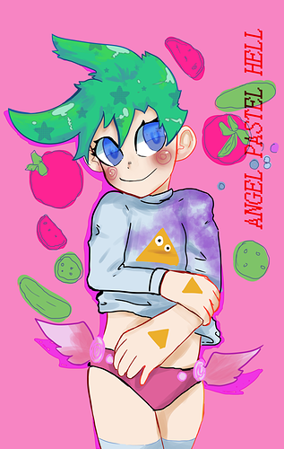
very lovely!  I like them very much, but just because you are asking for area of improvement: the hands are a bit strange in the second one. all the fingers have the same size, which I don't really know if it is your style, but the thumb is very awkward and one hand is bigger than the other. I like that the character has big hands but one has a tiny wrist and the other has a thick one. And maybe the "text Angel pastel hell" can be improved a little. Maybe you don't want the text to stand out and interrupt the drawing but the text can ad some personality to the style. You can use a bolder font and make the letters green. If this is the name of the comic, then you can definitely play a little more with the fonts.
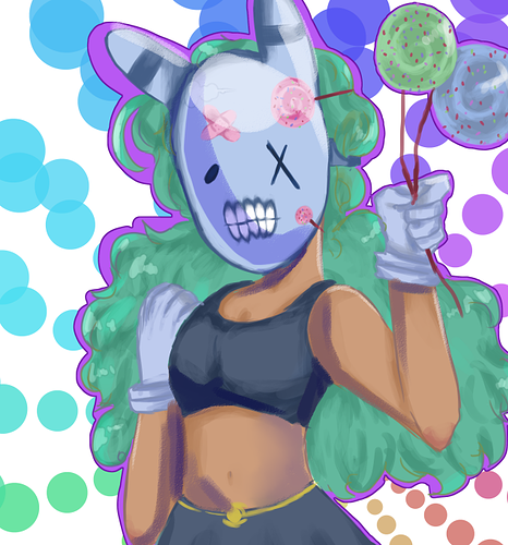
Overall it is very pretty to look at.