
Take a look at this. It is guaranteed to be good, atleast an editor in webnovel agrees because I got a contract offer. Check this out.
I definitely know I have to rewrite the beginning, but I'd like to know how my writing stands now. If anything, I'd like to know if my writing has improved at all comparing the first few chapters to the last few.
I've chosen to write in a present tense/ third person POV which turns off a lot of readers.
If that doesn't deter you, please feel free to let me know your thoughts.
(it's my first novel btw so mercy please lol)
I'll focus less on the art side of things and more on the story and style for this one. I don't think I am qualified to call you out on anything art-related.
-The cover/banner: I like the cover. It has great visuals.
-How hooking the prologue is: Your art is pretty good, so many people will stay just for that. Some dialogues felt unnatural at places. Like Amelia's first thoughts after, what I assume is being drugged, and taken to hell, were how she looks like her younger self.
It would make more sense for her to be confused, she would probably notice the inner changes. Since she's old, it would be easier for her to breathe and move and she would probably notice these things before she could even sit up. I know that conveying these small things in comics can be difficult and time-consuming, but it would have greatly enhanced the vibe of your story.
I'll also say that it was difficult to follow the events of the first chapters at times, but that's probably just me.
-Impressions on the first few chapters and whether they make me want to keep reading: Yes. In fact, I caught up myself. There are a few grammar/spelling errors in between, but other than that, it's a great read.
-General story and/or artwork: It's still in its initial stages so saying anything about the story is not possible. I'll at least say that I am really liking how you are building it up. Slowly introducing the world and the characters while hinting at the main goal of the story. Great work there.
-Style, tone, and setting: Beautifully expressed. The visuals are great and the paneling is done very nicely. Nothing to criticize here.
-Writing/storytelling style and how smooth it is: Again, there are a few grammar/spelling errors and some places where the dialogues feel unnatural. Barring those, it flows very well and the story lures me in.
I really enjoyed reading it and can't wait to read more. Keep up the great work!
This was a very fun read.
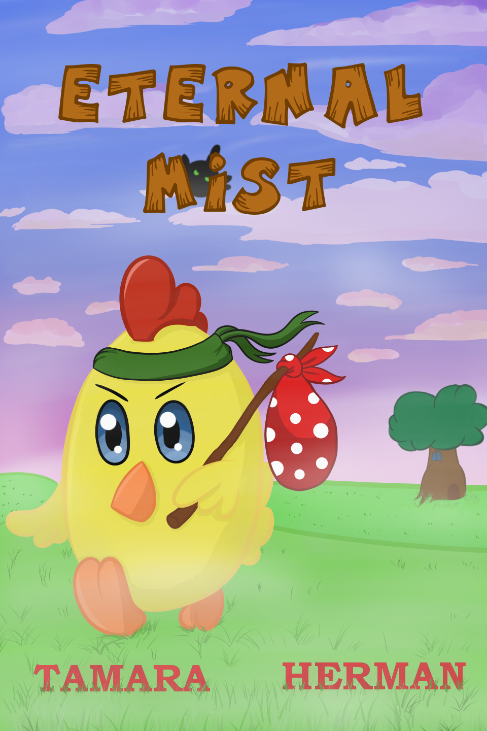
-The cover/banner: Cute and mysterious. I would totally check it out if I ever saw it at a book store. But! It doesn't convey the same image as the description. I'll give a simple suggestion to solve this problem. Make your title large, bold, and slightly ominous. Give it a misty texture or something along those lines. Right now, some people might dismiss it as a children's story, and I am sure it is so much more.
-How hooking the prologue is: I think the prologue could have explored more of Chippo's day and the world around him. I understand you want to keep the chapters short, but the prologue needs to be slightly more catchy. It's the first thing your viewers will see after all.
-Impressions on the first few chapters and whether they make me want to keep reading: Very interesting. I loved the chapters. The cuteness and the mystery blend well. Once again, a little more insight into Chippo's daily life would have been better. What does he do all alone every day in a mist-filled world? Answering this question would have made his departure much more dramatic and exciting.
-General story and/or artwork: The story is very interesting and, as I mentioned. The art blends the cute and mysterious vibes very well.
-Style, tone, and setting: Chippo's size is slightly inconsistent in different panels, but that's hard to notice. I think for panels that are repetitive, like in episode 7, using different angles and showing more of Chippo's surroundings could do wonders.
-Writing/storytelling style and how smooth it is: Very smooth. Natural dialogues coming from a little chick, and the flow is great. The pacing is great too. Looking into Chippo's thoughts and life a bit more would've been great.
Overall, it was a great read. Subbed and looking forward to more!
Thanks very much for taking your time and your honest feedback!
I agree on the title. When I came up with it, it was supposed to be a simple, light-hearted romance story. As the plot developed, the story got darker and more serious so the current title isn't really fitting anymore... I guess I'll also work on the cover font 
Personally, I think the plot is the strong point of my story but it takes quite a bit to pick up. Perhaps I will add more foreshadowing--I'll have a think!

I know you already read this and liked it lol, but I'd like a more specific review on it if you're willing to give one. And here's my novel as well in case you want something different from me
 (If you have any recommendations for a better font I'm willing to try them out ^^ ) I will also read your story and make a mini review on it at some point soon.
This is pretty good! I'll try looking into some fonts and get back to you if I find anything good! Keep up the great work!
A bit overdue but I checked out your novel. Here are my thoughts.
The cover/banner: It looks really cool! The whole gears of a time piece theme is really fitting and I like the font and texture on the title. Did you make it yourself in photoshop or some similar software?
How hooking the prologue is: Really well done prologue. I'll put the rest under spoilers just in case someone else wants to check it out.
Summary
I like how the prologue was also Ivan's first time testing out trial run. It made it really organic in terms of exposition and stuff. Honestly after reading the prologue I felt like he was a bit off his rocker which I'm assuming is on purpose? I don't know I guess I'll have to read further to find out 
Impressions on the first few chapters and whether they make me want to keep reading: Strong start. When Ivan "broke the 4th wall" I was a bit thrown off but I think that's part of your style that I need to get used to. I definitely intend to read further.
I feel like I can take the next few categories at once since I haven't read super far (first 5 chapters) and I'll just end up repeating points.
General story, style, tone, and setting: The plot seems pretty interesting and highly driven by Ivan as a character. The style is new to me I haven't read anything like it. It feels highly conversational which I had to adapt to a bit. The tenses were a bit weird in places but nothing too problematic.
The setting is very interesting and mostly cloudy right now since, as I mentioned, I haven't read that far. Minor gripe, Ivan's thoughts are sometimes in italics and sometimes just part of the paragraph. Not a huge problem or anything but I couldn't help but notice 
Anyway not really an issue at all just a matter of consistency. Doesn't take away from the story in any way.
Overall it's really unique. Even though a few sentences here and there struck me as a bit strange, that was mostly me adapting to your way of storytelling which is quite gripping. I subscribed and will definitely go back to read more. Nice work!
Thank you very much for checking out my work and for the helpful review. I really appreciate it. Ivan is certainly a crazy character to the point that he should be getting immediate mental help.
I guess my grammar is still not too good. I'll try to fix the tenses and whatever strange sentences I find. Thank you very much for pointing it out.
As for the italics... I originally wrote the whole story without any dialogue tags, and it's a product of that. I keep going over the story for errors but miss a few. Thanks a lot for pointing it out, I have fixed it.
I just started to read yours, the concept seems great, and the way you introduced the ability and how easy it was to follow the scene was amazing. So you got yourself a new reader.
I just started and will update regularly; episode 2 is scheduled soon. The feedback I got from friends was the usual - looks nice, so I'd like to know from the readers perspective. Thank you for the offer.
Sorry for such a long gap. My laptop broke down, and I got it fixed just a while back. Writing a review on my phone would've been difficult. ;;>.<
-The cover/banner: It's a good cover, sweet and simple. I think the color around the mask is slightly different from the rest of the background? You might wanna change that, it can throw some people off.
-How hooking the prologue is: It's an interesting start. Maybe it's because of my own style, but I found it oddly slow-paced. The descriptions of her gadgets reduced the thrilling tension of the hectic surroundings.
-Impressions on the first few chapters and whether they make me want to keep reading: Yes. I find it very interesting. The story has my whole intrigue and post prologue, the pacing is pretty nice too.
I will cover the remaining here since I can't find much to say. The story is great and you have written it very well. The only things that stood out were a few awkward sentences and scene transition. It was difficult to understand when the scene has changed.
Other than those, I enjoyed reading it. Keep up the great work,
 I see you have a lot already.
Oh, I've been subbed to you for a while! I'll go over things really quickly because there's not much for me to say about your art or anything.
The cover is amazing, very catchy. I'll count your first 6 chapters as a prologue and say that they are done well. The plot quickly moves into a fight which is hooking.
The fight then goes on all the way to page 15, which can be too long for some people to go without getting any context and world-building but should be fine.
The story is generally very interesting. Gives off the vibe of a lighthearted tale of friends and adventures. Your art style is amazing. The poses are dynamic, the characters are expressive, and the backgrounds are very well done. A few panels felt flat, but that's probably just me.
One thing that struck me as odd was that the bartender mostly had his mouth open in the same manner throughout many pages. That last bit doesn't really matter but was a funny thing to notice since I was re-reading it.
The dialogues are smooth and natural. The only issue that one could have is the slightly slow pacing but since you are releasing a page every week it shouldn't be a problem in my opinion.
To end things. Your comic is a very fun read that everyone can enjoy! Keep up the great work!