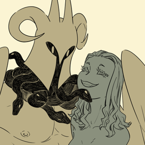
For Heavy Horns in particular, I stick with black, white, and 4 shades of gray simply for time efficiency. And with color being a non-element, I'm able to focus more on the actual drawings. Which is important since this series employs slightly more realistic proportions and I have to get them looking just right.
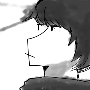
For Erie Waters, I wanted to challenge myself to do a true black and white comic without any grays for depth. It was an exercise in composition and contrast.
Here's my short zine. And I focused on black and white here because 1. I wanted to print it for cheap and 2. I wanted the very specific aesthetic I had envisioned for it (where all large areas of black are 'filled' in by hand drawing individual lines)
As for my own reading habits, I don't care if it's in black and white or full color, it just has to appeal to me overall.