Hey I’m forming a Renee fan club who’s in?
Uh, anyway, so first off we’re starting with the speech bubbles. Speech bubbles? That’s sort of a weird note to begin at, isn’t it?
No.
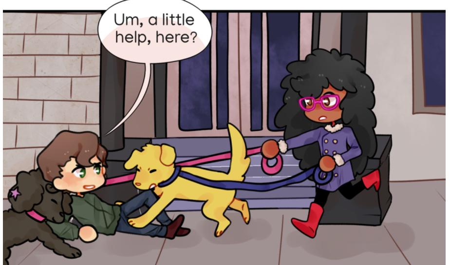
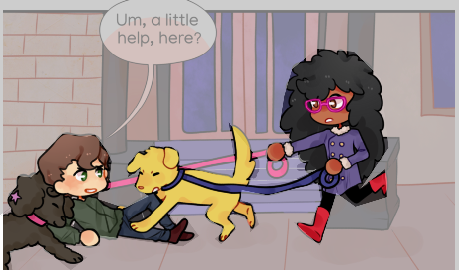
Your shading on the speech bubbles messes with the readability since the contrast of the dark text/light background (or vice versa) makes it easier for people to read especially people like me who have more trouble picking up on text as it is.
I know how tempting it is to have cutesy aesthetic speech bubbles but in doing that you sacrifice how easy it is for others to actually read it, so make sure you prioritize it being practical over aesthetic... Or certain people are going to have to read it a minimum of three times to figure out what’s going on, thus throwing off the story’s flow for some of your audience.
(If you’d like to go an extra step you could brighten the speech bubbles as well so they contrast more against the scenery and draw our eyes there. They don’t have to be starch white but a VERY pastel orange or blue would do! The text doesn’t have to be black either, you can use a way darker shade of whatever color the bubble is to soften things up.)
I know this is a nitpick but but your choice in fonts doesn’t match the rest of the art. Fonts are hard to find and if you don’t know where to get more it can be daunting since you start out with such a limited amount, but I’ve got a resource that’ll have you covered!
This place is heaven for comic creators. You can find a world of fonts that’ll fit your needs! From what I know, the fonts are all safe to download and copyright free (unless otherwise stated) because they come directly from google. I’ve also been using the site for years for my own projects!
Since there’s A LOT of fonts, here’s a few I think would blend in better to the adorable aesthetic of your artwork!
https://fonts.google.com/specimen/Sour+Gummy?categoryFilters=Appearance:%2FTheme%2FBlobby
Your comic uses a lot of similar colors, warm on warm, cool on cool and has a distinguished palette, which is great! It looks beautiful! I can tell you’ve got a great eye for colors! But I’ve got a suggestion to elevate it!
So here, there’s no focal point. It’s hard to find exactly where to look since the colors and line work are all consistent. Of course, that’s not inherently a bad thing, but one of the things that can help bring your art to the next level is making the illusion that your characters exist in a 3D space. Sounds complicated, doesn’t it?
It’s actually pretty simple. So first off, line weighting. (You can find visual references in my other comments) Think of the scene like you’re looking through a camera! The closer things get, the thicker the line-work should be. The farther? The thinner and lighter. It’ll help make it pop! You can also bring air density to the table to really spice it up!
My example isn’t good, I’m using my mouse! I did a choppy job at cutting out the characters but take a look at your hand and hold it up to whatever is in the skyline, be it trees or buildings. See how the further things get the lighter tinted they are? As well as your hand, which is darker, even if you’re looking at your wallpaper. It’s subtle, but once you train your eyes you’ll pick up on it in a snap.
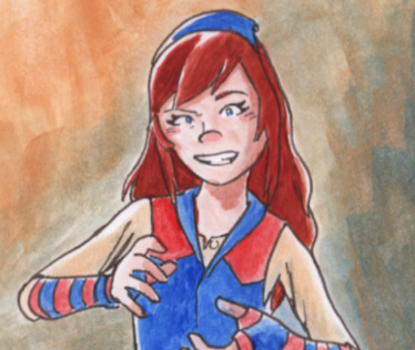
Your character designs are soo cute! Not only that, they feel realistic yet chic. They match how absolutely darling your style is, as well as complimenting their backgrounds! I definitely have some advice that could help bring it to the next level!
(Tapas doesn’t allow me to post tons of images in comments so I have to put all these together, sorry.)
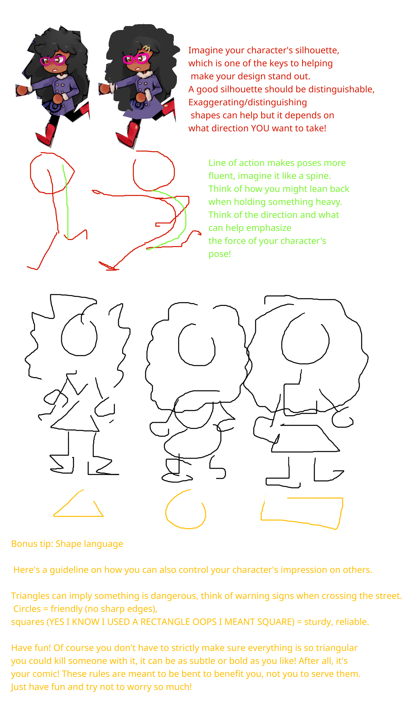
SO for the first segment, see how I also added more gold around the design? Like her hair pin and the button on her boots? It helps balance out your colors thus giving you a more balanced character design! I also exaggerated her hair, boots and the fur trim to make it bolder, as well as her coat.
Another thing I did was saturate and brighten the glasses to contrast her deep red and less saturated blush, which brings attention to her eyes! Color contrast can make it POP! Whether it be lighter against darker colors, warmer against cooler, etc. It makes for a great focal point! But be careful where you use them because too much contrast can muddle it. (It's like... pepper. If you put too much, it'll overshadow the other flavors.)
(For example, how you might see the caps POP before reading the rest of the paragraph. Focal points pull your eyes to a certain place and can be weaponized well.)
You can also add stuff like hair bows and whatever to help with a distinguished silhouette, but in the end of the day, it all depends on you!
The way you round out the corners of the panels though is amazing, it may be small but it’s like sprinkles on a cupcake, it really helps get the cutesy aesthetic across!
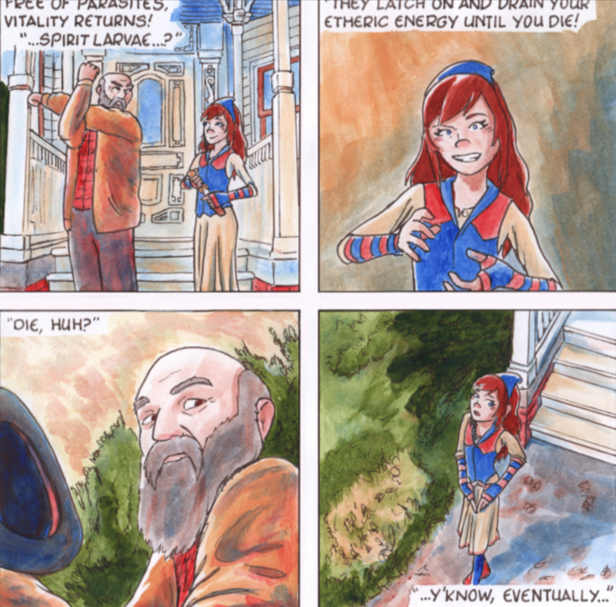
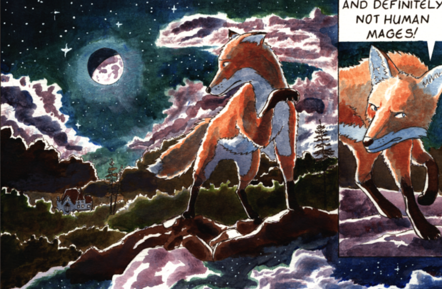
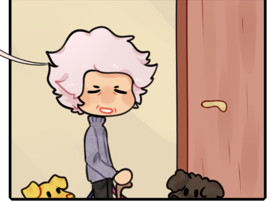
I absolutely adore your comic plot-wise. Your characters are full of personality and you waste no time on unnecessary exposition and keep things moving! It’s easy to follow, you should be proud of yourself! Give you a pat on the back! I love Renee’s shy yet quirky vibe! (Also the dogs are ADORABLE! But so are the characters!!~~<3) Also you did great on all of them. Yes, the guy is only there for one chapter but you managed to make him--and all of them, memorable!
--Helped by how differently you make each character emote! Did I mention how distinguished they all are already? Renee and her mom look worlds apart yet they still look like mom and daughter. I can't compliment you enough on how you manged to make them all believable in the same world, fit the same aesthetic yet look so different.
The last nitpick I have for the art is that the line-art should be consistently colored. It doesn’t have to all be black or blue, some people color their lines darker or lighter shades of their base colors, but it’s still consistent. The line-art being mostly black and then having the doors be brown is a bit off-putting.
(EDIT: Ohh, I see what you did! You used different colors for the insides of the characters, which is very clever! NICE! I'm leaving the last paragraph up just in case someone else might need it.)
Anyway the last thing I’ve got to say is that your description could use a lot of work. Short descriptions are best, but I heavily suggest you make it distinguishable from literally everything else out there.
Your description: “A hardworking young woman has a chance encounter, she'd never forget.”
My suggestion: “Hardworking Renee has a chance encounter she can’t forget. What happens when it comes back to haunt her?”
There’s not much of a difference, but the question begs for an answer and where’s the answer? In your comic  I also changed it to Renee since a name is stronger and more distinguished already than just a young woman, it already gives us someone we’re following. YES, your animated slider is SO CUTE and deserves all the love and praise in the world (Same with your gorgeous cover),
(Also 'to haunt her' implies a problem and sets the stakes!)
BUT, your description is like a bill-board. People need bait and yes, good art can serve well for that, but it can’t do all the work setting yourself apart from literally everything else out there. People, especially those heavily looking for plot, need bait to latch onto or they’re not gonna budge. If you’ve got any questions, feel free to ask! (That goes for everyone reading any of my comments even if they weren''t intended for you! I'd be happy to answer any questions you may have.)
You’re doing great! I say none of this to put you down as an author but to hopefully help you improve. Thanks for considering me! Remember to have fun over all else, it’s your work and nobody gets to dictate what you do with it besides you, no matter how intimidating it all is. Keep going!