Okay, wow that was a fast response.
PAUSE! Please let me review these comics, then I'll reopen submissions!
Okay, wow that was a fast response.
PAUSE! Please let me review these comics, then I'll reopen submissions!
Darn! Missed it by an hour! Can I still put mine here? Obviously you'll get to it when you get to it and when you complete everyone who came first. Thanks!
I would suggest DRAGOONS, but that's not really a thing yet apart from a few failed pilots, so how about my first attempt at serialized comics, Alpha Alpaca? At least when you have the time, anyways.... :bleep:
Well this is convenient, I was in the middle of reading Royal anyway and you're the first person on the thread.
I understand you're currently on hiatus (and I'm really sorry for the circumstances. My thoughts go out to you and your family), so it's a good time to take a break from the comic grind and spend a bit of time studying, planning and thinking about your comic, so you can come back with fresh eyes and some new tricks.
So the first thing to say about Royal overall is that a lot of what I'm going to bring up is stuff that you have clearly been taking steps to improve on since the comic started. You're on the right track with things, so a lot of the advice should feel expected.
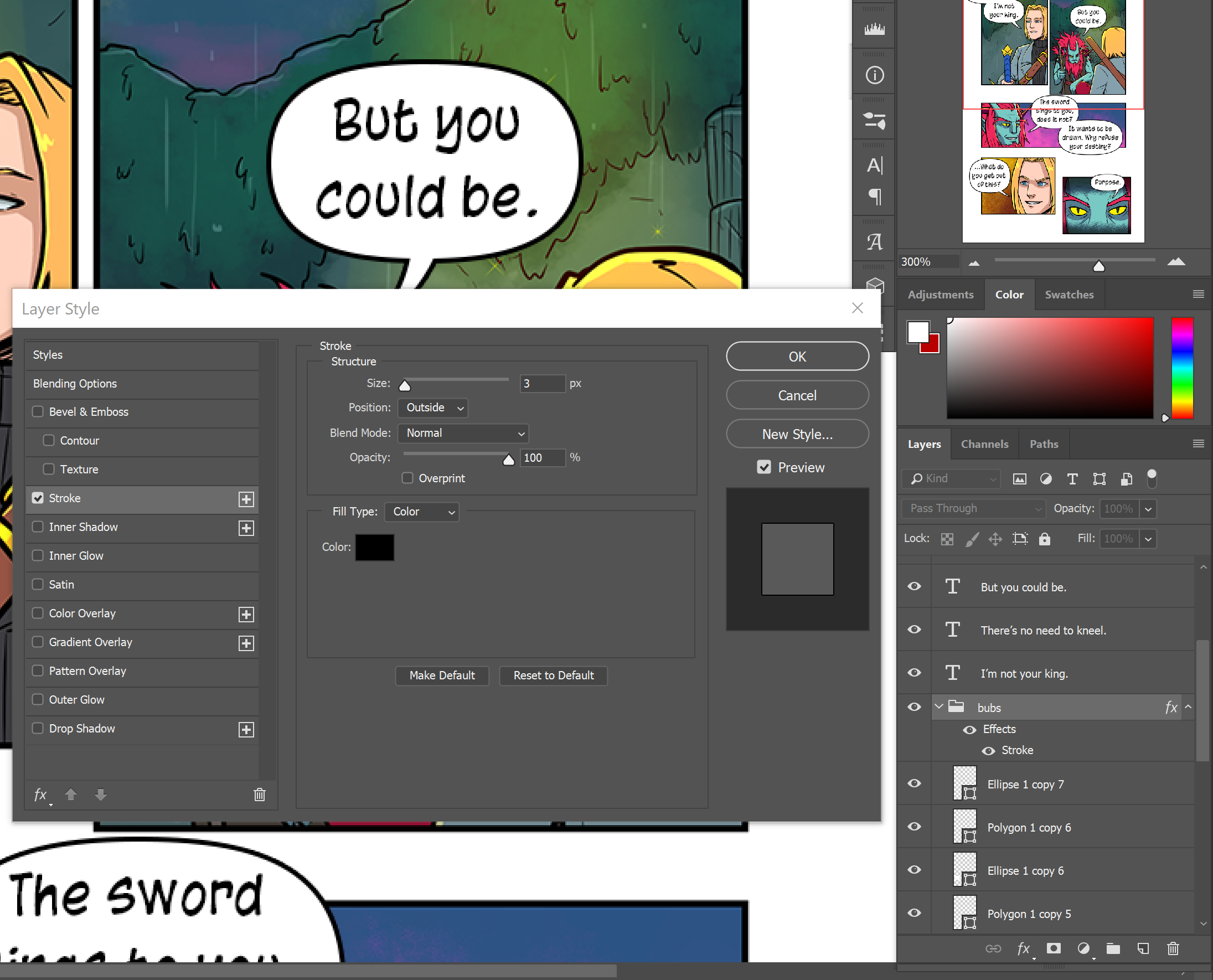
Starting out with an easy fix: Spelling. There are a lot of misspelled words in this comic, like "summoning", "volcano", "sandals" etc. If you're lettering in Photoshop, you can actually fix this incredibly easily. Go to edit > Check Spelling. Otherwise, maybe type out your dialogue into a google doc, then copy-paste to your bubbles. It's only a little extra effort for the big boost to how professional the comic will feel.
Some neater speech bubbles would also add some professional polish. Personally I like to use the shape tool in Photoshop to make nice flattened oval shapes and drop them, along with tails, into a shared layer folder with the folder's blending set to a stroke. It's flexible, quick and looks nice and neat.
Moving on to the Art...
One of the things that stood out to me, particularly early on during that period where the comic was in black and white, was that it was a bit of a struggle telling the characters apart and remembering who was who. The cast has a lot of slim pale skinned guys with medium-short hair dressed in a t-shirt or shirt and full-length slim fit trousers.
That doesn't necessarily have to be an insurmountable problem, since like... yeah that describes the cast of a lot of shoujo manga like Ouran High School Host Club. The art style has a nineties shoujo look that feels influenced by comics like Saiyuki and Gravitation, so looking closely at how mangaka you're influenced by differentiate characters could be a good place to start. Try to think about different physical builds, posture, face shapes. Even when the cast is all fairly young and trim, there can be a fair bit of variety in terms of bone structure, muscle mass and definition, where the muscles are, bodyfat amount and placement. This is a good example8.
Clothing fit and material also makes a big difference. You can get across a lot with how loose or tight a t-shirt is, and whether it's tucked in or not, and similarly with trousers, there's a distinct difference in silhouette and impression between dress pants, khakis, jeans, chinos, drainpipes, combats etc. Obviously your aim should be for all of them to still feel like they're in your style, but see what you can do about expanding the variety of the cast and how you show the differences between existing characters.
Throwing in some more female characters and variety to the skintones when new characters turn up would be a really straightforward way to make the cast feel a bit more varied visually, but I think right now there's a bit of a problem with having a lot of characters, so adding more may not be ideal until some existing plot threads are resolved, so concentrating on refining designs already in the comic might be best.
The other thing in terms of the art is... you probably knew this was coming and have been dreading it, it's backgrounds. I can see a distinct increase in the quality and detail of the backgrounds as the comic goes on, but a little more work would really help add a professional feel to the comic. Don't be afraid to use reference. For towns and cities, google streetview can be remarkably effective for this stuff. You can go to the kind of place you want to reference in google maps, plonk yourself on a street and BOOM: reference, get! When drawing indoor environments, look at photo reference or observe from life for details that really help sell your scenes, like skirting boards, light fixtures, door frames and door handles, shelves and what's on them, furniture and flooring materials. Adding a pinboard full of posters and notes to a school hallway and some scuff marks on the floor can add loads of character with relatively little effort.
On the scenes where there's just a panel with a character, consider using some light patterns, texture brushes or noise. Sometimes the soft gradients feel a bit empty and also a little early 00s looking.
Story thoughts:
At times, I felt like there wasn't a strong impression of the overarching narrative, or even who the main character is and what their arc is supposed to be. The comic is named Royal, but at times I really felt like Oliver was the real main character. He seems to get just as much, if not more screentime early on, he has more dedicated and threatening antagonists, romantic tension with hot vampire guy and the battles he's been in felt like they had higher stakes. This does seem to have improved later, with Royal getting a couple of strong action sequences and a mystery set up with this "Lane" person. I think trying to tie the plot threads together and setting up what Royal's main motivation is will help avoid the kind of problems that plagued "Bleach" where every time the mangaka got stuck for story, he introduced new characters to try to put off the problem of a protagonist with no particular motivation or overarching goal he could achieve.
There's a bit of an issue with scenes constantly being interrupted by other scenes that makes things feel disjointed and keeps killing tension buildup. If the scene you're cutting away to has nothing to do with the scene that was cut away from, it should be left til the end of the chapter like one of those Marvel after credits scenes. During an action scene, cut away only if what the other characters are doing is going to impact that battle, so something they're doing or saying explains or foreshadows information about the battle that ramps up the tension (ie. revealing something the character fighting doesn't know, like their opponent has a poisoned knife in their boot! Or their opponent is actually their dad! Or showing a sniper overlooking the battle from a rooftop as she raises her rifle and puts the hero in her crosshairs...).
I'd also advise trying to keep the number of characters in scenes, and just in storyarcs generally, smaller. For one thing, it's easier to draw when there are fewer people in a scene, but it's also easier to follow on the reader's side. If a narrative role can be fulfilled by a character who already exists, and even better, who is already in the scene, so long as it's reasonable for them to be there and they could reasonably have the knowledge and skills to say or do something, have them say or do it. Sometimes a new character turns up and it bogs the plot right down with things that other characters could probably have done. ie. The principal introduces herself over the phone just to tell Royal about the challenge, then she's never seen again. We've met a bunch of other characters, including teachers who probably could have done this and saved time spent introducing somebody.
Overall, it's a comic that's clearly been improving over time, especially in terms of visual storytelling. Hopefully these pointers help give you some direction for continued improvement.
Oh, how exciting! uwu Here's my comic if you have time. It's kinda new, but there's nothing too explicit or violent in the content.
EDIT: im sorry, i completely missed the post where you said there was a pause ToT
Perhaps you should edit the title to let people know this is closed for now? I did that with my drawing request threads
All right, here we go with Mercy: Freedom.
Art thoughts:
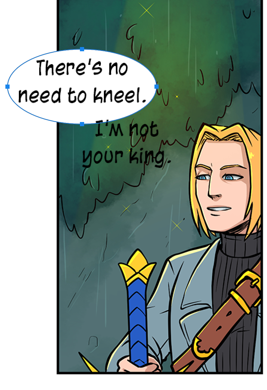
The speech bubbles use the default digital art program oval tool shape, which is a pretty common amateur comics mistake that tends to look unpolished. If you can use shape tools or similar to make the oval more inflated, less pinched looking, they'll look better.
I'm not a massive fan of the 3D modelled look of the comic. It's not terrible, but it does tend to feel quite stiff and cold. There are a lot of panels of characters staring straight on at the camera with a sort of... serene, neutral expression. This does improve later on with more drawing being done over the faces, and it really helps. More of that, and anything you can do to try to make those poses feel less stiff would also make a big difference. Rotating the figures to be stood more diagonally to the "camera" rather than always straight on or in profile is a good way to add a bit of dynamism and depth to a scene.
There's a lot of narration used in this comic, and at times I sort of feel like this is really more like a novel with pictures than "sequential art". There hasn't been a lot of panel-to-panel visual storytelling to get across actions or transitions. Panels are often copied and pasted, and the narration carries a lot more of the storytelling and emotional weight than the visuals. Combined with the fact that so much of the visuals are done using 3D models and premade brushes rather than drawing, which makes the art look very bare bones and low-effort, at times it came across as though the art was an afterthought, done without much passion and perhaps that this was made into a comic because comics tend to get bigger audiences than novels, but really you actually wanted to write a novel.
Maybe that's not the case, and you're passionate about comics, but feel like you don't have the skills to draw from scratch, but overall, I think your aim should be trying to inject as much life as you can into the comic to balance for how stiff and robotic 3D models can be. Adding a bit of warmth to the skin shadows, drawing in some lines where the 3D model renders have missed them, drawing over faces more and also putting in some research into how folds on clothes should look so that the clothing sits more naturally on the characters and the soft furnishings like curtains that you draw in by hand look more believable would all boost the overall quality of the comic.
Story thoughts:
I just read this comic for about an hour to get through the archive and finally now something surprising has happened in that a character grew wings, but there's still been no central conflict established. I've never felt like Mercy was in danger of having her power revealed, or got a sense for what the stakes could be if it was. The people around her all seem so nice, why should the reader feel worried for her? There's no antagonist, all the characters are falling over themselves to make it clear the captain just seems scary and he's actually awesome, everyone else is super nice and supportive, and the main character has no clear motivation or large obstacle to overcome. These are things that I'd definitely prioritise fixing.
There's a lot of telling rather than showing going on, and the plot moves both very quickly and very slowly, more like a novel than a comic, with a lot of time devoted to explaining Mercy's new life and her learning to speak and write and meeting people, but a huge amount of the development is described, rather than shown. An example is that Mercy keeps telling us the captain is intimidating and she's scared of him, rather than being shown an example of him looking scary or doing something she misunderstands as looking threatening, causing her to cower, hide or run from him. Similar examples would be her getting to know the squad. Mercy's power is actually a bit of a pain for a comic because she has the power to just know things about people and tell the audience, so there's very little on-panel character development and a lot of Mercy telling us facts about them that could have been nice facts to learn organically from seeing those characters interact.
Overall, it's not a bad comic, the prose quality is very solid, the characters have consistent voices and it's consistent and competent. It just needs a bit of... spice in terms of the visuals and story to liven it up a bit.
You're absolutely right, I'm a writer first, and wanted to try my hand at comics because I went to school for art, and got really interested in the idea of making one. I'm still clearly learning, you've absolutely picked up on that! Thanks for the critique!
sp the first thing, i know my spelling is terrible XD but the speech bubbles thing bugged me... til i saw what you meant on the mercy review, now THAT looks ok cause i cant stand the look of the bubble tool XD
i do own a few volumes of these series but i never have gotten around to read them yet which is kinda funny. the Mangaka i could say is a huge influence, and i didnt notice til like recently was Rumiko Takahashi
I was confused by this til i realised you have been refering to Junior as Royal. in the context of the title connecting with the characters, Jr and Olie are both the main character even tho later on, Olie does take a bit of a back seat
i do have a wide variety of characters being introduced since it is a school full of strange students, as for Ms. North herself. since the introduction of the cryo-guy, imma call him for now, her role is going to be bigger since that guy is more so her problem in the long run
i had done it a couple times since my comic takes place in the same city i live in or lived in. because of mom dying, i had to move in with my dad, there is a bit of an upside to this. because my dad is able bodied, i can get more practice driving which in turn will help with references since i can just go and take some shots with my phone. I have recently did that with a crossover project im doing with a couple of friends
other than these, the rest are things i definitely have to work on 
Okay here we go, here we go go go! It's Five!
I uh... actually don't have anything negative to say about the story on this one. It's actually a solid setup for a manga-style story, it's pretty well-paced and the writing quality is very solid so far. The protagonist is likeable with a distinct personality and the supporting cast feel fleshed out using extremely efficient visual storytelling.
Art stuff
This comic is pretty close to a pro standard by the time it's out of the prologue. The colour palette is pleasant, well thought out and consistent, the style is distinctive, with a bit of flavour that evokes Hiromu Arakawa and Kiyohiko Azuma (oh no, two of my faves... must try to remain unbiased...) while still feeling like its own thing and the visual storytelling is very strong. Big props on pulling off pages with no dialogue, that's some confident comicking right there. So we have a strong base to start from here, and a comic that just needs a bit of a push here and there.
Sometimes it feels like the figures are all quite similarly chunky. Like there's a 6 year timeskip, but I didn't feel like there was a difference in the appearance of the main character during that time to give me a sense of them presumably aging from a small child to a teen (particularly throws me off because they dressed more like a teen in the bit before the timeskip with like... cool boots and stuff, but then after the timeskip they wear dungarees and a cute backpack like a small child), and everyone in the cast has the same sort of build. That's something to work on a bit, as well as trying to be a bit more consistent and clear with the height differences between characters.
Rough speech bubbles in places could do with tidying up particularly because they don't always match the clean lines of the art, which also tends to have thicker lines than the delicate bubbles, and I think the font is a little flowery for the art. It's a very cute font, but it looks like it belongs in like... an inky indie slice of life comic or a graphic novel adaptation of Pride and Prejudice. Something a little more suited to an adventure manga with shounen looking art I think would fit well. It doesn't have to be too macho, just a little less curly maybe?
Panel gutters are inconsistent in width while being in a single page rather than long-scroll format and it feels a bit thrown together because of it. They're better later than in the pre-timeskip part, where some of the gaps between panels are very big, but there's still inconsistency there and some panel gaps that feel too big creating a slow move between panels where you actually want a snappy transition, and sometimes it feels as though you're prioritising making the panel layouts interesting over having them do their job effectively. Sometimes a simple layout done well that lets the storytelling and art shine is best.
Sometimes there's a little bit of skimping on the environments and leaving things flat or empty that with just a little push would add a bit more professionalism to the finished product. For example, if where pavement- er, sorry, sidewalk (defaulted to British english there haha) wasn't flat and at the same level of the road with a sort of roughly hatched few squares, but had a nice raised kerb and the flagstones were offset, and if the corners were curved, like on a real kerb, it'd just add that extra polish that comes with evoking real things and add depth to the environment.
Overall, this is very strong and it's on its way. You got this.
Just jumped on this... Your right. Love it @AbelDraws
Despite this, would you be willing to crit a single page? I'm inundated with studying so I'm not actively making comics, and there's an old short I'd love to re-make (and finish) when I have time again. I'm not going to cry about not being popular because it's not even up anywhere lmao. I just wanted an opinion on the panelling, because I felt like the actions were 'jumpy' in hindsight. I guess looking for confirmation and/ or anything else I might not have noticed on it.
First of all, thanks a lot for the critique. Being compared to Hiromy Arakawa is like, the biggest compliment I could have ever gotten (FMA is and will forever be my favourite manga, after all x'D).
You made a lot of very good points, let me adress them one by one.
I couldn't agree with this more. Depicting the characters' ages will be the end of me, seriously x'D (and heights. It gives me so many headaches having them be somewhat consistent askfjlsaf I'm really not used at all to drawing multiple characters at once so it's been a ride).
I realised Arckan didn't change enough when a reader asked if he was still 9 by that point. I knew he hadn't changed a lot, but the reader's and your comment now make it evident the change was not enough. There'll be more time skips, just smaller ones, I'll pay more attention to Arckan's appeareance in the next ones <3 (he hasn't gotten his growth spurt yet, so hopefully the next change will be way more evident :D).
I didn't think of this at all, but I should have taken more care with his clothes indeed. Thanks for pointing that out <3 I decided to go with those clothes for the second chapter because he is still quite childish for his age, but I do should have taken more care of the first chapter clothes.
Very fair x'D I try to make them look good, but it's true I should take more care with having them be consistent with the lineart (and also a bit better in general).
I read a thread about fonts here not so long ago and it got me thinking about the one I use as well. I really should look into a different one x'D I'll try to rework the pages with the old font by the time I find one more suitable for the story <3 thanks!
They are indeed. In the latest pages I'm trying to be more careful with that, but I really should read some tutorials about how to approach that aspect of comicking properly, I think I lack some basic knowlege in that aspect c':
Another very fair point. I'm still trying to figure out a good balance between having the pages look interesting (I just love playing around with the layouts asjklsag that's to blame in that aspect) and having the scene flow correctly. From chapter 3 on (I have chapter 2 already sketched out) I'll try giving the second aspect a bit more priority, at least for now, while I learn.
Yes to this entire paragraph. There's so many things to take into account when making comic pages I usually skip adding details like that, but it's very important and it'd really really add a lot to the scenes. I'll try incorporating them as much as I can <3
I think I got it all. Let me thank you again for the critique, you pointed out a lot of things that I'm sure I'll be able to incorporate (well, height differences will still give me hell, but I'll try my best x'D) and that'll make the comic look a lot nicer <3
It sounds like I could make an exception in this case because you're asking for specific crit on panelling rather than an overview of various ways to optimise a comic for popularity. Also a single page of a short is probably going to have more stuff going on than a single page of a long-form comic. If it's a single page, you can even just post it in the thread rather than remotely linking.
But obviously, please wait until submissions are open again.
I haven't heard about this comic bubble shape thing until today! *sweats and looks back at my 100-page comic covered with oval bubbles * So uh, just curious, are you using a rounded-corner square selection tool, or do you just copy paste that bubble shape into photoshop? Just wondering the best way to make that squared oval shape in Photoshop with the least amount of steps.
All right. Next on the list is... Burning Shadows.
Honestly I have actually tried to read this one before in the past. It wasn't bad, but I did lose interest at page 14 when I first tried to read it. It's a shame because actually the comic does improve throughout, particularly when it hits chapter 4 when suddenly there's this huge leap in quality.
Let's talk design...
So I had a lot of notes on the design in this comic as I read through, only to find that a lot of them, you actually have resolved or massively improved on all on your own by the time of chapter 4 or so. You've put in the effort and I appreciate that.
I immediately realised while writing this review that the page where I stopped reading when I first tried to read this comic was pretty much the point where the text went handwritten:
The speech bubbles improve hugely later in the comic, starting out pretty terrible, but by chapter 4 they're pretty pro looking, and really just refining the shape just a little would be the final push they need. I'll discuss speech bubbles in a dedicated post on the thread because this topic is coming up so much. The ones in chapter 4 aren't bad though. They're passable and I've seen comparable bubbles make it into print comics.
The panelling improves a lot later on. It was something I was going to talk about at length based on early pages, but pretty much everything I was going to say about like... not enough panels per page for visual storytelling, messy panels, weird layouts... you've already fixed! Chapter 4 suddenly there are these lovely neat layouts with clean, consistent guttering.  Looks great! good job!
Art:
The art is overall pretty good! Especially in chapter 4 when everything really tightens up nicely and the characters get better integrated into scenes. Colour palette is solid, style is consistent.... yeah it all works. If I could advise one thing, it would be to vary the shot distance a bit. There are a lot of mid-distance shots, and a little more use of more close-ups and wider establishing shots wouldn't go amiss. The composition is a lot better later than early on, like I was going to comment on how the camera has a tendency to frame one character at a time rather than showing where characters are in relation to each other in a scene, but like a bunch of other things, that seems to suddenly have been fixed in chapter 4, when the framing of scenes and the angles are used really effectively to tell the story.
(What even happened between chapters 3 and 4, did you like... eat a copy of Making Comics by Scott McCloud and absorb all its wisdom? The jump in quality of visual storytelling and comic design is frankly one of the most impressive I've ever seen)
Storytelling and Writing:
There are some pretty glaring grammar issues early on, but it's an aspect that seems to have improved, so good work there! The dialogue later feels more natural and fluent, after feeling a bit stilted at the start
The storytelling is one of the core issues with the comic, and the main reason is this: Flare is doing things, and the things are interesting, BUT so far none of the things seem to have any sort of lasting effect that changes her circumstances or get me invested in how she's going to solve the problem. There's also a lack of a sense of any ticking clock, looming danger or important thing Flare needs to do, or a strong desire or need on Flare's part to change her circumstances due to some big dissatisfaction with her life. Sure, she wants to find the mysterious man, but really it's because she's curious, not because she or the audience knows anything bad will happen if she doesn't. This means there are effectively no stakes. Conflicts all resolve themselves extremely quickly and easily in a way that makes it hard to feel worried or intrigued.
A really good example is when Flare arrives in town after being trapped by Shade after a fight she started. Her friend, who we, the audience, have never met before and have no emotional attachment to, tells us she was gone for a week and he's upset! She's shocked and angry that she's been gone for a whole week but... well... there are no consequences. She doesn't have a job to lose, she's missed no important events, nobody's been running around posing as her during that week and her other friends don't seem worried. Then she's all determined to find Shade and she just... gets told where he is, like immediately by the kid she's already talking to, and he's actually there. She finds him basically immediately without any hitches. It's way too convenient.
Similarly you get a sequence that goes like: Angry townsperson comes to tell Flare the pub she was in several hours ago is on fire and the townsfolk suspect her! She needs to get rid of the fire! Flare's friends immediately intimidate the guy out of even trying to hurt Flare, and Flare, sighs and goes to help. She arrives and... the townsfolk all seem pretty respectful, honestly. Nobody shouts at her, the guy she meets doesn't seem angry or suspicious towards her and she goes in, gets rid of the fire, nobody except Shade, who clearly doesn't understand that she's apparently immune to fire, seems worried to the point that he stops worrying seeing how calm they all are. Then Flare stops the fire and wanders out without a scratch on her just looking a bit tired and shaky (but she still has enough energy to fly off immediately). The overall impression is that the guy who came looking for her is just a jerk, the rest of the town respect her and that there wasn't really much of a threat to Flare; the problem was easy for her to solve.
There are a lot of things like this throughout the comic, where an obstacle is set up, but it's resolved almost immediately without complications or lasting effects that make Flare's life more difficult. As painful as this can be for any writer, and
I totally empathise here because this was a huge problem with my comics in the past: You need to make your protagonist's life difficult. I know that's hard when you really like your protagonist and want the best for them, and especially if there's an element of power fantasy to the protagonist that makes you feel empowered writing them bulldozing their problems in a way you wish you could, but it's necessary for them to struggle and get knocked down now and then to give their victories impact. They need to face a problem that with the current skills, emotional understanding, knowledge and equipment they have, they cannot overcome, and they need to go through some kind of challenge or quest that changes them, maybe causes them to lose something they care about along the way, and then to succeed only after this gruelling ordeal.
So my closing comment is really that the improvement in the visual storytelling in this comic is amazing and I'm super-impressed by your dedication to getting better. The next area for improvement is storytelling. I'd personally advise picking up a copy of "Save the Cat!" by Blake Snyder. It's a book on screenwriting, but it's just generally useful for learning about the mechanics of how to tell stories, and since comics are paced similarly to films, there's a lot of applicable advice in there. Keep up the good work!
Okay here we go, welcome to:
HOW TO MAKE SPEECH BUBBLES!
This one is er... assuming we're using Photoshop, hopefully some of this is applicable to other programs, but you might need to do some googling. I think Clip Studio actually has a built in function, I've never tried it because in the past "Manga Studio" as us old timers used to call it, was really bad at making bubbles that weren't the really tall kind better suited to vertical languages like Japanese.
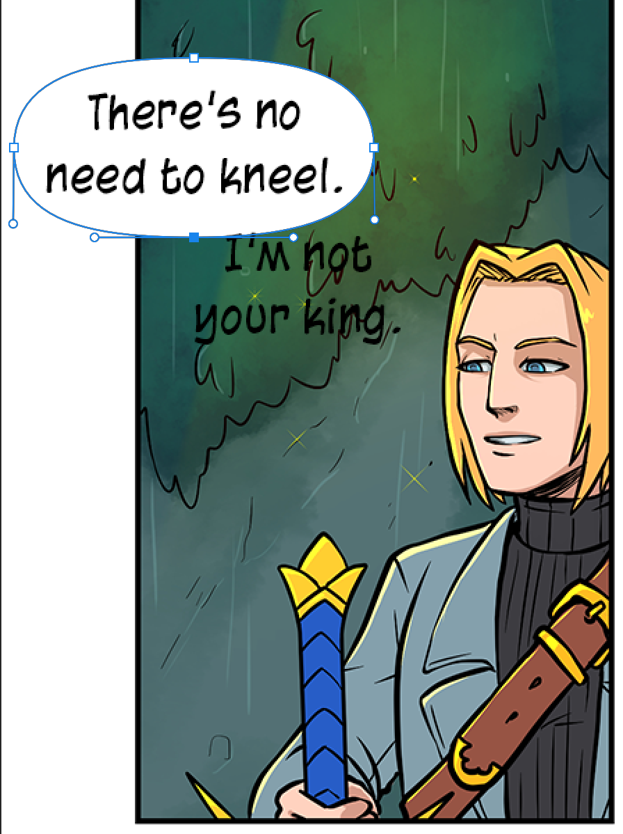
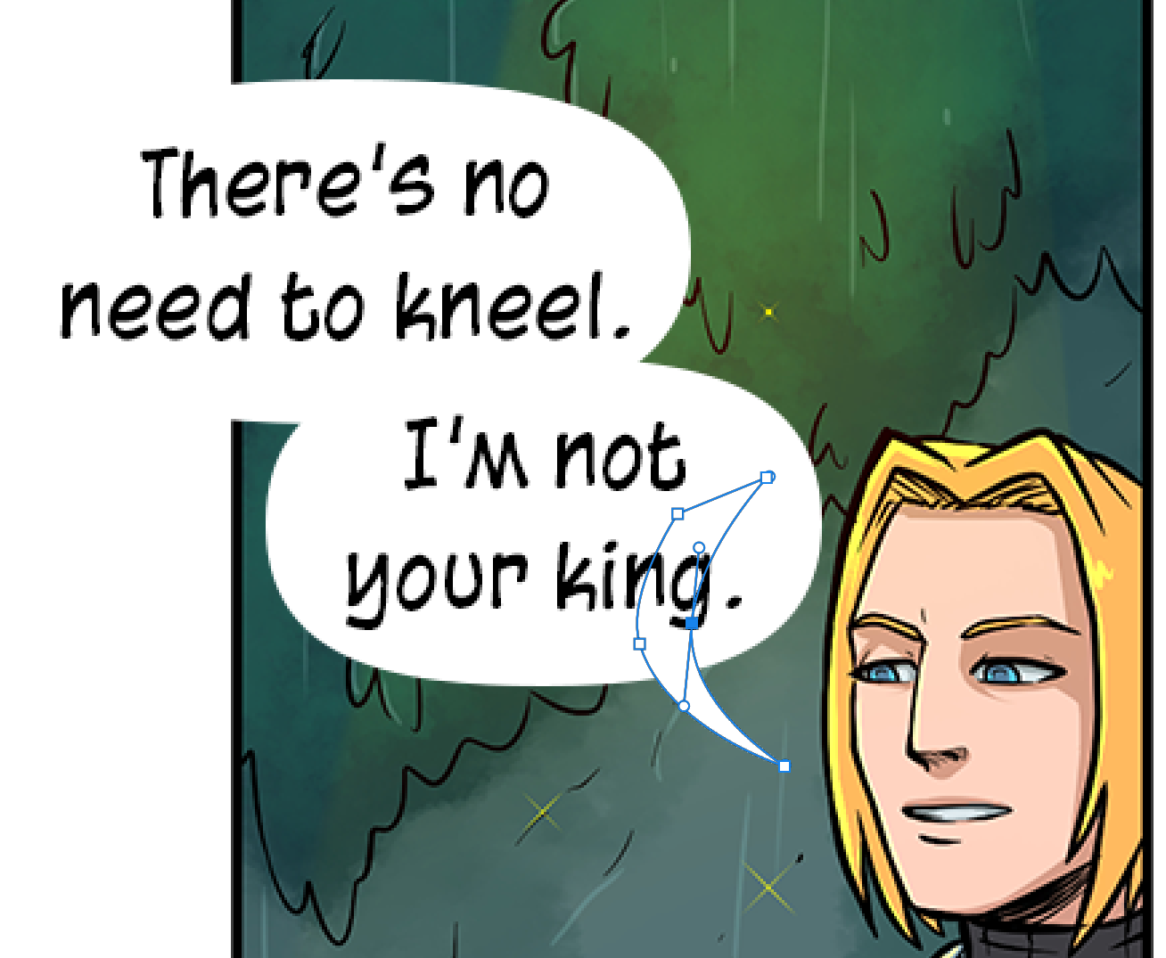
So, you're in Photoshop and you have the oval tool selected. Your first job should be making sure the oval tool is on SHAPE mode, so you can play with it:
So now we have a bunch of nice inflated ovals and tails, we want a nice stroke around all of them, but not the individual shapes... Soooo... sneaky tip! We make a "new layer folder" and we put aaaaaalll the ellipses and tails on in there (the layer order in the folder doesn't matter).
Congratulations, provided you don't put speech bubbles over faces, you are now better at speechbubbles than... whoever did the official Twilight Graphic Novel.
(Oh my god, this is just.... aaaaaaaaaaagh)