
I have a few 


I used to hate to draw backgrounds, because euuurghhh perspective, but when I started Grassblades, drawing proper environments was one of the challenges I set myself - and I really think it's helped me improve. Used to be when I drew a house, it was literally just a box with some holes in it for a door and windows, and a generic roof - there was no sense of personality to them whatsoever. It was like that house kids draw in preschool, only I knew what perspective and 3dimensional shapes were.
Now, when I draw a house, I feel like I know how to make it look like something specific and personal, rather than Generic House A and Generic House B.
This goes for all environments! I feel more confident drawing forests and rivers and grassy plains, etc., - than I did a year ago!
Examples: 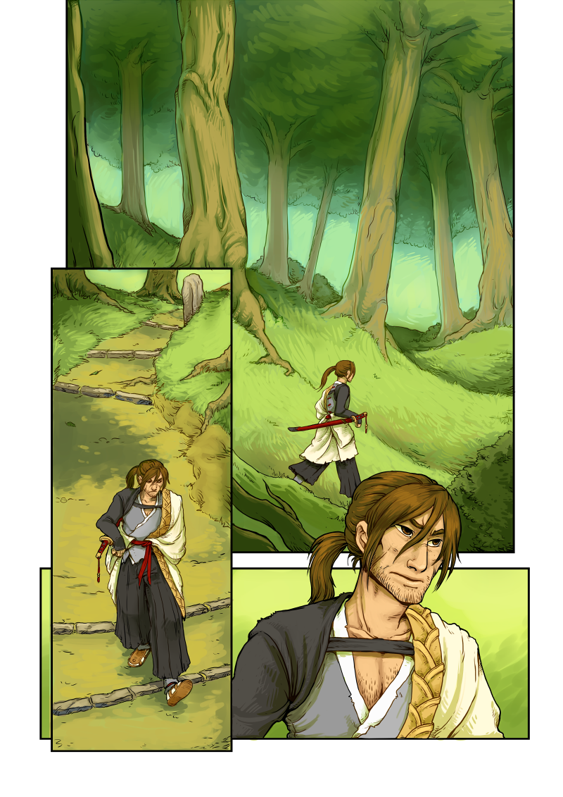
.
.
.
.
.
I don't really hate drawing backgrounds... sometimes I tend to overdo them.XD
For my comic U-speed, it's the race tracks, school buildings, city, etc.


Hmm. In my imagination (remember, not on the paper ) lol is "japan 50-s" mixed with European villages and surreal fairy +current days stuff/ But not always it possible to show on the paper. For someone who drawing on the paper, nice solution -screen tones, it really helpful. On pc I guess It more easy to make.
I'm not really ever suffer to carry with backs, (coz I like minimalism in art), only problem sometimes is to draw them identical to each other and remember decorations and lil details on the back.


Did someone say scenery? I hope you're ready for lots of images because I really love drawing scenery and I draw it at every reasonable opportunity. And probably at unreasonable ones too. It's my favourite thing to draw, even more than my characters. Here's a selection (and this really is just a selection - I wanted to post even more), from oldest to newest. They are all from Lemongrass.


here's town logene of THE LAST SAMURAI

When I first started Stormspectrum I dreaded having to do scenery, since it was not my best skill. But over time I got to enjoy it. 


Everyone, these scenes! Utterly stellar stuff, it's amazing to see how the meat of the story gets a killer glaze with your background elements. There's a lot to love in non-figural work and it's very obvious when an artist loves their characters so much they give equal attention to their worlds.
There's No Such Thing as Jason -- I.T. takes place in the bland, non-confrontational suburbs and at Jason's rather formal, private university so there's a lot of very stiff, "acceptable" structures. Most of the emphasis I place on the backgrounds is all to further establish mood, a teeter-totter of presentable society versus the very rough edges of each individuals' psyches. I try to integrate these ideas as I work but I'm also learning about composition and basic technical design, too, haha!


The watercolour splashes I make and use for the pages are an attempt at one of many things, the most basic being an imitation of TNSTAJ's original watercolour look after some heavy editing of ink and colour pencil illustrations! It's the raw, "nervous" feel I love, love, love, hah!
Here are some of the scenery in my comic Lemonade3. :3


Man, your pages are so tight as they are! I really dig how clean and crisp everything is, looks amazing! I think you could totally work in some simple watercolour splash layers (set to overlay/soft light/hard light/etc.) over the backgrounds and adjust opacity to a delicate little touch. It might look really nice! Is that your plan or would you want to paint the backgrounds with a textured brush? Either way, you could experiment and get that look down, your colours are already fabulous.
Backgrounds take time to do, but honestly, I hate drawing crowds more arrggghh!!
Here are some from Malleus Maleficarum1. Wish I can show more of the "actual setting", but I only have one page published so far :'D
And majority of volume one takes place in London:


Random ones from Two Faced


Here are some of the ridiculous backgrounds from Radio Silence!


Here are random ones from "Crystal Casualty!"

My backgrounds probably aren't the fanciest but I always try to include some interesting details/quirks that show off the world, even if it's just a dumb sign or two. Anyway, here's a couple of background-heavy pages of Drugs & Wires1 I'm quite happy with:


Seeing as my comic Glamour2 is set in a small rural town, most of the scenery is just ominous forests and dreamscapes so far but I do love taking a generally simple bg and using it to really impact the tone of the page. I really need to work on my indoor environments but that's a hurtle I'll deal with when it comes lol


