My comic Those Called Wolf is only in its 3rd month of being active. However, since starting my comic, I have seen an improvement in most of everything from paneling, writing, and color.
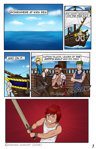
Here is one of the first few pages of my comic (Posted Sep. 21). While I think it looks okay, I feel that the skin color is bland, the paneling could be better, and the writing is cringy and too predictable. Most of all, the woman in this page looks too "stiff" - her pose doesn't give her much life.
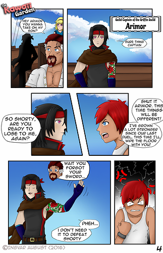
This page is from Nov. 11th. I really liked the paneling in this page. At some point in working with my comic, I realized that I could use diagonal lines for panels too, and I think this page flowed more because of that addition. The skin color has more red in it, which makes the people not look so dead, and the poses at the bottom half of the page really makes these two look more lively.
Come take a look and let me know what you think! I would love to hear from you guys