26 / 164
Mar 2020

It hasn't been rolled out yet :slight_smile:

Oh but I'd like to remind people that even tho we are getting shiny larger icons, to make sure their title is at least 1/3 of the space so people on mobile can easily read your title logo.

Clarity is everything so make sure it can be read even zoomed out a bunch.

this is a good point, i'm seeing a lot of covers with REALLY small fonts! when i made mine, i took a peek at current premium covers on my phone and how big their titles are. they need to be readable when VERY small!

Tricky, when your letters are little leadcubes in a printshop 2080 km away. Can I turn the title 90 right or should I rearrange the letters top down?

I have an idea for a cover but I won't start making it until I can see where I can upload it.

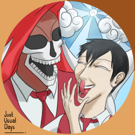
I'm not sure I follow. Seeing your initial post with the cover page, at a thumbnail size, no one will be able to read the title. It's ok to overlay the title over the bottom part of the art (perhaps with a bold stroke around the edges in a different color for better visibility) so that the title fits the entire width of the Page.

It's harder to read when words are written vertically cause English is left to right.

Essentially you want a reader to, at a glance, see your story's Title and a glimpse into its tone by the cover art.

Finally made a chapter cover for my first chapter.


Luckily I already have full-sized covers for my novels because I also post 'em on Wattpad. But here's the one I made for my comic! Coloring is hard…

Force Six season IV is under production.
Going quite well - I might add.
3

Me too, me too!
I made this cover to start the 2nd part of my comic, Snippets. But right now life's getting busy so I don't have time to make any new chapters yet.

How do you show the cover image for your comic? When I go to the dashboard I don't see any options to do that.