4 / 21
Sep 2023

Edit: clarity

Hello forum
I've been trying to get back into things after an unplanned hiatus. I wanted to experiment with some simple backgrounds just to break out of my usual and maybe save some time--
Except they're not really that simple?

By simple I mean backgrounds that work in multiple settings or no setting at all. I've specifically been interest in backgrounds with mostly one color after seeing how well they were utilized in LMLY.

There's less to work with so there's more to think about IMO. Something about this is harder than just drawing the literal setting to me.

My reading list has only one comic that really does this well, so I'm coming here for more inspiration.

Artists who practice simplicity, what is your thought process? What do you like to do to break away from reality in your panels? Do you have any scenes without physical locations? I would love to see them.

  • created

    Sep '23
  • last reply

    Sep '23
  • 20

    replies

  • 1.8k

    views

  • 1

    user

  • 50

    likes

  • 6

    links

I only use backgrounds as establishing shots. Most of the time I use color to show different emotions.

Oh yeah! I see the emotional colors sometimes.

I should look more into that. There's probably some general color to emotion conversion. I just know yellow is happy.

My advice is, make your life easy, trace backgrounds, change them around to fit into the compostion

The background / no background question depends on which kind of comic you are creating.
All comics I grew up with have backgrounds in every panel. I later found comics with backgrounds
in most panels + 1 or 2 panels without background. Tintin has 15 panels per page with background
in every panel.

And that´s pretty much how I do it too now. I have one panel without panel borders per page
and no background. I usually draw one establishing shot with more details.

The good thing about establishing shots is that you can draw other panels really simple.
I make 3d models of every room to make my life easier. I have apps where I can place characters
in the scene and play around with camera angles. I always end up breaking the perspective
and make objects bigger or smaller to place them better in the scene, nobody cares if the
perspective is not correct when the composition is good.

Some comic and cartoon artists put super simple backgrounds and that can be very effective.
I always like to refer to Charles Schultz / Charlie Brown. The reader never has a doubt where the
scene takes place and it´s usually just some scribbly lines

I tend to have a rule of "at least one panel with some background in per page", but beyond that, I tend to use colours and patterns. I generally start a scene with a detailed establishing shot, and then subsequent panels with backgrounds in that environment are simpler and more pulled-in. I also sometimes copy-paste backgrounds if I can get away with it.

Colour symbolism in backgrounds in Errant is largely based around the characters. Each character has an associated colour; it's not subtle at all because these characters are literally colour-coded, but people often go "OH!" when it's pointed out, because they don't necessarily think to assume backgrounds might be coloured deliberately to show who is dominating a scene, who somebody is thinking about when they speak etc. It works for Errant because the colour associated with each character is something that can symbolise a bunch of things that are associated with that person. Some are really obvious, like Rekki is associated with red and orange and she's energetic, violent, bold, hot-headed and self-destructive. Some are less obvious, like Urien is an antagonist, but he's associated with yellow, which can be warmth, but in Urien's case, it's yellow as gold; ambition, power, royalty, greed; an overpowering, sickly, decadent colour.

There's a good rundown of colour associations here:

@Lensing
That's true. The type of comic can change the type of bg even in the confines of simple.

For me I planned a flashback scene that doesn't have an established setting to force myself to think more abstract. I guess I'm not as creative as I thought lol

I also love the advice on perspective. I felt so freed when I realized perspective can be loose. It was a video about theme park decoration of all things to show me that. Even IRL perspective can be so loose!

@darthmongoose
Thank you for the link! It's very thorough! I will bookmark it!

The color coding is great! I tried a bit of that but then kinda hit a wall when I realized two characters' colors were too similar. Definitely a lesson in preplanning character designs.

well in my case, I use the simple background to stablish the ligh and/or main colors of the scenario


for example my character is about to get hit by a purple lightning so the background is white (with purple tone), pink,purple, and then goes to dark purple or blue because is actually night.

now the trick! I actually duplicate the background twice! one to make the overlay, to help mix the colors with it, depending of the intensity of the light, the opacity will be lower or higher (since here the light is very bright, the opacity is high), then, the second layer on Add and the same opacity as the previous layes, has a mask, which I use for the lights, I use the mask because is easier to mix with the overlay layer.

The amount of work you put into a background is down entirely to your artistic pride. The webtoon audience never stops scrolling long enough to appreciate that sort of work. They got a lot of padding and single word balloons on a black background to get through.

Pragmatic advice on the whole topic: Just do enough to get the location clear. Stick your isekaied princess in front of a couple of Roman columns and Versailles windows and everyone will accept that she's in a palace. If you're feeling ambitious have her sit in a Louis XVI chair.

Practical advice if you do attempt background work: Keep your camera / p.o.v. at or near eye-level. We all experience the world in this manner so it's easy to fudge perspective to get it to look right even if it isn't. A good example is the Peanuts cartoon @Lensing shared up above.

@llobucervallince
Nice! Gradients are classic.
Having the character take up a lot of the panel is just a smart decision. It's too late for me to change the composition, but this is good to keep in mind.

@thepenmonster
To clarify, I love backgrounds and they are my second fav part of the process.
But I want to experiment more with intentionally simplifying and also some abstract stuff.

I will edit the main post, but I guess this more of a thread about what bgs to do when there is no bg.

I used to draw very simply but also my old comic had no borders so I had to change the colors of walls all the time.

I made a bunch of backgrounds I can reuse made with watercolor. This gives a nice texture and is more interesting to look at than just one color. As someone previously stated, I also use some establishing shots but then use thise simple bgs to save time. Personally, I love doing nice and complex bgs, but I also had to find a middle ground between this and actually getting pages done :,)

Here I used a somewhat complex reusable bg so it feels like they are in a city. I reused the same ones in following pages.

This one is even more simple and I edited the color into something that fits here.

Edits (sorry I can't english today :sweat_02:)

Oh I can be "lazy" aswell xD

I wouldn't call that lazy but "effizient" :smiley:
Do you want to show a crowd? - yes. Does it look like a crowd? -yes

So no worries ^^

Color and basic shape panels can be used to ease the background burden and can be used in different ways depending on the situation. You can also save and build a library of assets to help you fill in those empty spots.

All my backgrounds are physical watercolor paintings or acrylic paints/pastels and is incredibly time consuming, so having a built asset library I can take for a scene makes my life easier.

I generally the first and/or last panels of a page to establish the scene's location, but everything else is contextual.

Love scene with highlighting a couple? Circular background! Then I can return to the location background shot.

Need to show characters being isolated? Spotlight fan shape with shading around it conveys loneliness.

Action scene? Lines! They can lead the eye to the center of the action and help with the overall flow of the action. You can also integrate parts of a traditional background and motion blur it. It really depends on how you want to structure the scene/panel.


Its more efficient to work smarter with shortcuts for time management.

@feuersichel
Yes, reusing backgrounds is a great time saving trick for many types of settings, abstract or not.
Also love the watercolor and the texture it gives. I've been experimenting with digitally trying to recreate that but it just can't be the same!

@llobucervallince
LOL but it does get the crowd across! Used to love grey people until I accidentally discovered drawing bg people is weirdly relaxing.
It feels a lot like people watching somehow

@PoquitoBird
Oh the spotlight fan is a good one!

I'm think I'm gonna compile some of my own experiments and put them here.

Edit: fixed formatting i think

Ok here goes a long post

I will list my experiments from least fav to most fav

1 - Dodges

You might want to dodge this technique lol
I saw this in a few places, namely The Strongest Florist. Used correctly, it gives a neat sense of space by implying the entire bg is light. Super easy to misuse and abuse tho. Which I did. Very important to pick a good color that works with all your charas from the start!

Face relevant

2 - A bg but monochrome

Thanks I hate it.
No, it's fine. It just makes me miss drawing full color bgs! Definitely faster than full color tho
Side effects include an overwhelming desire to make the characters monochrome too

3 - Colorpick from the bg
-->
I debated putting this since I'm trying to get more abstract, but this is simply a correct and logical decision cuz who's drawing all that again lol

4 - Generic anime bg

Ok kinda lazy but super super fun, right?
Pretty classic ways to convey character emotion. So classic that maybe they're cliche. But we're here to have fun, aren't we?

5 - Textured backgrounds

There's something about a texture that just makes a bg feel more full
Just super simple and easy to overlay and implement. Pairs well with gradients!

6 - Symbolism

Ooo symbolism~ what does it mean? :sparkles:
These are just plain fun and an easy break from reality. Can't go wrong!

7 - Character motif

Kinda like the symbolism? So for me, all my OCs get assigned a plant, pollinator, or place.
So I just draw that! Super easy and I love the plant ones. But not all plants are so aesthetic (do not google magnolia fruit)

8 - Holographic

I love holographic cards. Love love love. What's not to love about :sparkles:shiny:sparkles:
This is probably more a flavor of the month to me since I just started experimenting with it.
I use custom brushes based on the character's motif and vivid light them over a texture bg.
Overdoing it can make it look like glitter vomit but still I eat it up

Feel free to share more!

So I figured I'd put my inspiration for my recent experimenting
If you know of comics that also break from the usual webcomic bgs like this, please share!

I didn't read this comic for the longest time but kept hearing the art is good. So I finally had time to check it out.
And it's good
It's just so clean, so refreshing. And I want to say simple but now I think that's not the right word. Minimal?
I love how sometimes the bg goes isometric. I love the paneling.
And I really loved the use of solid color backgrounds.

So as someone who usually puts bgs in every panel, I felt like this is the first time I wanted to do less. Now ofc this comic does have physical settings and great establishing shots, but I felt like these minimal techniques would pair well with scenes that don't necessarily need a physical bg. And I also thought it might have the benefit of introducing me to faster techniques.

Now ofc I don't have the experience so my experimental scene ended up taking a lot longer lol

But yeah, I'd just like to see more breaks from reality like this.

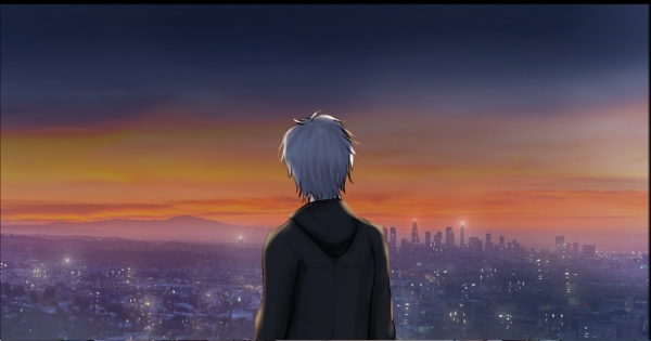
I actually tend to spend more time on my backgrounds than I do on the main subject, but I don’t do a comic (yet), I do static images for my webnovels. What makes this even more difficult is that I am a total novice at digital art and only recently learned how to use such basic tools as layers and transparencies!

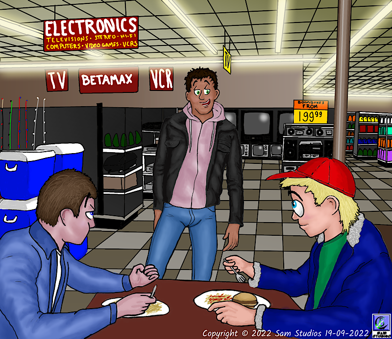
For example, in this drawing from my first story, Wild Nights, Hot and Crazy Days, depicting the interior of a 1980’s K-Mart, this was all done “flat”, all on one layer just as you’d do on paper. I was just starting to figure out lighting here, as you can see by the fluorescent lights and the picture tubes on the TV sets, but even this was primitive. I used the “airbrush” tool, adjusted size and transparency, and drew right over the other parts, then went in and cleaned up where the light shouldn’t be (such as the support column).

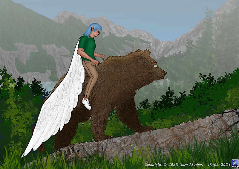
I believe this image from my second story, Finding Daecon’s Way, may be the first one I ever did using layers. Even then there are only two: the rocks in the foreground, the bear, and the dude are on one layer while the mountains, trees, and sky in the background are on the other. I got the “haze” effect by using a gradient covering the entire background layer.

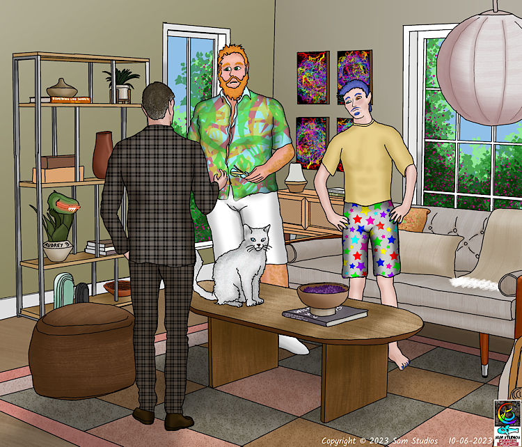
Finally, I figured out that I can use multiple layers. In this image from Finding Daecon’s Way I think there were more than ten layers. Each character (including the cat) was done on a separate layer, as was each texture in the background (the different colours in the rug each had a layer, the wood grain in the table and hardwood floor each had a layer, the corduroy in the couch cushions had a layer, as did the corduroy on the pillows. Of course the final file size was MASSIVE, but once I saved a copy as a PNG it became more reasonable:

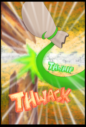
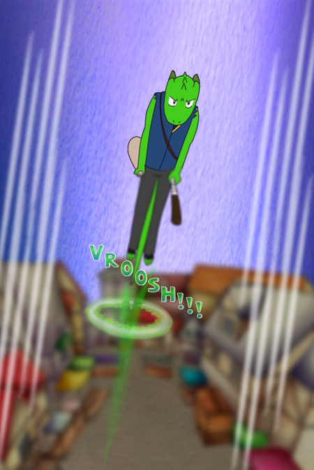
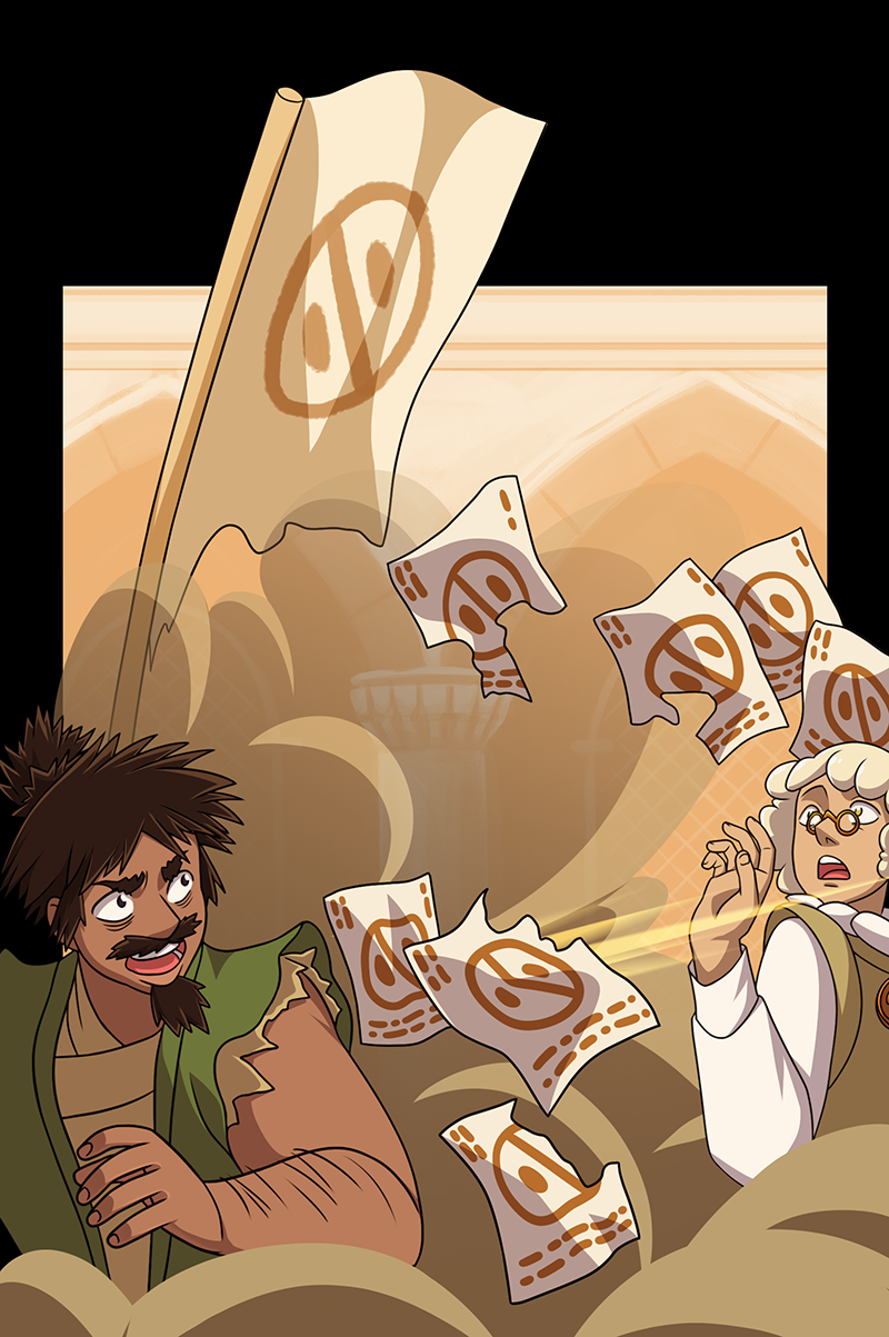
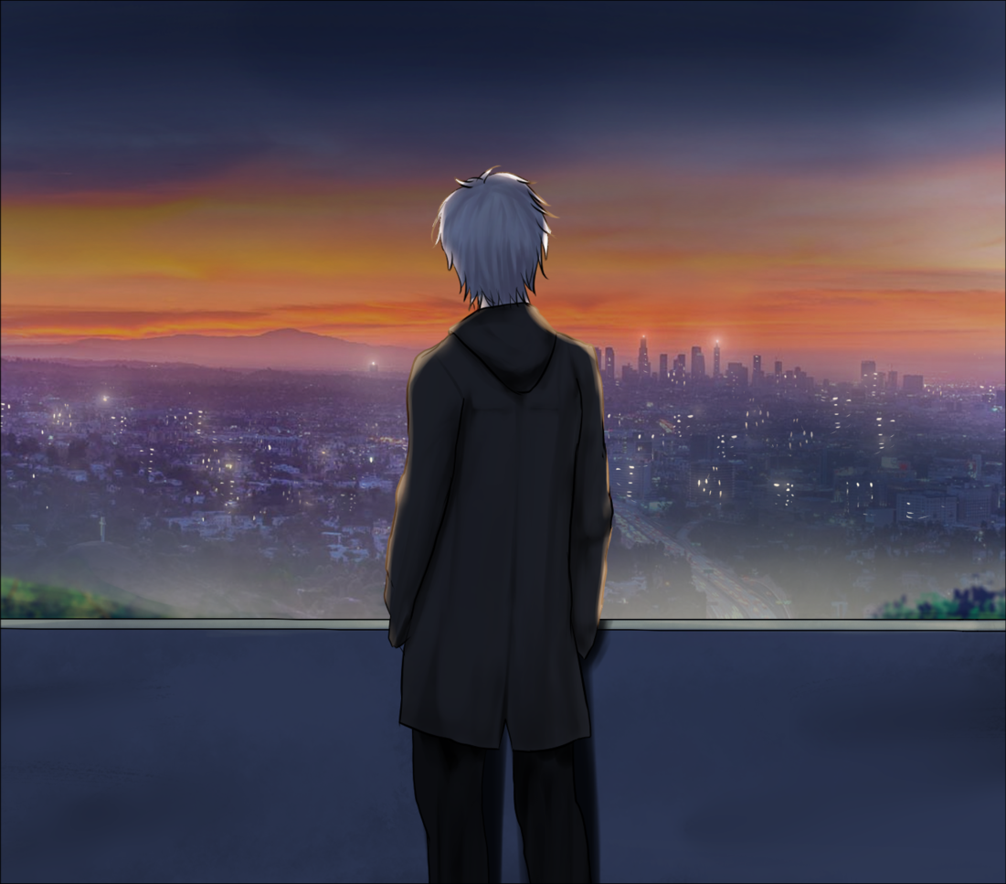
When I do eventually make a comic adaptation, probably of Wild Nights first, I will spend considerably less time on backgrounds, and I will probably make the characters look more simple and cartoon-like as well.

It depend on the panel. Some chapter are background heavy while other are more simple.
This chapter for example use 1-2 bg copied pasted and crop accordingly.


This chapter uses more complex bgs because it set up the mood for some of the panels


You don't want to put way too much time into the bgs either. You can cut corner here and there if necessary since it's still a panel that viewers might just look at for a few seconds then scroll through anyway. Having already-drew assets can help a whole lot as well.