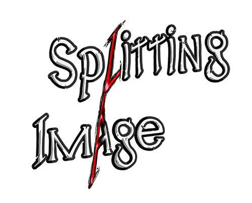
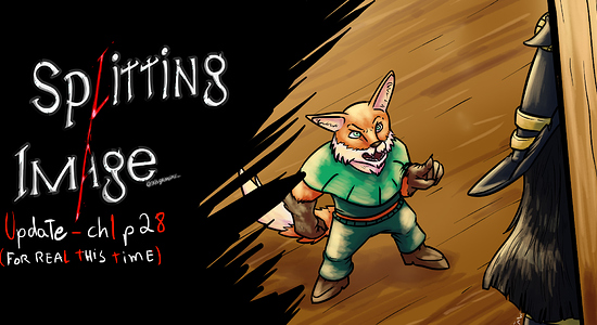
If you aren't experienced with logo design, it's best to keep it simple and choose a nice font. You can get plenty of good free fonts from Google Fonts or Dafont.com (with Dafont be careful, because most of those aren't licensed for commercial use. You can filter results by "100% Free.") The nice thing about Dafont is that it separates fonts by themes, like fantasy, science fiction, horror, etc. So, you can get the right vibe even if you know nothing about typefaces.
I also strongly suggest doing logo research before you attempt your design. Just look at other webcomics/graphic novels in your genre, what do their logos look like? Also, just searching "logo inspiration" in Google will help you out. Save your favorite logos for reference (yep, just like with drawing!) Design is just another form of art; rely on your sense of good composition, shape, line, and color.
Lastly, if you really feel clueless, don't be afraid to find a graphic designer to either do the work for you or consult you on the design. There are a ton of graphic designers on Fiverr, Upwork, and social media with affordable rates, or maybe you have a designer friend you can talk to. You shouldn't be expected to do ALL the work with your comic, it's normal and expected to enlist the help of others! 
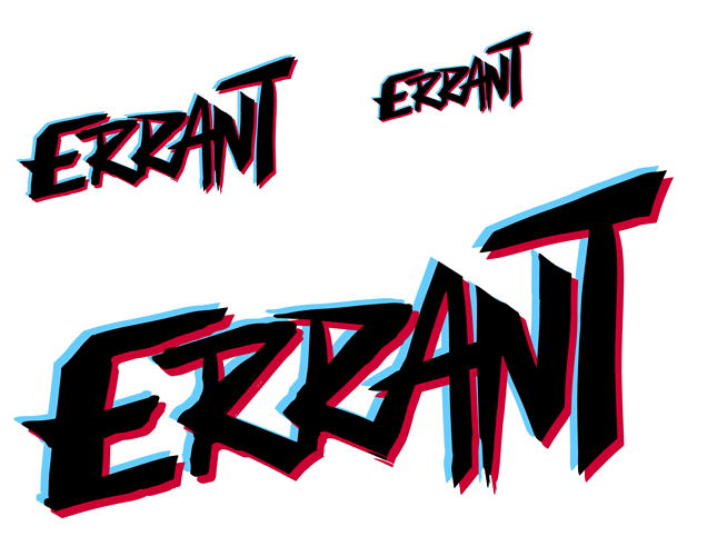
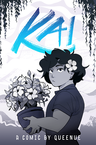
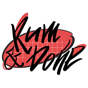
So, the logo for my current story I kept very simple. Since it's only 3 letters, I drew it myself with some brushes in Photoshop (eventually I'm going to vector it in Adobe Illustrator, but for now I can't afford that program lol). I wanted it to reflect an ocean and beach theme with its brushstrokes. Also, a lot of YA / coming of age titles use this handwritten style.
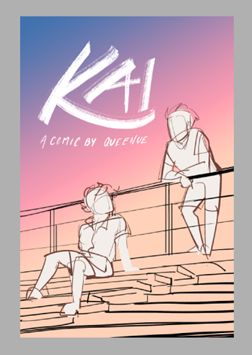
And, since it's so simple, I can easily change up the colors depending on the color scheme of each design I create! Which is fun.
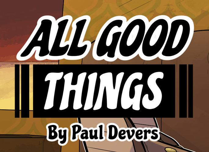
This is a cover concept I'm working on where the logo is going to be pure white against a sunset sky.
Anyway, good luck with your design and comic!