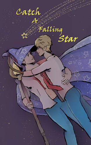
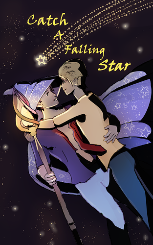
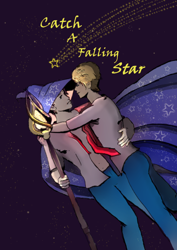
5 / 13
May 2019

Okay, so I finally got off my rear and decided to launch the thing, but... now I'm having second thoughts. My plan was to launch it now and then post the first episode during the Inksgiving festivities.

I plan to have the actual interior of the comic b&w with spot coloring, but wanted to go full color with my cover art. O' lovely artists out there, any advice on improving color work for my cover art image. I need all the help I can get...
It's just not turning out the way I'd like it too. I think I've been looking at it too long and tinkering with it so much that I've become colorblind to the image.

Than, again, maybe nerves is just getting to me now that I'm actually getting ready to start posting episodes...

Thanks for your time!

  • created

    May '19
  • last reply

    May '19
  • 12

    replies

  • 1.2k

    views

  • 4

    users

  • 16

    likes

  • 1

    link

The colors are actually very nice and subtle, reminding me of the nighttime. If you really want to change the mood of the piece I would recommend upping the contrast between elements and giving each character their own color scheme.
More specifically, Making the background darker and making the elements in the foreground brighter, (or vice versa) could work. You could make the shadow harsher by focusing on a light source. Maybe the light is supposed to come from the wizard character's staff.
If you're alright with it, can I take the picture into a drawing program of mine and show you what I mean.

cooL! congratulations on your launch! :+1:

hope your comic will be successful! :blush:

Hi IndigoShirtProd!

First off, thank you for taking the time to give me feedback. It is much appreciated! Those tips are quite helpful. I'm thinking, based on your feedback, that I might need to push the image's colors further. I'll apply those suggestions and see what I come up with.

As far as going into a drawing program with it, don't feel obligated to do so, but if your have the time and inclination, I'd appreciate it.

Thanks again! Your words have upped my motivation! :grin:

I like the colors so far and i think overall it looks amazing.
maybe you can add some lights from the stars or from the wand...you know "glowing" ? with the same yellow you used on the title.

Thanks chaouchazza! I like the idea of the "glow" coming from the stars and/or wand. It would give me a specific light source to work with.

Thank you so much! This is beautiful and it really gives me an idea of where to go with the piece. Sometimes, you just need that extra push to figure out where you need to go and you definitely provided it!

Really, thank you for taking the time to create this example. virtual hugs

Glad I could help, believe me when I say it took me along time to be happy with the cover pages I've made before. Good luck with your comic! :grin: