1 / 24
Aug 2020

Share how your thumbnails have changed through time

Here's mine in cronological order:


I decided to return back to the classic.

  • created

    Aug '20
  • last reply

    Sep '20
  • 23

    replies

  • 1.4k

    views

  • 18

    users

  • 54

    likes

  • 2

    links

I know my thumbnail for my Novel is going to change a lot in the coming chapters, but right now I just have two!


Kinda saw that I should have cropped it so my friend redid the boarder, so happy, looks a lot cleaner!

TreasureHUNT!! went through 3 thumbnails over its run :slight_smile: I swapped it out about every 20ish pages and it went for 70 so yeah! The story wasn't divided up into chapters but there were points at roughly those page counts that could be considered big changes in the story so I felt it appropriate. These were them in Chronological order:


I like it a lot the way it is. If you want to change it maybe you can make him open his mouth a little? It would be pretty cool.

I thought Tapas were phasing out thumbnails, but it's been like two months since I thought that change was being made... I should probably make a new one.

Current thumbnail for the corrected version of the novel which is a remake from the second one.

Those are flowers, the liquid is beetroot water, the eyes are from Halloween prop, the long-haired person from third thumbnail wore his necktie too tight. They are cracking so they are just statues and not flesh with bones. I break no Tapas guideline :upside_down:

@darthmongoose they're still everywhere on the app, so that might not be a long time coming.

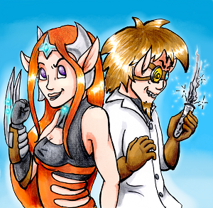
I have four iterations, but only three are/will actually be in use so far.

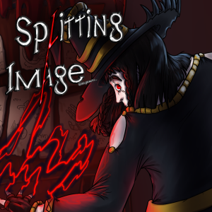
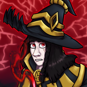
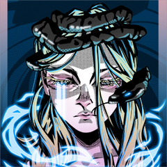
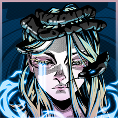
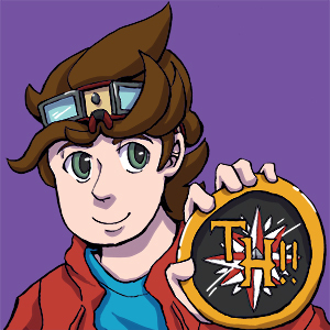
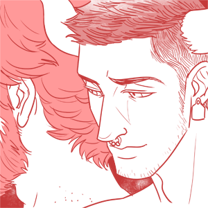
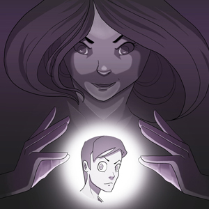
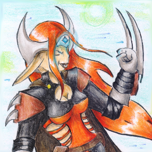
After improving my art, I thought about redoing my thumbnail with a redraw I did of an old Mortimer picture. I did a poll here even; but the consensus was that the thumbnail was clearer the first time. So instead, I made the picture into the banner that's up today, and just fixed the really bad anatomy on the first icon instead, which is what's also currently in.

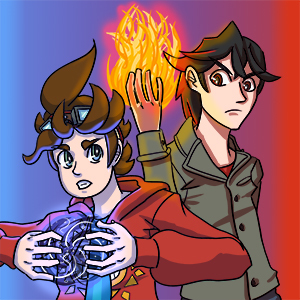
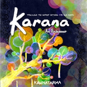
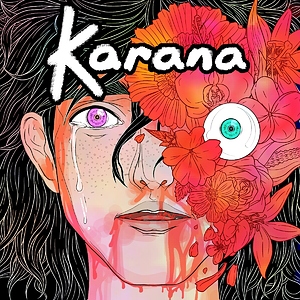
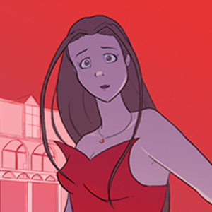
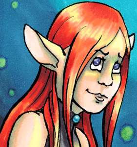
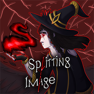
However, for Chapter 2 onward, I thought it'd be best to drop a bit of the mysterious aspect, so I'm working on the new cover having the thumbnail in mind. Mortimer finally looks at you directly, even if still scared!

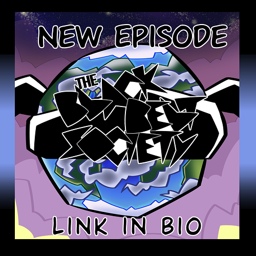
edit: since the thread has been bumped, here's the new one:

I switch back and forth between the 2! I have a hard time picking cuz I like both so much :weary:

I completed my first (and I'm sure not last) thumbnail revamp today. Does anyone know some resources for best practices?

When I'm looking for something new to read, I make the decision to click entirely on the thumbnail image, so it seems really important!!

The second one is one I did all by myself (you can tell, lol) and I'm hoping to do an even better one in the future :slight_smile:

1 month later

I actually just updated mine to have my main characters on there :smile:

Specifically for a novel, is it expected to have the title on there? As a bit of a “this is a novel” telltale? I’ve seen some other threads discussing thumbnails, but most of them were about comics.

First:

Second (current):

I think the first one has a better layout and is easier to read, but having my MCs on the thumbnail (especially now that I’ve updated my novel cover with them) makes the most sense :sweat_smile:

I've had quite some thumbnails :,D

Here the reeealy old ones... (also still with her knife-thing which she never got in the story xD)

Getting better but looks uneventfull

And this is the current one. Just a crop from the Title picture but it looks way more dynamic than the old ones.