
1 month later

1 month later
advice for the first two images:
start with a light sketch and then add more shadows (good technique when paining in B & W), and when there is too much shadow add more white there. because currently it looks muddy and i'm not really sure what it's supposed to be.
advice for the 3rd image:
i'm not sure what you are asking and are the lines meant to be streets or where you want to place the buildings. I do like the design you created looks very beautiful and interesting to look at.
before you design a character you need ask yourself:
- who is the character
- what do they like. pretend that you are the character.
- how do their interests influence their attire. e.g. i like to train and muscle build, so my armor is going to be more chunky and spacious. but someone else likes to run fast, so theirs needs to be light and have a flexible parts.
- and finally does it add to the characters appeal and help the audience better understand the character.
also from these 4 questions you can derive more that help guide when character designing. right now it is very vague what the armor is for, but maybe i'm just late to the party, but with the questions above you can ask yourself.
- who are the characters in unit 2. e.g. kings personal body guards or just regular arms men.
- what does the unit 2 do, e.g. shoot arrows, use swords, hold spears etc.
- question 3 isn't really needed if this is just for the background characters. but you could take into account, a symbol that unit 2 uses, or something that makes them different from the other units. it could even be a badge.
- and finally ask your friends what they think about the design, is it clear what the unit primarily does. like marines have a shit load of gear (ranging from guns to goggles to air-tanks to ropes etc) making it clear what they are trained in. just things like adding big boots or thick shoulder plates or even a feather could express better what the characters are for.
hope i could help, great drawing by the way 
pretty much the same thing @leonardeojr said.
but if you are lazy like me and just hate having to draw proportions for complex, dynamic poses. you should get clip studio it offers 3d models that to be honest can save lives. (it sure as hell saved mine)
if you really don't want to have to create the same environment from different angles every time, i advice you create a 3d model (colored and as detailed as you can). it pretty much would take you a day or two to make, which is just as much time as it would take for you to redraw an un-half-assed background. it is wort it and all you need to do (if done well) is to add fog to your renders out image. (that's what most people do).
but really your background doesn't look half assed, i normally just stop at sketching and leave the rest to fairies to finish. or do a 3d model.
start a comic!!! clip studio has its program now available on apple iPad by the way. so yup you can now make a comic. your style isn't bad, but it isn't good, it's currently in limbo, it's not accurate enough to be bad or good. so start a comic, it is a great way to improve your skill as it...
1. motivates you to draw everyday
2. allows you create something that is yours and entertaining to others
3. and it could be great to look back to see how far you have improved. and laugh.
(i won't sugar coat it, there would be sometimes where you get frustrated with your art and comic and go on hiatus for a year or more, but you just pick up that pen and keep drawing)
goodluck.
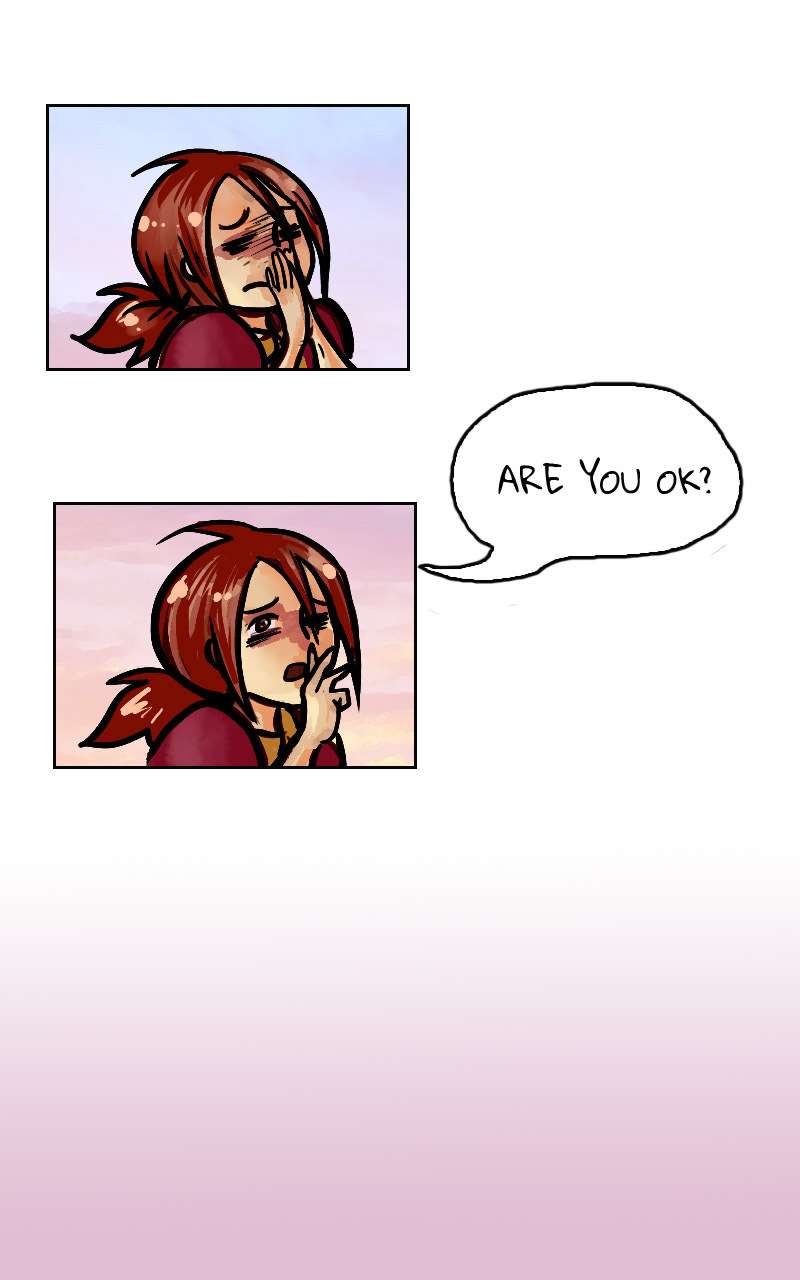
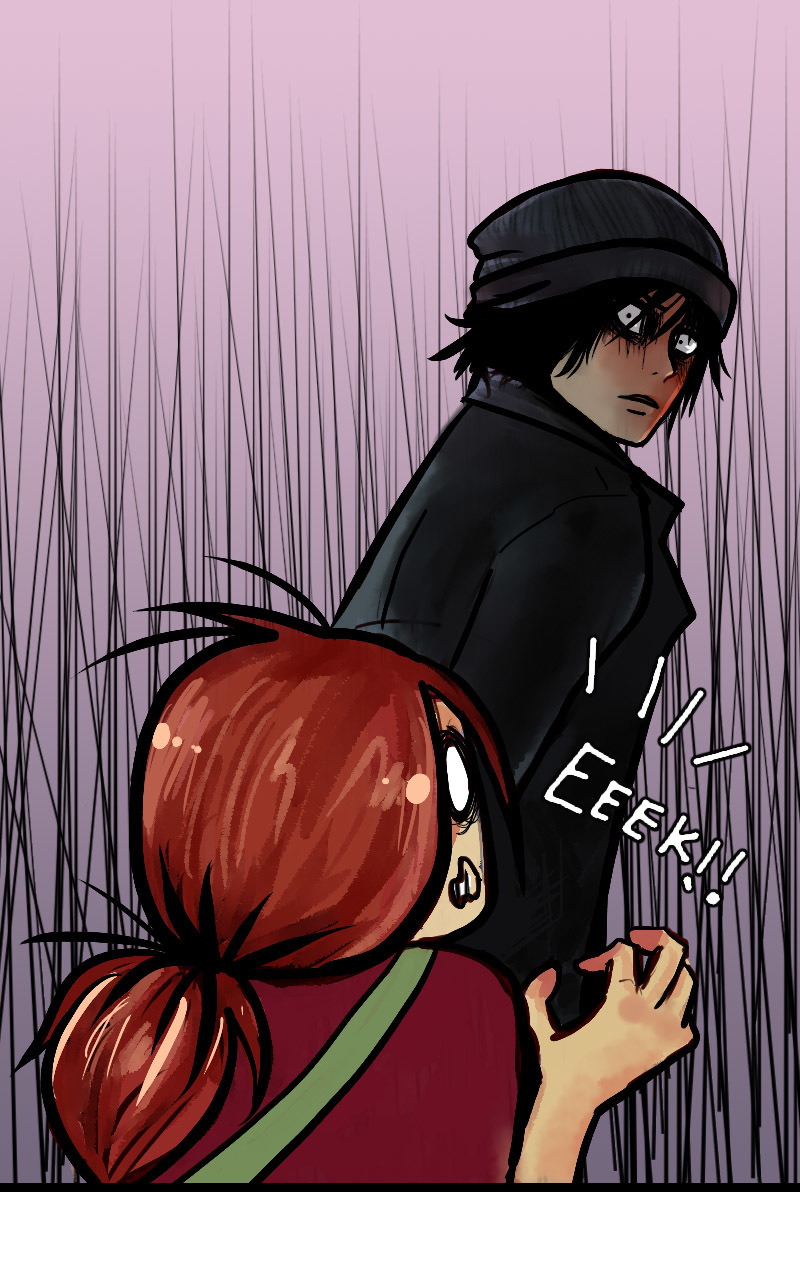
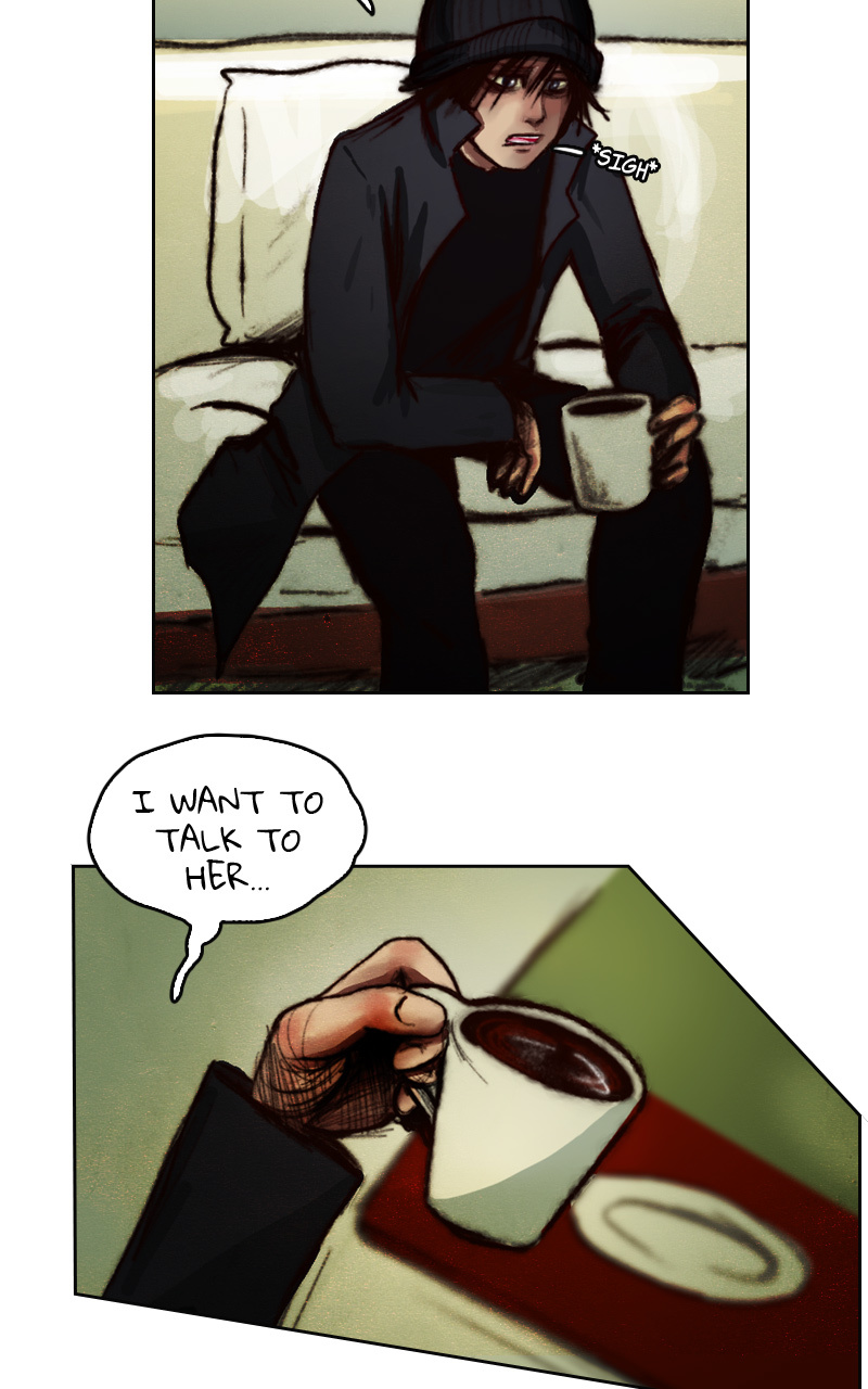
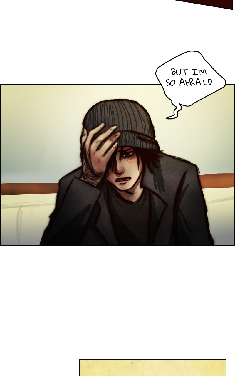
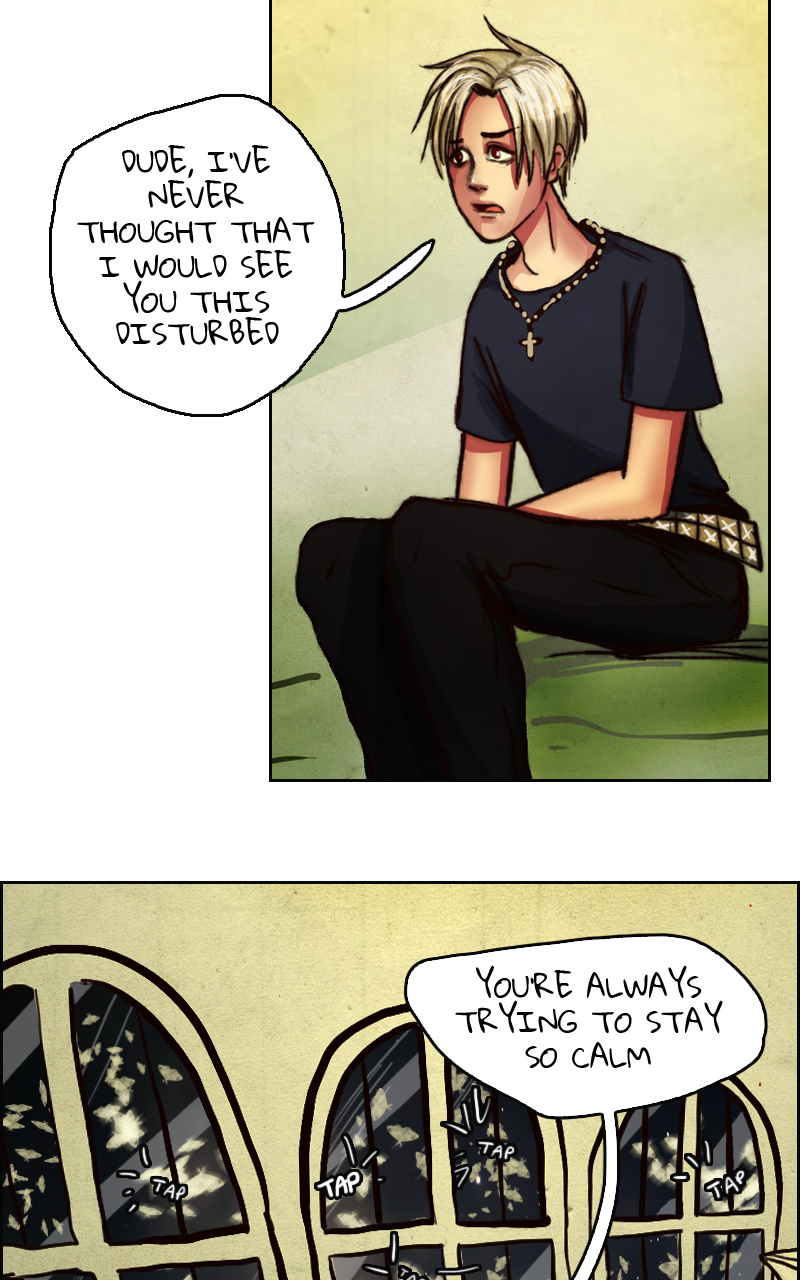
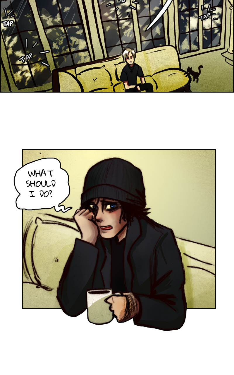
3 months later
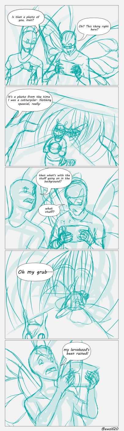
From my comic at:
We've been going at little abstract lately since we're in Stardust's world. He had to come to earth from somewhere after all, and only a strange world could produce something as strange as him. What do you guys feel about the abstract in the comic? Is the context being communicated okay?
2 months later

18 days later

1 month later
unpinned Feb 21, '19
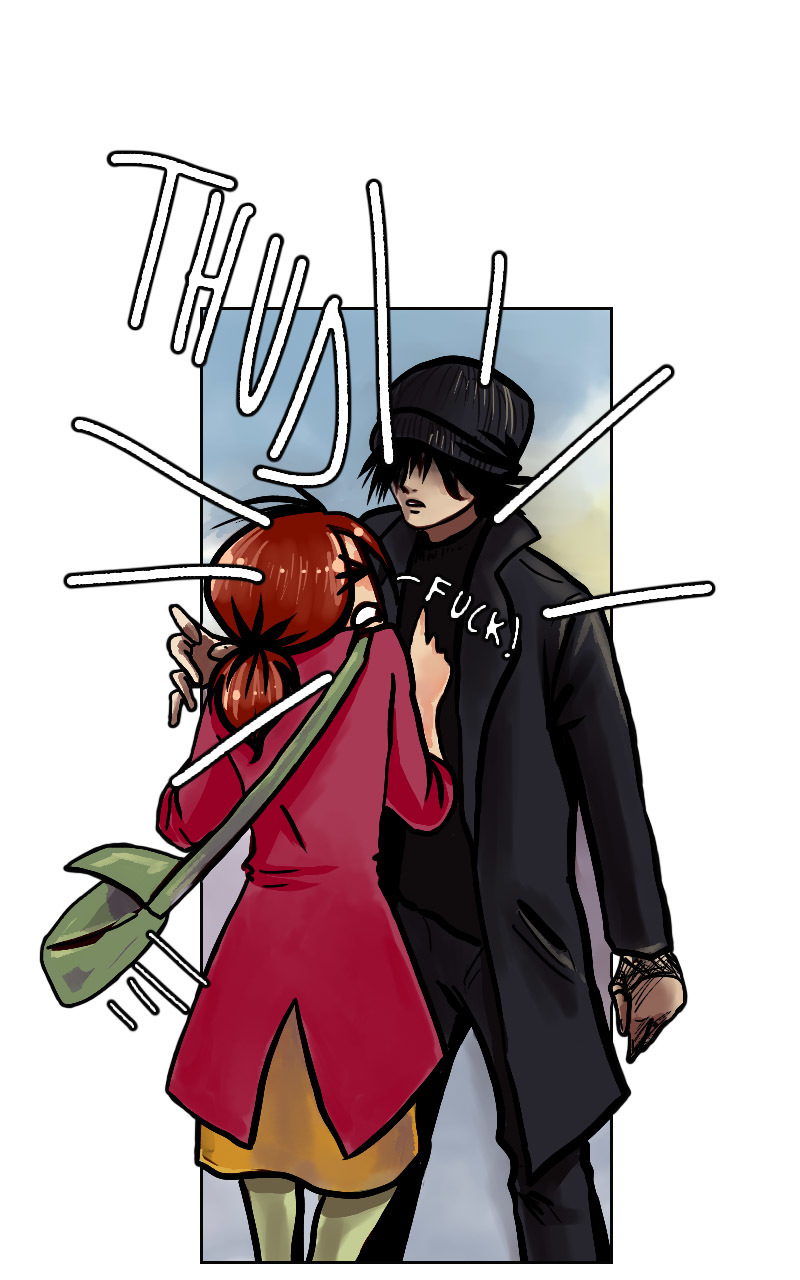
Hi. I'm new here and I've started my first webcomic a few weeks ago. I used a cartoonish artstyle, but I want to change it to something more sketchy, I think it will suit better for the story. But is it too sudden? I think it's better now than later, since I just have done two chapters.
THIS IS HOW IT LOOKED BEFORE:

AFTER:
It feels like it's a complete different genre, and I like both styles, but I'm not sure if it is right to make such a change. This is the webcomic, btw:
4 months later
(casually tries to bring this thread back right quick)
so i know it's become pretty common practice by some to have a little advert banner at the bottom of an episode, it's an easy way to plug things make annoucements, etc
so i recently upgraded on for one of my comics but i'm worries about legibility. i'm like a-ok with the art but really worried about how readable the text is
any tips, advice, or suggestions are welcome