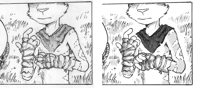
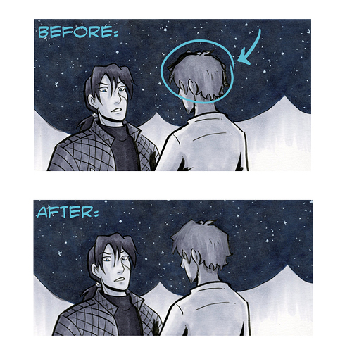
This is one of a drawing i still am not happy with.
Because of the small size of the comic panel, i sometimes comes out with ugly faces. This is the awful derpy face from scan.
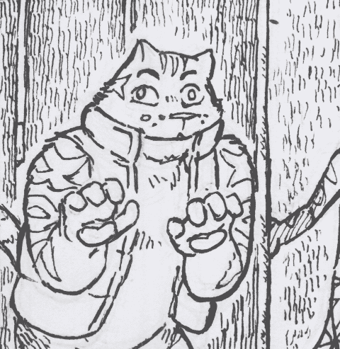
(yes he has misaligned eyes but the face can be drawn much better)
I digitally redraw the face. And i thought i could'nt have any weird looking faces, i outputed to smaller size and check again on the Tapas platform...
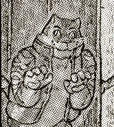
HORRIFYING.
When posting in output size (the same size as you see here,cropped) The "muzzle dots" give an illusion an extended wide grin that make it look sinister & evil (combined with those eyes, posture and lighting) These are totally unintentional.
i have to fix the face again by rearranging the muzzle dots and mouth...

Less creepy looking... not by a long mile but it's passable... (is it?)
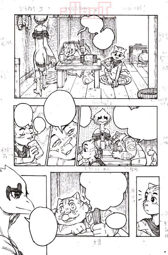
(also, when possible, I should use less multilayered screentones which may cause moire effect)