
I think you are already getting the character's personality across. I would definitely include the snail in the thumb as well even if he hasn't shown up in your comic yet because a) from the sketches you posted at the beginning he's very cute and likely will be a draw, and b) I looked at your thumb and then the title of your comic and was like...who's shelldon though.
The thumb you have now is pretty clearly warped in how it's been resized. Since you work traditionally it might be a good idea to draw yourself a square on a piece of paper (dimensions would be x (inches) where x = 300/[scanner dpi], assuming dpi is the same as ppi which I think it is...? Someone correct me if I'm wrong). If you make it that size or bigger on each side it should give you an image that works at 300 by 300 pixels without having to resize.
Other than those two things seems pretty solid. Play up that snail cuteness man. I am all about cute snails.
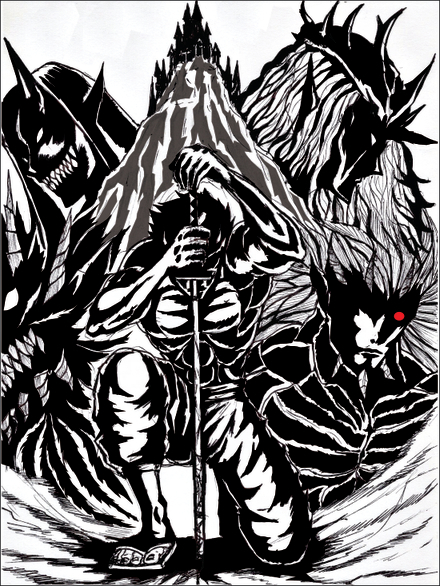
Your thumbnail definitely gives off mystery! I see the dude in the back with the red eye, and I wonder, "Ooh, who is that guy? He looks like he's up to no good." The shading on people's faces also shrouds their actual looks, so that adds to it more. Not to mention we've got, who I'm assuming is the main character, not showing his face, but his weapon of choice.
I'd say it looks good. I have to look at it for a minute because there's a lot to look at. I'm not sure if that's a bad thing or not. But it does convey what you're going for! Also, his sword goes up the middle and points toward the castle. Not sure if that's where you're wanting the reader to look, but it's a good guide for the eyes.
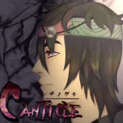
I feel that this thumbnail is good but not great. The colors have a nice contrast, but a lot of the image is dark grey which is not eye-grabbing. The name Canticle is easy enough to read, just a little small and dark in parts. The MC's expression is poker faced which is not a problem, but it does miss an opportunity to express some of his personality. It's not bad.
Great inkwork on your cover!  The style reminds me of Berserk and indeed gives reader mysterious and dark fantasy feel. It also gives reader idea about what kind of graphic they'll be seeing, and would it be colored or not.
The only thing is while I think the composition, intricate linework, and shading are brilliant in large scale; yet all the details and entirerity of the composition might not be conveyed in small display of thumbnail.
It looks like this on mobile site
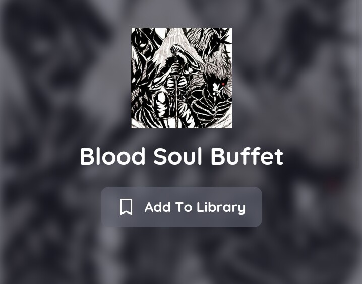
And even looks smaller on desktop site (already zoomed)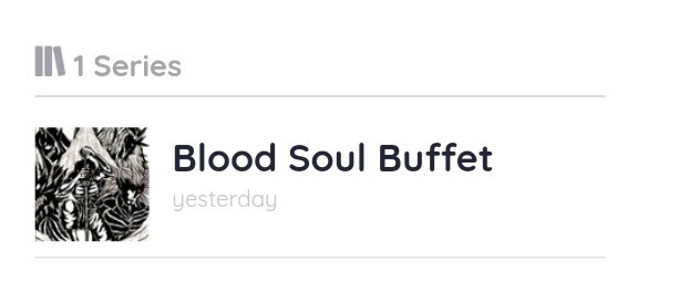
Compare with other series from your library, see the difference?
(I apologise to creators shown in this image if you don't want your work or name displayed)
I think zooming in the cover image used and crop it at that size might help, refocusing it to a single character or small portion of it may also help. Giving clear boundaries between characters or an effort to make them more distinguishable in small scale is a good idea, such as adding different colored outline or color the character
Small tips:
Check how your cover is doing on the small size. Resize the image to 100x100 pixel then 300x300 pixel, and view it at 100% size (or just zoom it out to reach such size).
Stare at it until it penetrates deep into your soul and check:
- Can I tell what is going on there or portrayed there? (Especially in 100x100)
- Can I read whatever the writing is written on? (Especially on the 300x300)
- Does it convey what it supposed to be in this smaller size?
Because sometimes scaling down the drawing can do considerable deal of rendering some parts intangible or perceived differently (like in optical illusion)
I love the colors in this. My main critique is that I can't read the series logo text at all in the thumbnail. Is it necessary to have the series title in the thumbnail when it's already listed next to the thumbnail by the app and site? If you really want it there, I'd suggest using a light color that contrasts with the dark tones of the background
thank you so much for you feedback kainatarma chan 
haha yeah your right
actually i didn't think much of my thumbnail
i gotta make sure to update it in the future
there is one thing i wanted to hint the readers on with this image
lets just say, theres a "twist" on the meaning of this image which greatly impacts the story 
I'd like some feedback on my (unfinished) new thumbnail.
I tried to make it more attractive than my previous one, although I want to keep it simple, and don't want to spend more time on it than on a regular panel, as I always find it a bit depressing when I click on a great thumbnail but the art of the comic is inferior to it.
My questions are:
1) Well, is it indeed better than the previous one?
2) In my latest pages I started to use gradual shading (before, I was using none). So gradual shading is more representative of what is in the comic, but it does not look good at all on a small thumbnail (probably because I do it wrong, but that's another story).
Should I stick to that anyway, or or should I do shading with hard/abrupt edges just for the thumbnail?
old thumbnail: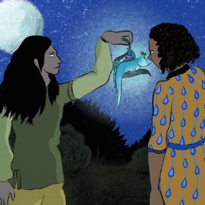
The one I'm working on now: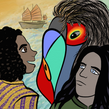
- I'd say it's much better than the first one - the main characters are bigger (and because a thumbnail is small (duh) we can see it better, which is good), and are drawn better. Lineart has gotten better as well. The lines are smoother and well-defined now. The background is more intriguing - that ship is amazing! One thing you could try for this piece is to set a correction layer:gradient map (if your graphical program can do that) it will make the colours match more.
- Depends. If it looks really bad I'd try different shading, but if you want your thumbnail to represent what's in the comic and not "lie" to your readers, then stick to gradual shading.
Now I'll post mine!
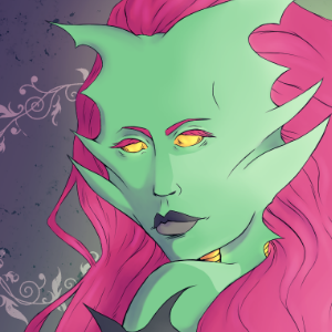
My main goal was to make her look appealing, since the main plot point of Overqueen is seducing mortals D:
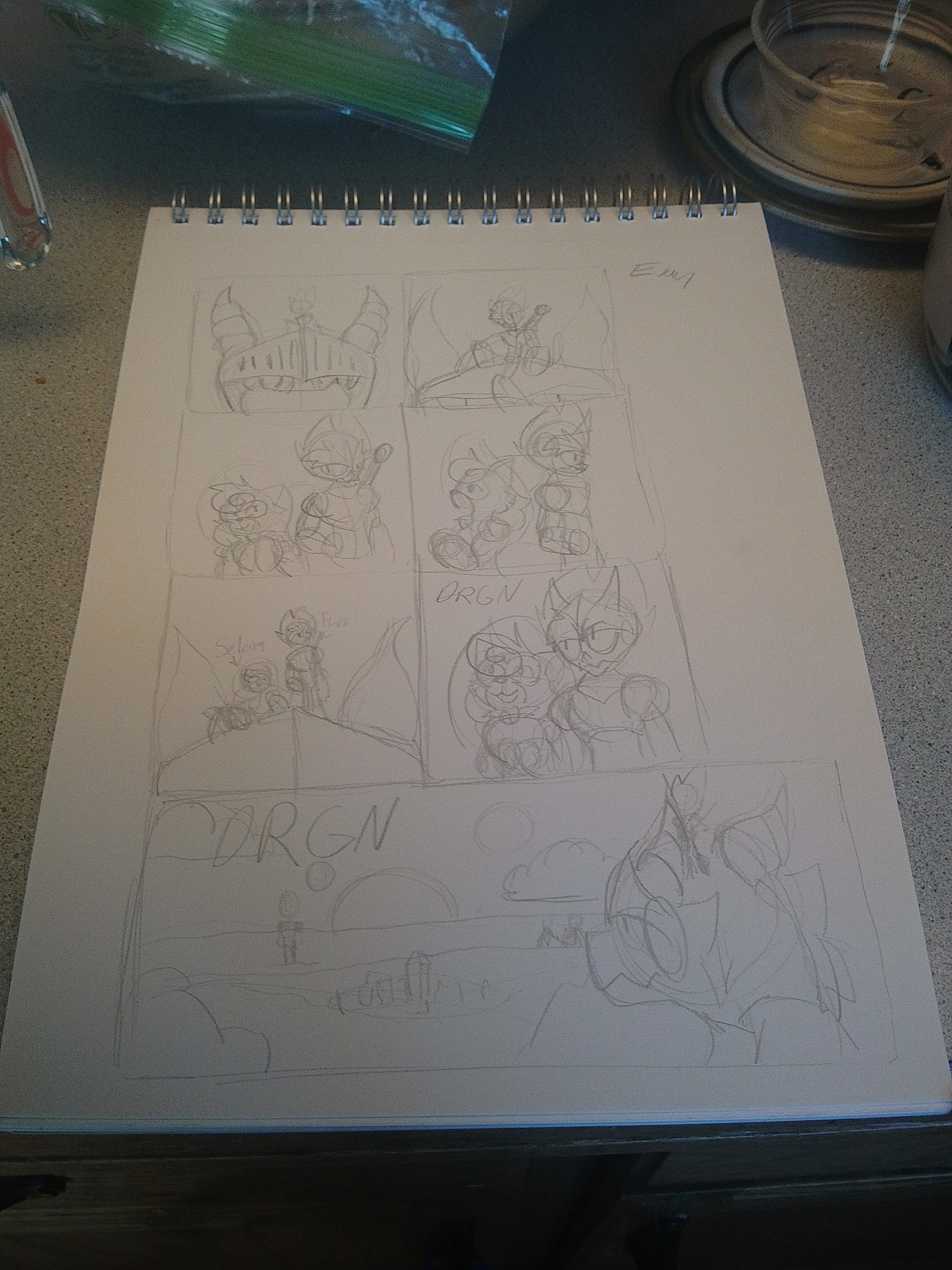
Here's a unique request: I'd love to hear some feedback on which thumbnail design I should go with for my webcomci DRGN. I've done some quick sketches of Ides for them (plus a possible banner design as well) and I'd love to hear which one you think looks the best. (Apologies for quality, had to take it on my tablet camera.)
@Listeczek
My impressions: I like that the background doesn't distract from the character, and, thanks to your color choices and shading, her features are pretty clear even when the thumbnail is shrunken down. I definitely get a retro comic vixen vibe. The palette makes me think of Starfire & Poison Ivy. Looking at your first episode, I see that she's a siren, but I wouldn't have gotten that from the thumbnail. Something about the proportions of her face seems wonky — almost like her head and her facial features are at slightly different angles — but I might be wrong about that. At first glance, I'd assume she's the main character, some sort of seductive alien anti-hero. If that's what you're going for, then great!
Suggestions for improvement: I don't think it necessarily needs improvement. That said, you could possibly add some visual theme to hint more towards the plot or even just the genre. From this, I can't tell if it's a sci-fi adventure, fantasy romance, supernatural thriller, or anything in between. I'm not sure what the significance is of the floral motif in the background, so it feels almost like wasted space. Obviously you don't want to steal too much attention from the character, but maybe that would be a good place to add a little more info.
Disclaimer: I'm a novelist, not an artist, so take my opinion & advice with a grain of salt.
@aqua03 I don't mean to skip you, but I believe the rules are you're supposed to give feedback to the person above you before you ask for anything. I just wanted to make sure @Listeczek didn't get missed.
Thumbnail for my novella:

I made it myself, but I wouldn't consider art my strong suit. I'd appreciate any feedback and/or advice!
I converted the thumbnail from this cover (also made by me — click for full size):

This is mine!
My Aim: comic's main theme is potential, family, mystery, childlike wonder and innocence
My Comic:
@paperwren Your comic does show me that the MCs are the ones in the front, and it gives me a mystery vibe, surely wiith a lot going on! Overall I think you're doing a good job!
@aqua03 No problem ^-^
I must have assumed the specific person above you thing because that's how these threads usually go.
Ordering from left to right, top to bottom, I personally like your 2nd and 5th panels best  The proportions of the main character vs the (dragon?) mount are fun and create a sense of adventure. If the relationship (romantic or friendly) between the two smaller characters is important, I'd go with panel 5.