1 / 7
Mar 27

So recently I’ve been trying out a different panelling style:

This is a style I've seen done in webcomics with a page-by-page / flip-through / whatever-non-scroll-format-comics-are-called format. Despite the difference in formats, I thought it could work in both scroll format and printed pages, so if I ever want to print my comics, I won't have to go through the trouble of reformatting my comics.

But now I'm starting to feel that perhaps it doesn't look as good in scroll format after all? I'm worried that it looks too much like a comedic slice of life comic strip, or that the panels just look very stiff.

What do you think? Should I change some things around? Maybe vary the sizes of the panels a bit more, or alternate the placement of the panels between the left, right, and centre of the page to give it some more dynamism? Or do you have something else in mind?

P.S. Take a sip every time I say the word "format" lol

  • created

    Mar 26
  • last reply

    29d
  • 6

    replies

  • 178

    views

  • 1

    user

  • 8

    likes

  • 1

    link

I like this paneling style the best, for print and for webcomics.

Print has 2 options for me, classic panel border or no border and
white background.

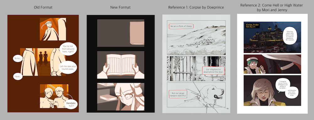
I think the reason this format doesn't seem to be working for your comic (judging by the "New Format" example) is because you're not actually using it very well...both reference examples have very thin horizontal gaps and wide margins, giving the pages a stylish feel and putting the viewer's focus on the panels and their contents. The contrast between negative space and the expressive drawings can be viscerally felt.

Meanwhile, your format has 'kind of thin but not very thin' horizontal gaps (that are visibly uneven...) reducing the contrast with the margins and the large amount of negative space within the panels...making the page feel haphazard and confused, like you're just throwing shapes around with no intent. Note that the example pages have panels of different heights depending on the emphasis of the contents, while your panels are all roughly the same size...again, it doesn't feel like there's intent here. I don't know what you want the viewer to focus on.

It doesn't help that the "New Format" page looks unfinished...like, it's hard to get a feel for whether this format even fits your art style or not. If it IS finished, then I would say no. Better paneling alone won't improve the look of a comic where most panels are filled with empty space...your original 'offset' format with the speech bubbles filling in the gaps is a better fit for that kind of art. If it were me, I would try to merge the two, like maybe just do much bigger offset panels in this vein:

I understand what you're saying, and I do think this would apply to printed pages, and that if I were to ever print my comics, I should reduce the margin between the panels. But what about in scroll format? Is it still a problem? I'm worried that if I reduce the margin too much, it would look too crowded.

Here are some other examples that might illustrate my question a bit better:

I think this is a very good idea. I'll give it a shot.

I see what you're saying, yes...well, personally, the way I got around that was actually doing page breaks within the scroll format.

I know most people who work in scroll format don't like their comics to look overtly 'paginated' like this, but it doesn't hurt; and it's not confusing or anything. I never had any complaints. ¯_(ツ)_/¯¯

Essentially, this would consist of simply making the top and bottom margins bigger on each page, so they'll be cleanly separated when you combine them together.
In my case however (since, technically in this comic it wasn't really 'pagination', rather it was negative space I added in on purpose) I actually made 'spacers' that I would add to the comic uploads:

Personally I'd do a mix. I also agree with what's been said about margins. (Side note, but I love doeprince's comics!)