15 / 15
Dec 2024

If your story has serious/heavy themes and you have a more cartoony art style, do you think it takes away from the impact?

I'm a cartoonist, and many of my stories have pretty simplistic or cartoony art. In certain cases, I feel like it adds to the effect. the flat, faceless characters give a vibe that I like for my strips addressing serious issues.

Other times, I wonder if it isn't SO cartoony that some people might just pass over it and not really pay attention to the point behind it? Either way, I like my style, but it is something I question sometimes. How do you all feel about it with your own works if you do something similar?

example of times I liked the effect:


  • created

    Dec '24
  • last reply

    Dec '24
  • 14

    replies

  • 363

    views

  • 1

    user

  • 36

    likes

  • 15

    links

As an author who has covered serious heavy stuff in all my stories, I have used simplistic or cartoons art to take away from the heaviness of the plot.

In the past, that was one of the feedback I've received. How my work ruins their day and makes them depressed.

So the cartoony art is there to balance it out.

Sure. Elsie is serious at times and in Cracking Eggs well it’s a crime comedy but yes it’s also crime!

Rosie gets scarlet fever and almost dies

Doctor Scarborough is a predator who experiments on people (specifically young ladies)

Scarborough touches Rosie and sniffs her ew. Ew ew!

In Jane’s anger and jealousy, she scratches up Ernest pretty bad on his back.

We have this exchange with Jane and these random bozos. Jane literally burns them! (They deserved it!)

We have Jane breaking into Ernest’s home and stalking him.

Ernest grieving over the loss of his friend.

We have this whole thing. Elsie cries.

Let’s just say the night was so bad, Roy and Ernest had too many drinks.

We have Anton’s younger brother trying to kill Ernest by throwing him off the Eiffel Tower. Fun fun!

Ernest’s father is murdered right before his eyes and next thing he knows he loses his leg. And then James falls to his death saving Ernest who is already bleeding so much.

The first season of Elsie yeah. It’s got some dark stuff in it!

It doesn't matter the style, is how you use it, if you manage to apply the right colors and pacing, your story will not lose the seriousness

So I am not completely sure if my style is considered cartooney or complex but I still have some heavier themes. In my chapter that is releasing next Thursday the comic continues with the heavier themes.

This is a little spoiler but I personally don't think it shows much of the next chapter.

I have seen it done before. Like with When the Wind Blows, Maus, Persepolis, Epileptic... to name some.

I do think that having a style like Spongebob might be harder to people to take it seriously.

Not at all. My art is very Disney looking but my story is dead serious.

No. Cartoons can express "heavy" themes such as loss, despair, and other complicated feelings. Whatever medium (or drawing) you use to tell the story should "fit" -- and that honestly overall depends on how you want to tell your story.

Ex. Adventure Time -- Has everything from silly nonsense to trauma.

As for the certain cases of blank faces, I observed those are for typically "distancing" those characters away from you -- like slenderman, faceless crowds, placeholder puppets for telling a short hypotheical story (within in your story), or emotional discord. Occasionally, just plain horror of face-snatching too.

Blank faces can work to carry serious issues, but sometimes might conflict with your audience feeling empathy for the character personally; we use little faces to relate like :doggo: or :doggo_shook: afterall. Depends on how you want to tell your story again so just something to note.

I think something people overlook when it comes to art styles is that they have layers beyond simply 'how the characters are designed'. The color work, blocking, and even the dimensionality of the characters does a lot to tell the viewer how seriously they should take the story.

This is why anime can do what it does despite so much of it having cutesy characters with giant eyes-- the environmental lighting is dramatic yet grounded, the physics are realistic and believable. The characters clearly have 3 dimensions, and move and gesture like real people-- these are additional cues that ALSO help determine the tone.


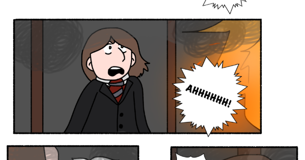
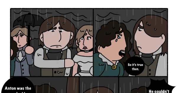
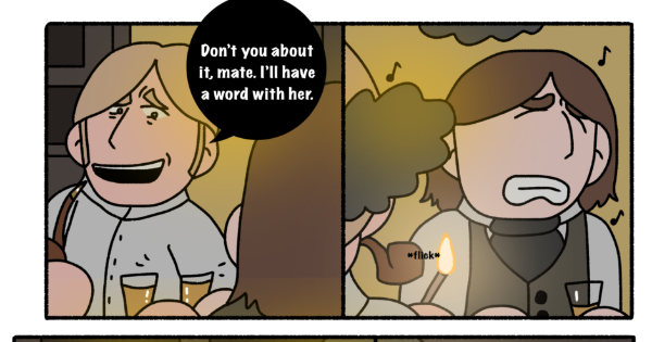
Basically: if you want a simple, cartoony style to be taken seriously, you DO still need one or two serious elements in there to ground it, even if the audience may not notice that they're there. This is a skill that takes time and experience to master, and it's the reason why this:

...CAN and does happen. It's not actually the cartoony-ness that's the problem; it's how well that cartoony-ness is integrated into the art. When it destroys the serious elements instead of enhancing them, the work will usually just come off as childish, 'tryhard' or 'DeviantArt edgy', instead of truly serious.

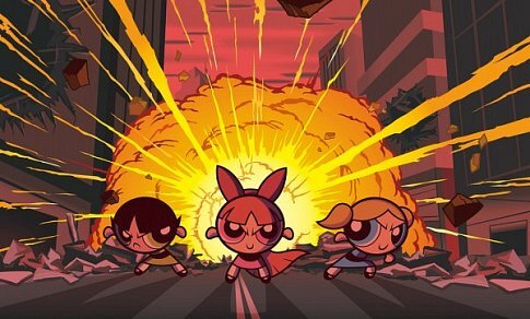
For example, this PPG poster is pretty cool. Despite its simple cartoon style, it really draws you in and feels powerful:

But let's say I try to recreate it, as an amateur who doesn't really understand how this artstyle works, and doesn't know how to draw figures consistently:

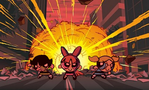
...Doesn't look so cool anymore, does it? ^^; Even the dramatic lighting can't save this...professional consistency and dynamic linework are vital elements of seriousness that were working very hard for this piece, but are now no longer present, making the whole thing look sillier. You could still do the PPG Movie with this 'style'...but the audience would probably think it was some kind of parody, rather than its own immersive story that just happens to star a trio of weird cartoon girls.

Meanwhile, if you take away a less important element of seriousness, like the sinister-looking colors:

Doesn't hurt the piece very much, tbh. ^^ Instead of looking silly, now it kinda just looks 'playful', like a story that could still be serious, but maybe with a comedic tone and some abstract-leaning liberties with the art direction. Because we still have the dynamic lighting and poses and the clean linework working to set the mood.

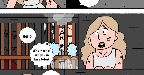
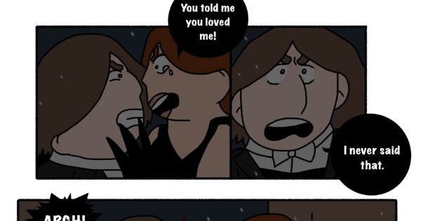
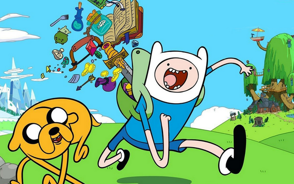
Some people in this thread have mentioned cartoons that do both serious and silly stuff, and those are great places to learn how these techniques work, as you watch the creators weaving in and out of them with the changing tone. Adventure Time is a fantastic example-- even as someone who hasn't really watched the show, just from video clips and screenshots, you can see how a show that looks pretty absurdist-silly 90% of the time suddenly gets its artistry and cinematography ramped up to 1000, when the directors want you to get immersed in an important story beat.
Steven Universe is also really good at this, Over the Garden Wall rocks it, even Regular Show displays a pretty good understanding of how to turn this on and off, albeit in a tongue-in-cheek way.

...I know this was a lot; I'm just really passionate about artistic juxtaposition. ^^ I really wish more people would pay attention to the subtleties in this type of art direction, instead of just trying to brute-force a serious story through an art style that hasn't actually been tailored to support it. A lot of the time, when audiences mock a cartoon/animation and refuse to take it seriously without really knowing why, one of these issues is the culprit...but these issues are actually really easy to fix, if you know what to look for.

No. There are alot of recent works that use a simple/cartoony art style while portraying a grander world with dark/serious themes. I think it has been done too much lately, though I do enjoy the tonal contrast it creates, I get a little weary when I see another work that introduces itself as a wacky/child friendly thing that unravels into something much darker/dramatic with scary imagery or addressing mental health issues.

Personally I like changing my style depending on the scene, going simplistic for silly scenes and more detailed for emotional moments.
It's an advantage to the art of cartoonism that we can be flexible like that.

That said, there's nothing to stop something simplistic from being heartwarming or emotional.
I finally got around to watching Gravity Fall and Owl House (somehow managed to avoid spoilers for the former for like 10 years! So worth it) which both juggle decently heavy character moments with a simplistic art style. I haven't watched Steven Universe but I've heard that does something similar.
If you want to have a simpler style I'd look to American TV animation for inspiration.

Namely the Owl House.
Can't recommend that show enough.

Not really. My art style is heavily inspired by Disney but if I had gone full Disney, I dont think scenes like this would hit as hard:

There's a sharpness and intensity to the relatively cartoony artwork that prevents it from looking extremely inappropriate, thanks to the linework, lighting and color. It would be near impossible to do this with the regular Disney style. Its like with Toriyama's art style in a way

When the Wind Blows is a graphic novel by Raymond Briggs which also got a film adaptation. It's about nuclear war and sort of a satire on propaganda in the UK at the time.

Maus is a graphic novel by Art Spiegelman. It's a semi-retelling of his father's life during the holocaust. The story is retold using antro-mice and cats.

Persepolis is a graphic novel by Marjane Satrapi which also got a film adaption. It's an auto-biographical about the author growing up during that Iranian Revolution.

Epileptic is a graphic novel by David Beauchard. It's a coming of age auto-biography about his brother who struggled with health issues.

oh, these sound interesting, though maybe also kind of sad/scary, i'll have to look them up. thanks for sharing.