There's so many replies and I couldn't read them all so forgive me if someone already said something similar.
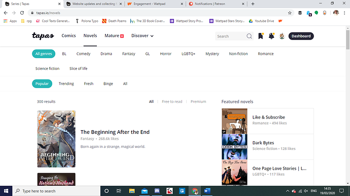
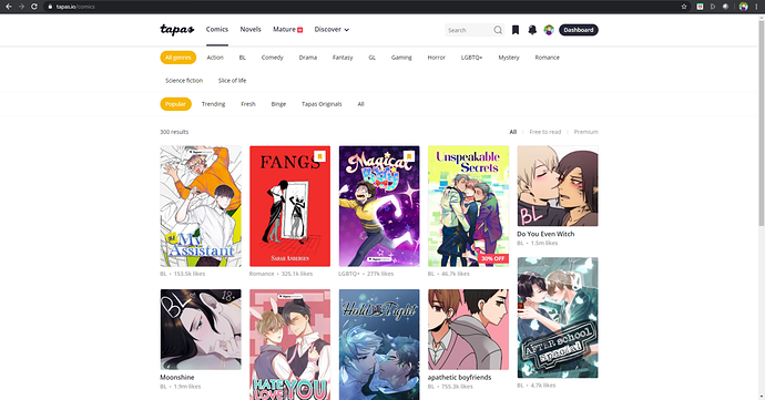
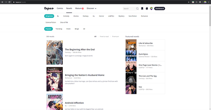
The new website design is to put it simply... plain. Everything is white and light gray and in my opinion it all melts together in big white page with nothing to set eyes on. Front page looks like chaos now (because of big icons and lots of them) and there's so many things going on that I can't focus properly on one thing and it makes me just NOT wanting to read anything because I can't settle on one thing.
Background mixes too much with toolbar which is almost invisible and if it wasn't in the same place I would miss it.
I actually miss the black/yellow/white design as yellow was a colour of tapastic and it let the website stand out amongst others. Simplyfing everything when it comes to design most of the times is not a good thing and so many trademarks/companies/etc lose their identities. Minimize - ok, but not to the point when you can just smash a different logo on the front page and it will look nice as would've any other logo.
And one thing that piss me more than what I've said before - reading new episodes/chapters of the favourite series is such a pain in the ass that as I've checked the site everyday now I do it once or twice a week because you've taken the most essential tool front the site which is endless scrolling. It was the most comfortable thing you could get and you just got rid of that.