
Unless you can build a website and market the hell out of it, keep going still if it's fun to make. Michaelson already showed a lot more effort in at least seeing immediate problems compared to say Smackjeeves, and a plataform naturally has a bit of categorization to be found by readers. Always always have a main website to prevent sudden shutdowns or weird format changes, but also keep mirror sites to make sure someone who's comfy with one website still sees your comic.
There's no nice way to say this, but the new update is horrendous. All the empty space hurts my eyes. Its now harder to get to my complete Library. At my library, I used to be able to just click and go right to where I left off on each comic. The extra steps make the site feel like Smackjeeves after its update, which chased tons of people who had been using it off the site. In fact, the website changes feel exactly like the changes that happened there, down to the font, placement of links, setup, and appearances. This site has lost all personality on desktop in addtion just being more obnoxious to use and look at. I might just handle everything with the app for now, but if things don't change I expect another comic exodus like Smackjeeves, probably to Webtoon.
This is pretty big and I forgot to add it on the form, yeah. It seems the pages just improperly go to previous pages even though you're on the newest one, too, because the reading reset and it thinks you're just starting. Maybe bringing back "read from the beginning" from the update should be a tad high on the list as well, just so that is its only purpose and next gives you, well, the next page. (and if there's no next one to simply show none, like when you've just read them all)
Whew... okay, I don't like the new design at all, sorry dear @michaelson x___x I am sure you all meant well, but... just nope.
I am totally with @blackdevil72 in some aspects. And @Alrathi has a pretty neat list of suggestions, too.
What I enjoyed when going to a new series was that I was RIGHT in it, I saw the latest comic page, I saw the artwork (not just some thumbs) and I knew right away if I liked the style of the comic pages.
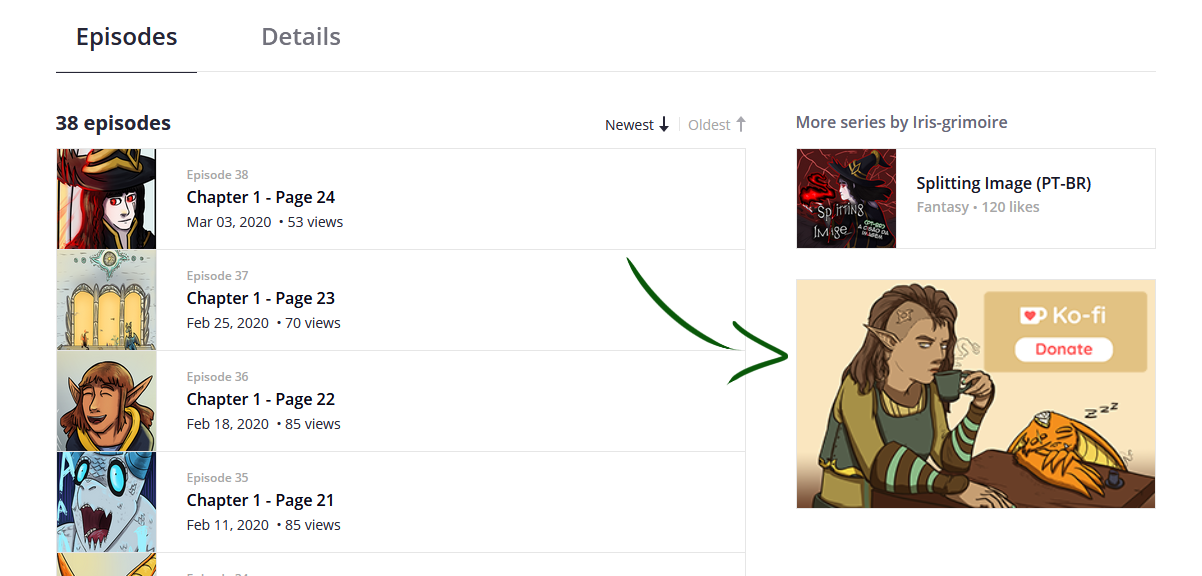
Speaking of thumbnails: I am really, REALLY disappointed that the scroll down bar on the left side is gone, me, as well as many other artists, used the top to bottom list of episodes to make an artwork of continuing thumbs. 2 years of thumbnail uploads for the trashcan, it just looks like garbage now instead of a pleasant artwork in thumbs. Why did you change that? I mean, it was a feature I haven't seen on any other webcomic platform yet, it added so much personality and us creators were able to play around and make it more interesting for our readers!
Where's the continuous scrolling of pages? Why can't I just keep scrolling down instead of clicking a button with the mouse OR tap on the arrow keys on the desktop mode?
Where is the webcomic header? It might seem minor, but it is another important eyecatcher for the webcomic.
Why can't I support my fave creators from each page as easy as before? I know that the ink support button is SOMEWHERE to be found. But I really enjoyed the one-click support I had before.
Same goes with the external link, wasn't there some way to promote a link, e.g. to one's patreon? Still haven't found that...
The new design is - pardon - a cheap webtoons ripoff. Where's the tapas charm? Why should anyone feel welcome on a bleak, generic design like that?
Uuuugh, srsly, as much as I love tapas, the new design just won't work... T___T Please, please, PLEASE listen to your creators and go back to the old design... treating a desktop like a mobile just won't work and you made it unnecessarily user-unfriendly...
The 200x300 ish icon for any link of your choosing still appears for me, but only that. Regular banner and the Support banner that's even incentivized every Inksgiving are gone.
Unfortunately I can see neither of those, not even the 200x300 icon and I checked 3 comics I know for sure they had one... >.<"
Thanks for letting me know though =)
If that's really the case then all creators who focus on one series at a time are screwed... ^^"
Also I'd love to see it next to each page in the comic, so I can support my creators as uncomplicated as possible... it used to be so easy... XD; siiigh Good ol' days...
It shows on the series page, but is absent when you're reading episodes.
So the series page has the other works by the author plus their 200x300 banner. But these are absent and replaced by recommended titles when on an individual episode page.
I think I'll go cry x__x
I mean, as much as I love recommendations, the spotlight should be on the creator whose story you are reading atm... the recommendations after finishing a series was fine with me @_@
Oh well, I'll go to bed now and hopw that tomorrow everything will be back to normal...
Here's what I suggest to make Tapas better. Please consider my requests:
1: Add a dark mode
2:Add scrolling instead of clicking
3:Please bring back the banners
There was nothing wrong with the old site, and I know as moderators it is hard to change things once it is done, but I hope my suggestions for the better of the tapas community, will be heard.
Thanks so much for your time.
Thank you for being so open about the whole process. I submitted the feedback on the form too, but I think I can do a bit more here.
As you've probably heard, smaller creators, under this new layout, will have a harder time having their work viewed. This is mostly due to the constricting nature of the new format. This is mainly due to the home page having a fat bar at the top, drawing they eye to the "marketable" work (tapas originals/popular/commercial works). Whilst yes, this will certainly draw more people to your site and hook them on those works--as again, they are commercial which is not a bad thing--it means you're using page space for more instant clicks rather than encouraging the user to explore. Sadly, it doesn't exactly end on the bar at the top either, you also have staff picks followed by trending which take up even more space. Again, this is good for the site as it will bring new users to the more attractive and proven commercial material, however it also has the downside of very literally erasing quite a lot of attention to other works.
That's not to say that I hate the new site, or that there's no merit because there's flaws. I honestly love the new reading mode, it's far more immersive and I find it much nicer to read on, which is massive for the site (especially for the novels side)!
Some changes I think would assist the site's homepage would be to essentially either remove the bar at the top with the scrolling work, or remove the staff and trending pages that are literally half a seconds scroll beneath it. You don't need that much space dedicated to large work, I'd honestly think moving it to the bottom would be a massive help. Fill the middle with the old catagories you used new, trending, I forgot the others. In doing this you're bringing back the space for smaller creators who are honestly quite in need of having their work viewed and read. You are sacrificing a little bit of commerciality and it might not work best for mobile platforms (that I imagine are most of your readerbase currently), but you can optimise on that later and experiment with the aesthetic (we all love a good bit of aesthetic).
Another criticism I've seen is that people think it looks a lot like Webtoon. This isn't unfounded, it does look a little like webtoon, however, that's not surprising as most reading platforms on the internet follow that look as it is incredibly good at getting clicks and having early site retention. At the end of the day, you're a business, and as a business, user retention is incredibly important, however with this new layout I think you risk having a lot of the smaller users who make up a lot of your readership and authorship, feeling a little off about the whole thing.
I really am looking forward to the aesthetic and the changes. Again, there's a lot of merit in what's around right now! And remember, these are all just suggestions from an avid reader on your site who only recently got an account (I guess I was a bit of a lurker!).
I mean not like my comment will be seen perhaps. But if you are going to work on changing the site again, You can take into consideration of making it easier for smaller creators to get noticed?
I noticed on the side of my comics page list it shows the "Trending list" maybe change that to the Fresh list instead so smaller and bigger creators get noticed so its more fair? If Im going to be losing readers to other comics I rather them be lost to folks who need it more than I do.
I already submitted the form. Thank you for your understanding.
One thing I like about the old layout was the multiple ways a creator can publish a new episode.
I enjoyed clicking on the sidebar to edit the series and add an episode that way.
But now I have to go an extra click to the series landing page and then the episode list.
Also I've never liked doing it via the dashboard as it takes an un-godly amount of time to load—which it seems to take even longer now.
(is it because I have so many series? If that's the case I wish that could be optimized some how.)
The feature that allows me to see where I left off in a series (sort of grayed out in that was in the sidebar) is gone and now I'm a little lost 
Also, the staff picks for novels being removed from the front page of the site makes me a bit sad. I appreciated that Tapas made more efforts to give more attention to novels on the front page. Especially, non-premium creators.
I'm always an advocate for more novels on the front page 
Edit: Dark mode would be AMAZING
BUT on a positive note, and I do want to stress this even if it was mentioned earlier, I LOVE that readers can now switch between two fonts and adjust the size and leading when reading novels!
Let's hear it for whoever worked on that 
Can there be an option for those that have stayed on here for a long time to have the site like previous. Like Deviantart has for their website. Still have the update version for those that prefer that but also has a switch to make Deviantart to look like how it did before the update for those that don't want to change.
I personally don't like the new layout and feels like it is trying to be a Webtoons rip off. This website is so amazing and I loved how unique it was to Webtoons. I came to this website before joining Webtoons and I preferred the old layout compared to Webtoons. I don't want this to end up like Jack Jeeved did where I mostly abandon the website and only check for those that didn't transfer to here. I really don't want to. I love this website and what is in it so much