60 / 587
Mar 2020

We may be in a cultural misunderstanding then. Because for me what I've wrote is really mild and just showing how uncomfortable I am with that change.

Probably.

I'm used to having to stop fights quickly so maybe my instincts are just kicking in.
My friends are a bunch of fiery motherf*ckers.

Ah, there's a scaling issue, in that case. It only appears when I have my browser in full-screen mode, which I never do. Thanks for letting me know, though

It glitches when I'm trying to see all comics, it only goes down part way and then in the bottom left corner, it shows multiple thumbnails overlapping eachother.

That's probably it. I'm from a culture where things need to be told to avoid them getting worse, fester and end up in actual fights.
I'm now living in a culture where everything has to be hidden, otherwise people freak out.
It's very difficult to remember each time who I'm speaking with, and when I'm traveling between my two countries it's always difficult to adapt.

Honestly, I love Tapas as a site.

I was just looking at Webtoons' format YESTERDAY and thinking 'wow Tapas is so much easier to navigate and find things on'. Only to refresh the Tapastic page last night and suddenly I was back on Webtoons lol.

Humor aside, the website layout now is very difficult to navigate.

Simply put, the improvements made on mobile sites do not automatically translate to desktop sites. We have keyboards and mice and bigger screens. Big, mobile layouts on a desktop site look huge and bulky.

I have a lot to cover, so I'll try to be brief with bullet points, if that's okay.

Missing features:

  • Endless scroll

(This has always been one of the best features on Tapas, especially for shorter comic formats. Coupled with longer loading times, the lack of scrolling from episode to episode is crippling the flow of reading through comics, especially story comics.)

  • Full lists of comic genres by sub/view/like count and alphabetically

(this allowed you full access to EVERY comic on Tapastic. Without that feature, all we can do is rely on the algorithm to hopefully suggest content. Listing comics in order of popularity also gives people the ability to set goals for themselves and their work. Ergo; 'I want to make it to the top 15 pages of this genre)

  • Direct access to the dashboard on mobile devices

(currently, the dashboard button does not show up on desktop displaying mobile devices, for those of us who use tablets or phones for content management)

  • Creators can no longer access their scheduled episodes to view them. Previews don't seem to be working either.

  • The personalized creator ad
    (it only shows up on the series main page now, which is a huge loss along with the description only being on this page as well. Author promotion for their patreon, merch and other items now NEEDS to be in the space limited episode description or directly in the comic, otherwise it will not be seen)

Site issues

  • Comics are loading far too slowly. It seems to be delayed based on the ads and reccomended comics needing to be loaded in.

  • Recommended comics under/on series are either staff picks or already INSANELY popular comics.

(They should probably be staff picks and/or related by tags. It may also be worth while to exclude comics that are already in a person's sub list. I get recommended to comics I'm already subbed to really often.)

Also two side notes
- The mobile app really could use some creator tools. It currently has none I can find.
- LONGER SERIES ON TAPAS NEED FOLDERS FOR SEASONS/CHAPTERS. It would help so much with scrolling and organization.
(sorry for the edits, I posted it early by accident lol)

As a final comment, I really appreciate what you guys do at Tapastic. Out of all the webcomic sites I've seen, you guys are THE BEST in my opinion. I would really like to see you guys stay that way.

Everything is loading really slowly. I've been trying to mooch around some changes, and I've been massively struggling to navigate the site. I had to wait a whole minute before I could scroll downwards when I was checking over one of my novel chapters to see how it looked. The lag is horrendous.

Gonna actually boost this as well. For a lot of people who are saying that we're easier to find - actually discoverability is down across the board. I'm not 100% sure where I was before on site rankings with my premium works, but I was ranking on popular. Now, my books are buried much further down. It could be an algorithm change that's more accurate, but it is definitely one I don't understand how it works in comparison to the old one if that's the case. Either the old alg was measuring data incorrectly, or the new one is. And I struggled to find my own work except for where it was featured/my own profile. The only thing that can be said of Premium creators is that we do get promotion to get our work in front of eyes more regularly, and can grow a fanbase that way.

Onto the positives as well, because I haven't really dwelt on that yet:

  • I like that the 'more series by' thing is now front and centre and that people read the blurbs before diving into things - that's pretty awesome.
  • I like that the placement of the 'like' button is now front and centre so that people can't miss it. Can subscribe be put there too please?
  • I like that the staff picks are on the novels page automatically.
  • I like the little thing that tells you if you're subscribed to a series already on the thumbnails.
  • I like that the 'trending' list has become somewhat more relevant again - whereas before popular was what got all the glory.

Honestly, I'm probably gonna parrot a number of other users as well but I am not a big fan of the sudden minimalist change to the website layout. As you've acknowledged, the previous layout had personality to it and helped it stand out compared to other comic websites - now it just looks exactly like webtoons save for minor differences here and there. I don't even use webtoons at ALL and when I loaded tapas I was immediately struck by the similarity. I do think some sort of design needs to be implemented to help tapas stand out as its own website.

And smaller thing, I don't like that to read a comic I have to click on two different buttons. It's somewhat insignificant honestly but when I click on a thumbnail, I sort of expect to be taken to the first/last page? I might be biased because of portfolio sites and taking people Directly to your content to minimize any potential of error but I did honestly prefer the previous incarnation of it. I doonn't like the details separation because I frankly feel like that should be the FIRST thing people land on so they can get an understanding of what your comic is about and whether or not they want to read into it.

I feel like the top banner? of comics is a little confusing too, I feel like if you're going to have more than one comic showcased they should all be clickable in some manner, and not require me to click an arrow to get to the comic that catches my interest.

Though positives, I do like the change in the comment section. And the inclusion of more than one genre for community comics as well as the LGBT tag. Though I do definitely want to see where y'all are going with this regardless.

Hm, the difficulty is that the web version was growing more and more behind the more we updated the apps. There are certain features that are app only that would be incredibly helpful but difficult to translate to the web version with the previous user interface. Comparatively, there aren't that many platforms that have a bifurcated web and mobile experience - they tend to aim for as much parity as possible.

Again, there was a definite need to change things with the website - like I mentioned the disparity between the reader experiences for the web and mobile were getting wider. If you were to visit the Tapas web and download the app, the functionality was becoming less and less aligned to the point where we needed to close that gap.

Yes - this is a high priority item for us and we're working on fixing that issue right now.

Yes - all formatting bugs for novels are being worked on and are a top priority.

These recommendations will evolve over time.

We're looking into the load times for the dashboard right now.

That's good feedback, we'll try to figure out a way to re-integrate this level of granularity back into the search.

This still exists on the series landing page but definitely agree that we should re-prioritize it's visibility on the episode page.

If you're logged in, it's on the upper right hand corner.

Thanks for bringing this to our attention! We'll address this in a future build.

We'll look into this bug - we're currently categorizing and prioritizing all bug reports related to the new website.

We'll look into a way to address this since we retired the "Full Site" option.

We'll look into this asap.

This is probably the only area where the app and web are going to remain bifurcated in terms of functionality - the creator tools will largely remain a web only feature and experience.

Perhaps an unpopular opinion:

Formatting issues and navigability aside, I like how it looks :heart_03:

wait

no

nonononono

are you shitting me

@michaelson do you know how many hours I spent reformatting all 330k words of Time Gate: Reaper's novelized version for y'alls website? I kid you not, it took two weeks to get it all ready to upload and I still haven't finished uploading all the episodes. I'm just thankful that I have 300+ thousand words already uploaded which people aren't gonna fly through. No one reads it anyway.

That aside, you know why I spent two weeks reformatting it?

Because y'alls novel platform doesn't have any formatting tools whatsoever. No right/left/center align. So all the sentences that I had to forcefully shove to the right side using the space bar are now closer to the center and I'm sure the episodes with text meant for the center are now god knows where else on the page. If y'all are gonna change visual aspects like the maximum width on text then you need those tools that make the text static in its position no matter what. Literally web formatting basics 101.

Not that I can check because it won't let me scroll the full list of episodes without hitting the stupid Continue button where it asks me to subscribe (ON MY OWN SERIES). Which doesn't work on mobile btw because it keeps sending me to the episode at the bottom of the list instead. So I have to manually click through episodes at the bottom of the page and it's 2020 and this shouldn't even be an issue.

I'm not going back and fixing it. Screw it. I already had to sacrifice a lot of Time Gate's novelized formatting for the bugs and lack of real writing tools beyond Bold and Italics. If anyone gives a shit they can download the PDF copy which I'm also offering for free. At least that one is downloadable and won't unexpectedly change its appearance without prior feedback.

The parity is distinctly a problem.

While I understand needing to keep both the website and the app on about equal footing in terms of updates and the like, making the website this similar to the app was clearly a mistake.

Hello!
Do I understand it right that NSFW comics are not going to show up in any category like Trending, Genres etc?

They shouldn't show up in app mode, but should in desktop mode. If not submit an email to see if that's not another glitch.

No, I'm talking about desktop mode. For example, if you select BL genre.
Sorry, my English is very bad.

Thanks for the note. Appearance and layout are mere aesthetics; I look forward to the restoration of the former desktop navigation functionality; the need to click 4-5 times to read the latest episode of a library entry is a strong incentive to read elsewhere.

Mature filter is off.
I see it in profiles, but i don't see it in genres, popular, trending etc.

Two of them are premium comic, apathetic boyfriends does not contain really NSFW scenes, and EYES ON ME is visible in "popular", but does not visible in BL genre for example.

Ok, sorry. However, many of NSFW comics just disappeared from genres and other category.
To be honest, I just want to see answer from tapas team.

@michaelson - The visibility for non-premium and Smaller comics keep shrinking.
How long are you guys going to keep this up?
If you don't want other comics on your site, why don't you just tell everyone else to go away?

@michaelson Do I understand it right that NSFW comics are not going to show up in any category like Trending, Genres etc?

because Tapas is a business and they don't want us to know that the entry level readers and creators who work for free are the currency ¯\(ツ)

Since I don't have any specific titles I know to be on the look out for, I can only assume the new site layout works on the same algorithm as the app to display works in 'popular', 'trending', and 'fresh'. So that definitely could cut out some series that I may by unaware of.

This would definitely hinder smaller creators' visibility.

@michaelson ? (and sorry for the tag, didn't realize 2 others pinged you ahead of this post)

Ha! Good point!
Well, let's see how much they grow when new creators avoid Tapas because they'll get no visibility.
That's why I left Smack Jeeves, no visibility.

To be honest, I feel the best course of action right now is to simply roll back to the previous design. Because there's only two ways this'll get resolved, and one to me, at least at on the surface, makes a lot more sense then the other.

First is taking the new design, and fixing it. But if only it were that simple. You'd have to re-implement many features completely missing now, like the sorting system, banners, creator ad's, just to name the some of the big omissions.

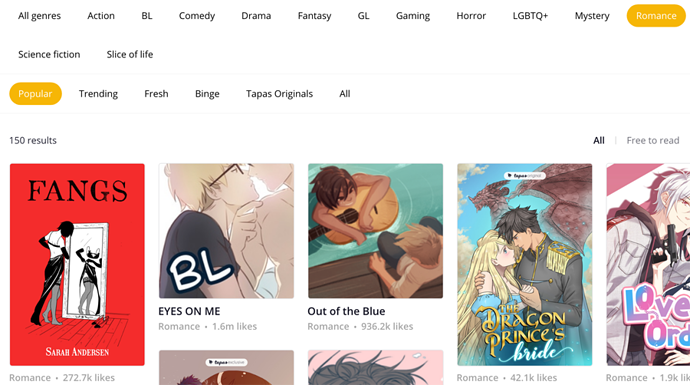
You'd have to fix things like the longer load times, the unresponsive search, glitched and unreadable novels...just to name a few issues.

Make many changes to the layout in general, making the website less confusing to navigate.

All this work and trouble...for essentially patched up WebToon. With features like the sidebar and autoscroll still missing, I still feel the community will still be very disappointed. And some may simply not bother waiting for change, and simply up and leave for WebToon or other webcomic sites. Websites they know at least will work reliably.

And that's kind of what's happening with Smackjeeves. The December update brought a Webtoon-like redesign that stripped it of many of it's unique features (namely custom sites) and made it significantly harder to find comics (having removed many search options). So many have simply left.

So I feel the best option is to simply revert to the previous design if possible. That way, we have a website that we know at least works, and is well regarded by the community. We won't have to fix the issues like the novels not loading properly. We won't have to hope the community learns to like the new layout.

Simply put: All of this just works!

Now, with a reliable platform in hand, all that's left to do is add new features the community wants or will probably like, such as dark mode. With prior testing and community input/warning, there really shouldn't be any issues from here on out.

We apologize for the bug that has caused this issue - the reformatting issue that has been affecting novels is one of our top priorities right now.

This wasn't part of my patch notes - I will look into this. NSFW content is perfectly fine to be promoted on the web.

We continually promote series within the staff picks to help bring more awareness to a diverse range of stories - we've featured over 100 series with less than 100 subs in this section this year alone. We also have the New & Noteworthy section which updates at a more rapid rate. Please relax with this narrative - we are and have always been supporters of up and coming creators.

Our comics stopped appearing there so I was wondering if there was something wrong.

I'll definitely look into it - that shouldn't be happening. Can you link me to your series so I can take a closer look?

Yes, but correct me if I'm wrong, that's mostly good for new comics and those that catch the eye of staff.
what about other comics which have been around for a while and got overlooked?
How are they getting visibility?

I'd like to add that the 24/h rule has been removed from free comics too. This makes it hard for new/small comics to even have a chance at ever reaching the popular page I imagine?

Actually there is a lot of platform that have a bifurcated experience. They just aim for parity in core functionality not in design or device specific functionality.

You don't treat desktop and mobile the same way. I can understand that the website backend was getting hard for you to update, but for us user the frontend was doing great.

Maybe on your end you gain a lot in term of ease of dev, maintenance etc, but on our end we have lot a whole lot. and unfortunately right now you are giving us a school case of "devs have strictly no idea what user need and implement things they think user need".

From where I am it looks like you've put all your egg in the same basket (mobile) and try to adapt your website around that.

If I'm not on webtoon and have actively tried to discourage creator to leave tapas for webtoon there was a good reason. And now I'm not anymore on tapas I'm on webtoon bis.

I've been here since you guys were named Tapastic before you even launched the Tapas mobile app. I've not always agreed with you guys but overall the experience was always good and I could acomodate to the change. But this time I'm sorry I'm seriously considering leaving tapas because this time most of the functionalities I stayed for are gone.

What is preventing a rollback to the old design? That's not done often with websites, but with how unpopular and problematic this update is, fixing all its issues just seems like upgrading a Ford Pinto to being fully electric: At the end of the day, you're still left with a lemon.