I really like your style! I'm a big sucker for fantasy armor and weapon designs, huehue.
I think I have to agree with @HollowEve that the necks are a bit too long, and their heads are leaning too far away from the body. Here's a quick reference I found on twitter that might be helpful.

Man, drawing humans is a pain, I didn't get a single complain about the Forest
Not so long ago, my necks were too short, now they're too long
Anyways, this is not my main comic. this is just a one-shot I wanted to draw. I think the clean style makes my mistakes stand too much, I think I'll go back to the sketchy style...
y'all need geeezture draaaawiiings
false!, look up some medieval armour videos, full plated armor is a lot less restrictive and more flexible than movies, or manga in this case, would lead you to believe =P
*studies too many armor videos for his comic
in fact if it was that restrictive nobody would use it, since they could not move effectively or quickly in battle, and believe you me in real medieval combat speed and flexibility is a must
What @IdiotWithPencil said. Armor has been used for centuries and contrary to popular belief, if you've fine through enough training for them to even hold that sword beside them, full armor won't be restricting at all. Also, I don't know much about your comic but Berserk definitely had fantasy elements and the guy was boss so I can't really tell if your character would be like that. Was only asking from what I was seeing.
yep =P between two people who have comparable skills if one is completely armored and the other one isn't the one with armour would win 9 times out of 10 if we are talking about swords of course, if she had a hammer and shield that would be another story (hammers cave plat like butter and the shock is absorbed by the body)
I know that feeling too well xD first i did too smal noses and now they are too big... But don't worry and keep on drawing and improving. Even though its very frustrating sometimes you still will improve. Look back on some older stuff and you will see btw. I really enjoy the forest and how balanced the details are.
So I think you mostly just need to brush up on proper anatomy. I get the feeling you've either learned largely from looking at other drawings or you just haven't spent enough time drawing realism. In addition to gestures and life drawing, I'd suggest taking the time to draw skeletons, muscles on top of them, then the skin on top of that. That sort of break down can go a long way in teaching you how things work.
The reason your pic here looks "stiff" because the pose isn't very natural for sitting and the weight distribution is off. You kind of have an in between going here--to look natural, the person should either be leaning back or forward more. Here's the example I drew:
Personally I think 1 looks best. A person's center of gravity is at their core (hip area, about) so in order to balance, their weight has to be distributed across whatever limbs they're using.
The other thing I noticed is that the armor doesn't... look like armor? You have lines that kind of insinuate it's supposed to be armor, but there's no structure to it. It almost looks like they're wearing a shirt with lines printed on it. D: To fix this, you have to make it look a little more rigid and give the plates proper space on top of each other, like this:
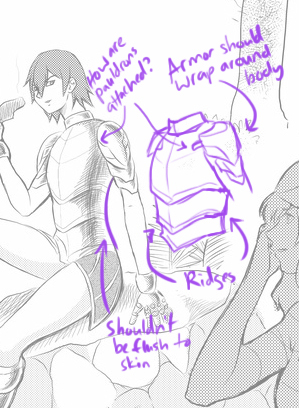
Rather than JUST thinking about the design, also try to imagine how it wraps around the body and even how it's constructed or held together. It'll go a long way in making it look more believable! That goes for regular clothes, too.
I would have to agree with @revisionstudios, I see the same thing going on with the greaves. Here is pics of armor7 for reference because I can't show you what I think is wrong as i'm not an artist.
My suggestion would be to work on your compositions. I made a few suggestions here:
In the upper panels, I completed the alternating high/low text and subject, because that serpentine path is good for variety. For the main subject, I pushed the near far by making the foreground subject bigger and closer, and the middleground figure a bit further away (and I put both of them in rule-of-thirds hotspots). I used the background to make a frame around the middle ground figure, to really emphasize the reveal of them being present. And I created as many visual pathways as I could think of to draw the eye to them. Just some changes I would have made at the thumbnail stage; there's no right and wrong in composition, but you can always push them to be more effective, and there are some basic techniques that generally work.
I've made some changes in the page, didn't change the poses or the composition because it meant to change it all, I'll try to apply it on the next page.
Btw, in case you wish to read the comic, you can see the previous 13 pages here1
Further on, the story will become very bloody, so, you've been warned