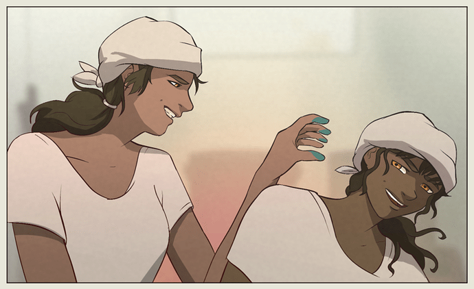
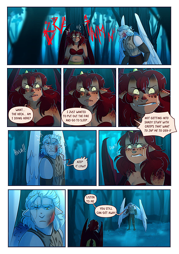
I went out of my way to try and make Alchemist Burn Outs feel like a unique nostalgic experience, actually. It's not my "artstyle" persay, because my style changes depending on the project, and even in this comic I like to change it up occasionally and do color.
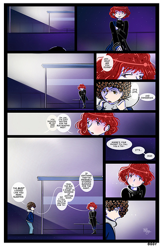
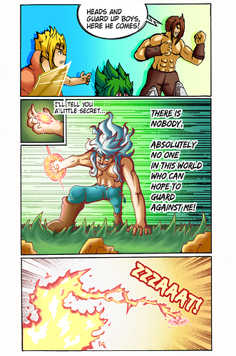
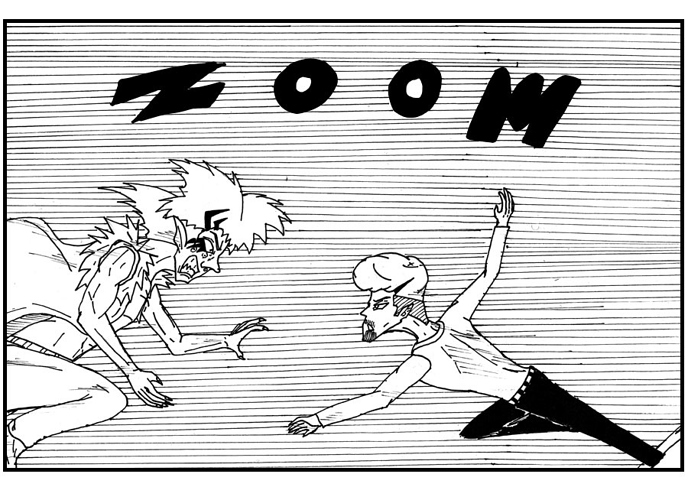
And it was a learning experience for sure. I wanted to reference things I enjoyed in more European comics like Tintin with it's simplified art style and in Sunday comics I grew up reading where you really only had linework and that was it (which is largely why everyone has blank eyes.) But to mix it with some interesting compositions that I enjoy in western page format comics that break the panels and allow sequences to sort of flow into eachother.
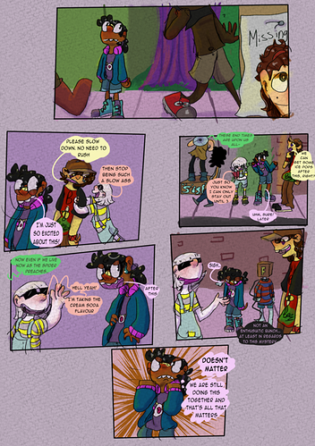
also it's a graphic novel based on a book, so sometimes I just had a lot of text, and I really wanted that YA novel experience so I left it in there.I had to really learn to take advantage of graphic design to try and keep it from feeling like it was a chore to read that text. To keep it booklike but also...comic like.
At least that was what I was trying to do, whether or not I acheived it--eh.
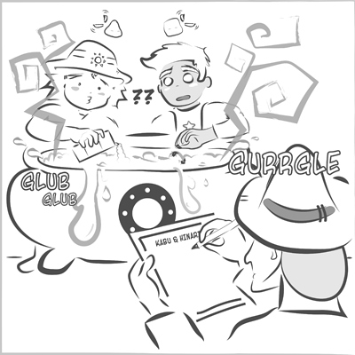
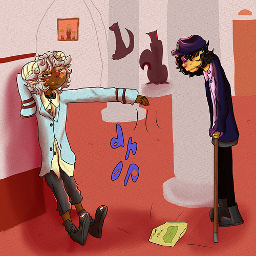
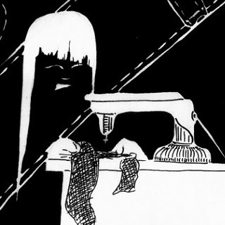
Like I really just wanted to see what happens to a comic when you take out all the details--and you're left with still...just so many possibilities. I was hiding behind details for a long time so it was a good exercise for me.