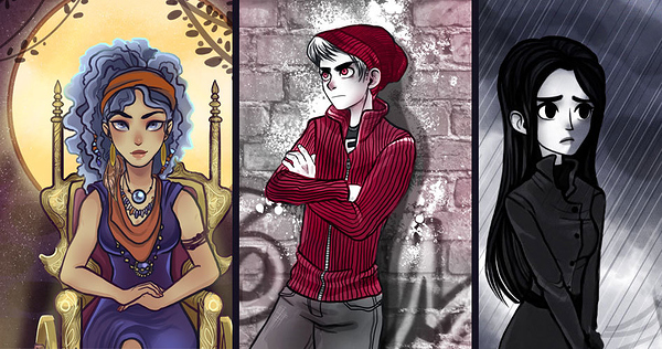
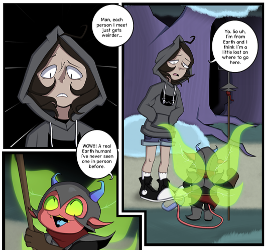
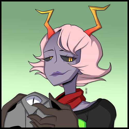
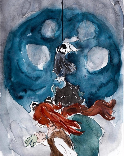
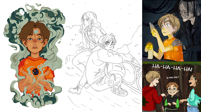
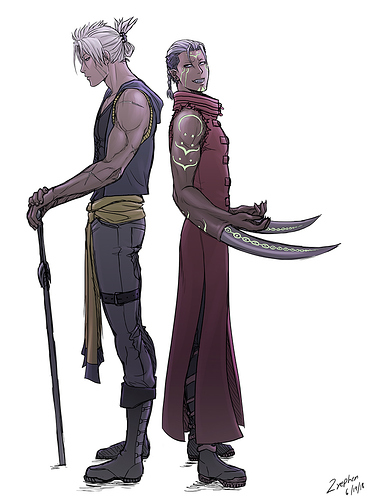
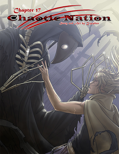
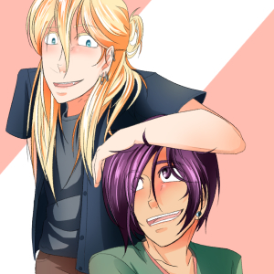
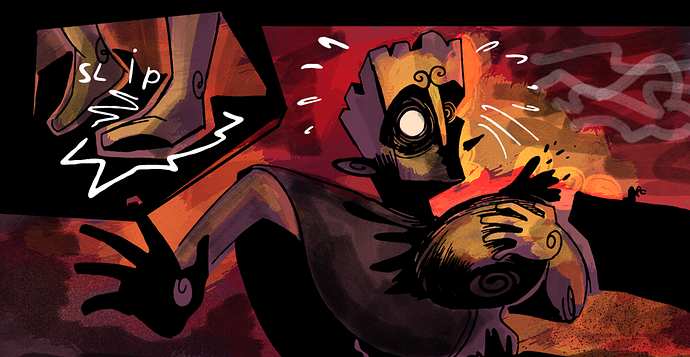
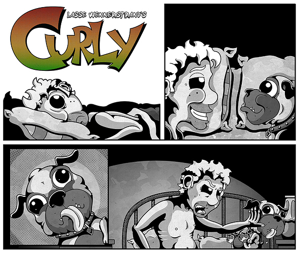
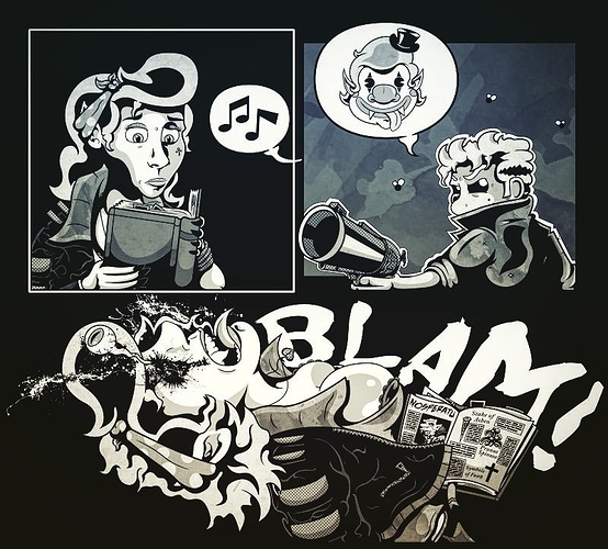
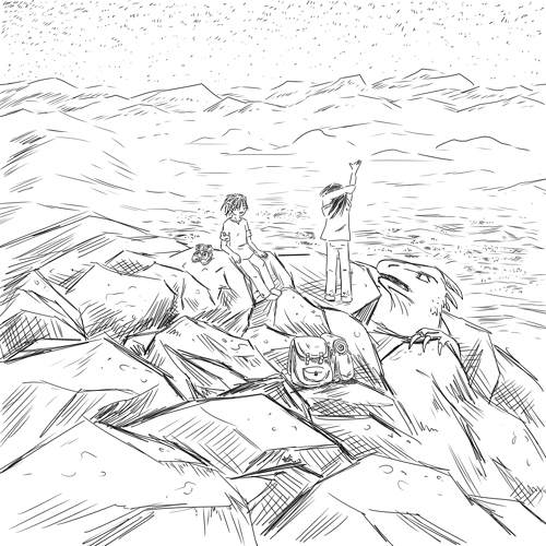
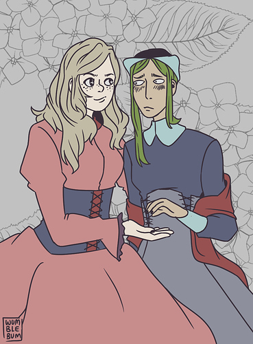
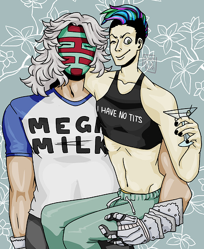
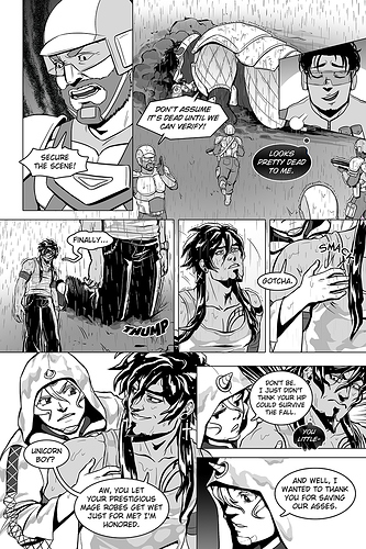
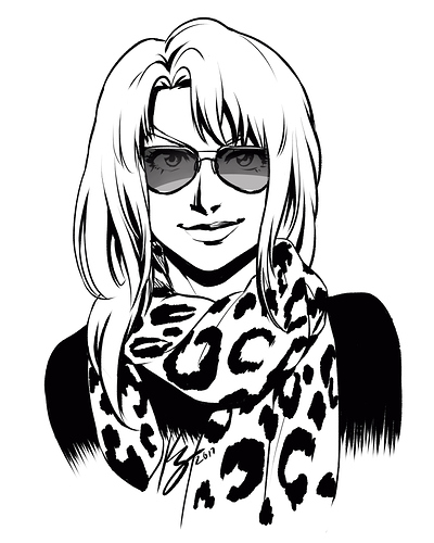
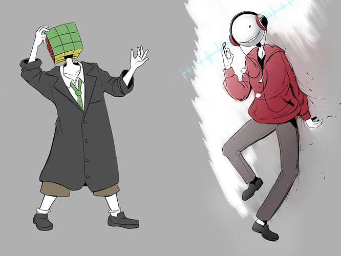
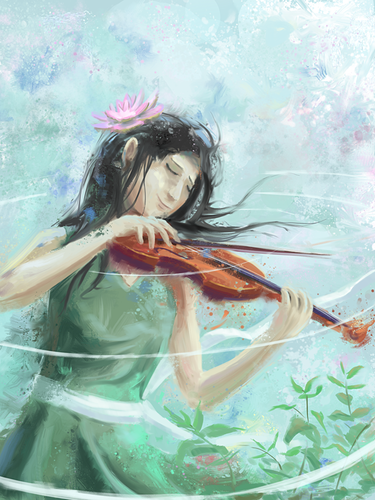
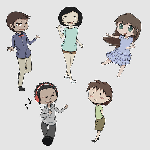
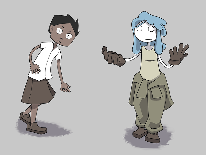
My style was from the very beginning, of my current webcomic, very noir-inspired with a lot of heavy blacks and shadows. I love using thick outlines and silhouettes. I often add several layers of greys, brushes, and blacks to achieve something that I am satisfied with. As for the characters, I go with a cartoony, stylized look since I just can't draw realistic humans... 
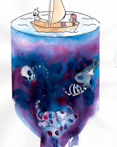
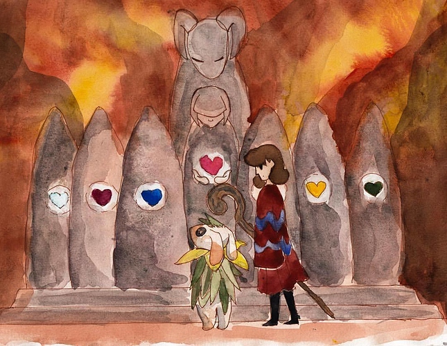
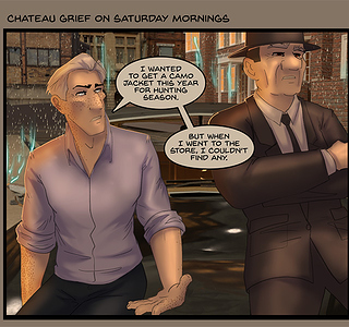
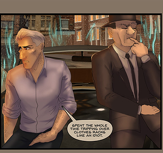
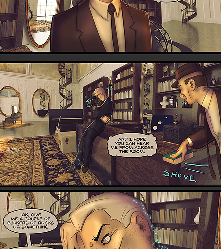
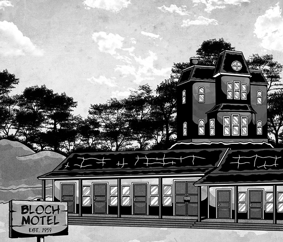
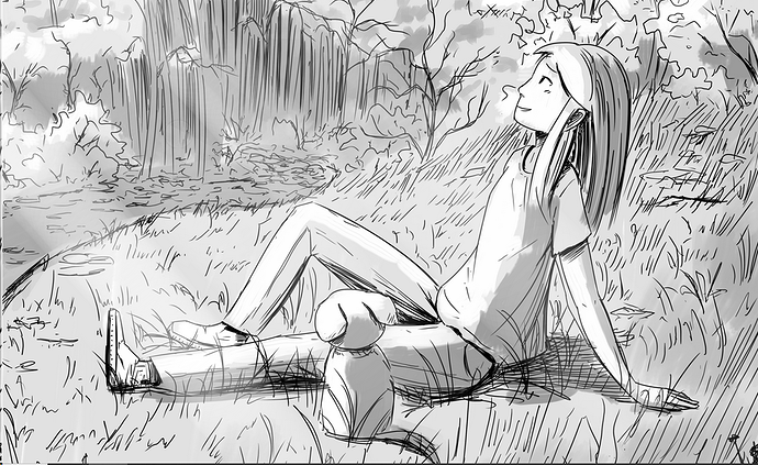
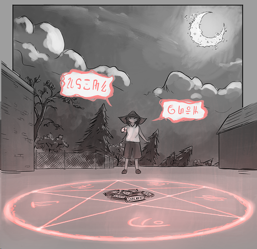
I do struggle with different perspectives and my archnemesis by far is backgrounds. Something I am trying to work with, but it is hard. Currently, I am reading Boku No Hero Academia, and they have such beautiful background art so that is where future inspiration might come from. In one of my recent chapters, I did some nice little homages to Psycho, both the book and the movies. My comic has tons of discreet pop culture references and homages in it. Backgrounds are hard though because they take much time and skill to create and not become distracting. Most often I nowadays try to use them as establishing shots and then cram one or two into a page.
One thing I recently realized is that I use a lot of "talking heads" which is a bad habit. I do not like when characters talk too much during a fight scene but hell, I need to start giving them something to do while talking! So yeah, need to improve my secondary action work. 
When it comes to action scenes I try to come up with interesting perspectives and sometimes I succeed, other times I do not...
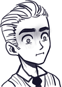
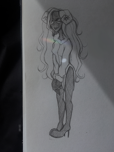
Next thing I am going to focus on is head shapes, I really need to get better at working with basic shapes to create unique heads and bodies more.
There is so much that I want to improve upon, but there you have it, my style in a nutshell. A black-and-white mess of thick lines, black backgrounds, and silhouettes! Sorry for the wall of text guys, I might been a bit carried away