1 / 8
Jul 2021

The outline is black, or some very dark shade of color to give it that softness. But the problem: your character's color pallette is also very dark! The result is that the internal linework gets lost on it. What's the best way to overcome it, especially if you can't afford any complex shading that would show structure the "normal" way - via intricate semi-realistic light and shadow play?

I've tried to just invert the color and make internal lines bright, but it just doesn't look completely right (especially if there's a normal bright character right next in frame), and the parts where the internal white line must become external dark line (For example: a character's arm is in front of their leg) always look off and artificial.

  • created

    Jul '21
  • last reply

    Jul '21
  • 7

    replies

  • 4.4k

    views

  • 7

    users

  • 9

    likes

  • 1

    link

I just tend to go for a 'grey' colour rather than dark black, to ensure I still have room to push shadows and keep the lineart visible. If the rest of the scene is lit normally, the grey will appear black to the viewer. I'll drop an example below.

If something needs to be utterly jet black, I still use dark lineart, but I'll push highlights rather than shadows. This works really well on dark shiny stuff, like leather, or metal. I don't have an example for that, though.

I've been testing out a few different art styles, and for one of them I had a similar problem. I just ended up using a darkish grey because I found the white too distracting. I still haven't really found a perfect solution for it but eh. It works :ok_woman:

Agreeing with @Kaydreamer and @sorible as I've done both of the above. Depends on the situation, of course.

But sometimes I personally think it's ok to have all black coloring with all black line art like where a solid black shirt in most cases just cannot be done justice (even in real photography) with gray substitutes.

This is my most recent work that has the black coloring issues met with either gray tones or solid black on solid black: (guy on the right)

For my characters that are dark but I want less shading, I put a line of light right next to the dark line to make it pop out. Like, ignore the shadow stuff going on in this one, since you're not interested in that so much, but on the darker bits on his hair and claws here, I put down a few lines just to make it pop away from the outline. Like it looks like it's lighting--but it's not. I'm just kinda putting that light in the hair only to make those lines show. (and you can compare it to where I didn't do that on the horns, to see how it looks otherwise. The horn color is the same gray that is in the claws.)

And also a thing I do on this bear--I almost never do natural lighting on this bear, just outlining. Which, honestly, outlining still takes time, but otherwise her features get lost.

Ah, the "you don't HAVE to lit your characters absolutely physically correctly" is a lesson that I am yet to accept, unfortunately. XD

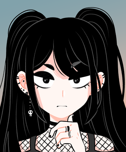
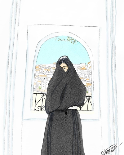
I have a character whose hair and clothing are always pitch black, and I mostly use grey lineart where the shape needs to be defined, like here defining the border between clothing and hair. There are parts where the lineart doesn't have to be visible, like the hair that doesn't meet the clothing (or overlap other parts of hair) - on a dark background this would cause the character to blend in, but for this particular character, it's actually the effect I want. Might not always be desirable for every character though. :sweat_smile:

Since different parts of the lineart are colored differently, this involves some extra work but it's the best way I found to go about this, I guess.

38