This is a good idea!!
@jensrichard77 On the first impression the comic looks like as if it's been done real quick with Paint by a kid. But that's a lie.
------The jokes are clever, I really liked the banana one! And the robot strip where blue is fixing panel borders! And the 'kneeling?'! These could be short animations in TV! 
------The simple style works great for the jokes. You don't have to spend time wondering "what is that", so the reading is fast and comfy. On newest strips the art looks even better. The strips with no outlines (like the ufo) look really good! The thinner outlines like in "going dark" make the comic look much more professional.
------I think the font is the biggest 'no' to me, and causing the bad first impression. It's easy to read, but also pretty cold. Maybe a bit rounder font would fit better?
@Tamachii The comic's logo kinda remind me of Final Fantasy's logo. I don't know whether this is intentional or not. In case it's intentional, it probably means there will be something final fantasy related (like padody) coming up? In case there is nothing Final Fantasy related, it might be better to change it more personal.
The text is hard to read at times due to small size. There a lot of characters, so you might want to draw a bigger panel when someone important appears. That way reader knows this is someone who they better remember/someone who will play a role in the story.
Also when drawing, try to use both thin & thick lines. Also solid black could be great at times.
Like on the newest page, all the lines are thin. This is one reason, why the mountains seem to be "standing" very near to the characters. Maybe mountains should be white? Or if you want to have lines of them, make some part of characters' clothes black and outlines stronger than mountains'. Also mountains' lines could get thinner and then vanish as they reach the bottom of mountain.
Maybe look for reference from a manga you like and/or which has same scenery like your comic. For example, 'Inuyasha' has mountain and forest sceneries and contrast between white & black.
If you don't want to let go of using lines, 'Naruto' has good examples how to use them.
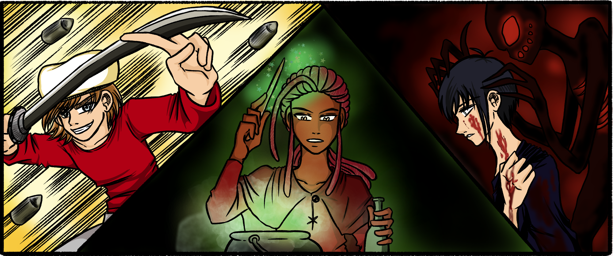
Here's a comic I'm working on
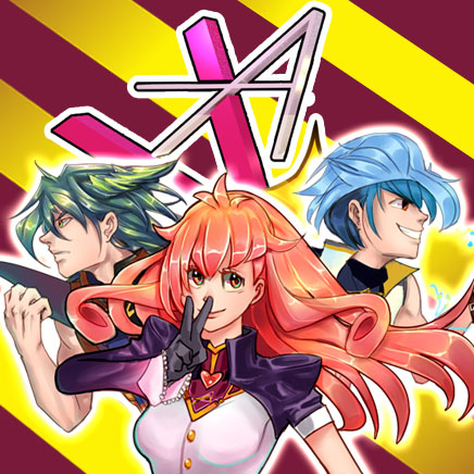
And here are my sister's comics. She's not here on the forums, but would like to receive feedback