58 / 258
Jun 2021

I guess I'll take part too!

Will I click on it?
I may, but I most likely won't.

What's my opinion?
It looks nice, and the character has a very cute design. I particularly like the clouds or mist in the background, they make the cover feel very ambient.

What could be better?
As it is now, the colours look a little muddy and because of this, the image stands out less than it could. Upping the saturation could solve this. Also, I feel like a more dramatic perspective would make me more inclined to look at your story.

100% honest opinion?
From looking at the cover, I imagine it to be a story which starts off as deceptively silly but then takes a darker/sadder turn around the corner. The cover art does remind me a bit of a kids show, so maybe something like Gravity Falls?

Here's my series cover.

This is a neat way to get feedback :slight_smile:

  1. Will I click on it?: I actually did click on it when I noticed it in the "fresh" section about a month ago, so my answer would be 'yes'. I click on pretty much everything new that pops up in the fresh section.

  2. What's my opinion?: When I saw your cover, I thought it would be an adventure type story. The chick has a determined Rambo-like expression and it's clear that they are leaving their home. So from a quick glance, this is what I thought your story was going to be about.

  3. What can be better?: There is a lack of depth perspective when it comes to the background. Everything seems to be on the same line of sight making the treehouse look like it's too close to the chick and small.

As for colours, the chick does draw the eye to it as the focus of the story, but without contrast everything blends together. Having the chick's colours more vibrant will help it pop out more.

  1. Honest opinion: Personally I like the rambo-chick character design. It's simple and your artistic eye understands proportion which is great! I also like how you've partial hidden your name in the grass, it's a nice touch :slight_smile:
  • Will I click on it

No.

  • What's my opinion

It looks like a comic for children. But if that's what you're going for then good job.

  • What can be better

Work on the structure of your drawings and make sure everything looks right from the very start of sketching it.

This should be interesting.


coloring is one of my weaker points but am trying some ways to improve the contrast and possibly having smoother colors, currently i am doing full reworks of the comic before #7 , the first 3 are a long prologue for the main story based on what you said i am thinking i might want to separate them from the main line, seeing it is a massive jump ,but i do thank you for your input absolutely i have some ways to go , in time they will be better ,and I hope you will read it some for your own enjoyment as well,

Will I click on it
I don't feel I am the target audience - so honestly, I don't think I would.

What's my opinion
The artwork gives me the impression it is a light-hearted fun book aimed for preadolescence.

What can be better
Maybe a different font, in my opinion. I quite like the art style - however, it all comes down to what your target audience is I guess.

Now you have me wanting to read it and find out :sweat_smile:
Okay, I'm curious - I'm going in!

Update: I took a look, and after viewing a few pages I feel the cover art is appropriate and stays true to the theme and tone of your story. The cover art gives you an honest impression that doesn't compromise your readers expectations. I like it.

13 days later

Will I click on it
- Most likely no, but there is a slight chance I would

What's my opinion
- Looks like it has to do something with mother/son relationship in medieval setting. Which is not something I would read any day, only if I feel like it. Also the artwork is kinda cute.

What can be better
Lighting on characters hair is a bit of other thing are fine I think .

Regarding my comic it can be for kids but I made it so it can be for all ages really xD

Thank you for all the critique I was reading comments of all the people that answered and it help a lot
, will definitely fix some thing. I did that cover few months ago so now I have more experience with art . :smiley:

Good luck on your comic journey

Will I click on it
Maybe

What's my opinion
Hero on some kind of journey in snowy area. Which sounds nice.

What can be better
Work a bit on the human anatomy. Head looks to small and he doesn't have an forehead. Perspective is also a bit of but I'm bad at perspective myself xD

Also it would be great if you would post a link to your comic :slight_smile:

As for my comic it doesn't have anything to do with Metal Gear but I was listening to Mgs soundtrack while making cover xD. It has some metal gear like scenes which aren't made yet but nothing that's true mgs reference.

Good luck on your comic journey :smiley:

Will I click on it
Maybe

What's my opinion
It looks like some medieval setting which isn't my kind of thing, but from time to time I would watch that kind of movie but comic not sure. Maybe I would like it if I start reading it which I would probably try. The main character isn't really appealing to me and that's important to me. Because he should be the start of the show.

What can be better
His little finger is to big and the hand is a bit off, they are the hardest thing to draw xD
Sword looks a bit wonky probably because of choice of the perspective and how he is leaning to it like it's a feather.

As for my comic it has comedic moment but is more focused on mystery. It is for all ages more like Soft Boiled from Visual Writer or Brutus and Pixie from Pet foolery
I will definitely work more on my cover I done it few months ago anyways

Good luck on your art journey :smiley:

Will I click on it
Maybe yes depends what kind of comic I want to read, but I would most definitely save it for later

What's my opinion
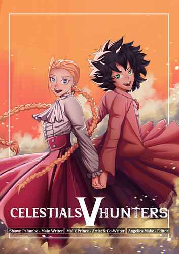
It's really cool you're making different cover for each number and it's impressive that you done all of them already :smiley:
Looks like high school slice of life story. Which could be interesting depends a lot on story itself. I watched a lot of anime this time some are great some are really bad. I really like how many details you put inside his room it gives a room lots of life. The kitty design is cute. You can look at this cover for a while and appreciate all the details. Really great work.

What can be better
Dunno really xD, shading could be done better but it looks to me like artistic choice.

Also put on the link for your comic :slight_smile:

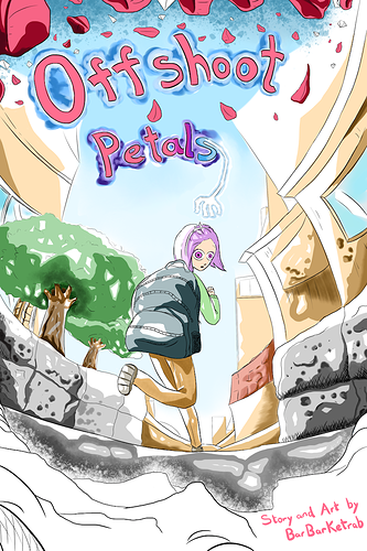
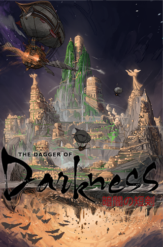
As for my comic you're not that far off I'm making it so it can be for all ages and it's mostly focusing on mystery of the situation the main character is in.
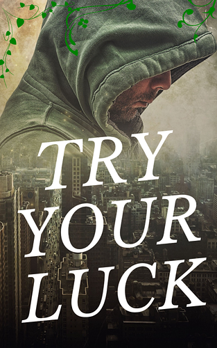
Thank you for the tip about the perspective I'm pretty bad at it xD, now that I look at the cover again I see the problem and I did this cover few months ago will definitely fix it up :smiley:
I can't add road, fence or cliffs because there is none near him. I can add grass though.

Good luck on your comic journey :smiley:

Will I click on it
Nope

What's my opinion
It looks like romance kind of story which I'm not into. Characters looks cute and their overall design is nice.

What can be better
Girl eyes look a bit off.

As for my comic he's not avenging someone or training for martial arts nor does he leave his home xD
He leaves his home when exploring, I guess some people could get the wrong idea from the cover and I get it why, that's why the description for comics exists.
I would definitely fix the colours and some others things you guys suggested me to do which is really helpful. I did cover few months back so yeah...

Good luck on your comic journey :smiley:

I'll tell the artist who did the cover.

Is a novel, not a comic.

Thanks for the feedback

Will I click on it
Most likely yes

What's my opinion
It looks like murder mystery which I'm totally into. If not then is some other type of mystery which is also cool. Design is simple but appealing.

What can be better
Character in the background would maybe look better with black eyes and mouth.

As for my comic it is slice of life with mystery elements. So you are half right xD
I choose simple art style for comic so I didn't want to put to many details in the cover I think it wouldn't be ok thing to do.
He's not running away from home but he is going on the adventure, that's why is great you can write descriptions for your comic because I get it why can people get the wrong idea from covers xD

I will definitely fix up my perspective which I'm pretty bad at, but I can see now what's wrong from all the comments that I got.

Good luck on your comic journey :smiley:

  • Would I click on it?
    I'm not likely to

  • What's my opinion?
    Not a horrible cover, the style is cute. I'd guess it's some sort of comedy/adventure story

  • What can be better?
    The shading and color values for sure. Maybe the tree should be farther back so the character's silhouette is fully visible and then maybe lower the value a bit so it doesn't distract from the colors of everything else. The value of the grass should probably be lower too, just to make the character stand out more. Really you just want them to be the focal point, so they should contrast with the scene more than anything else. Idk the content of the story, so I'm not sure how well that font on the title works with the tone of everything, but I think it could benefit more from the title being hand-drawn. It's more difficult that way, but it usually ends up looking great and being well worth the effort