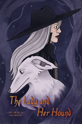
Here's The Lady and Her Hound!
And my review of your cover!
Will I click on it
I clicked because I love chickens, and like a dream of mine is to actually have backyard chickens 
**What's my opinion**
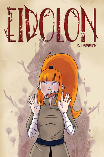
I think the art style is cute and simple. I definitely get the sense that this is an adventure story of some kind. Trying to figure out how the title plays into the image and plot of the comic.
What can be better
I think the background could use some work. I like the soft desaturated colours in the sky but I feel like it's a bit at odds with the bright green of the grass. I would probably go for a bit of a more olive tone, rather than the super bright green here. I would also maybe play around with text colour and font? This is probably just a me thing, but I think the black text is a little harsh. I think the font works for your name, but I might have picked a more whispy, script like font for the title, just to tie in a bit more with "Eternal Mist". Also I would make the tree house a little bit taller just because right now there are a lot of tangents happening with the top of the headband and the rucksack. I know that you're trying to show that your character is further away by having the tree house be smaller, but if you nudge them just a bit forward you can still have that affect with the taller tree. You can also add a bit of atmospheric perspective on the tree house. As things get further away, their colours get more desaturated and take on the colours around the horizon a bit. Think like when you look at mountains getting further away in the distance.
100% honest opinion
I think the art style of your character is really cute! I don't think all comics need a super detailed style to be engaging, and like, I love chickens, so you got me there. I want this little one to be okay and go on big adventures! I think the only the only thing that detracts, for me, is that the bg needs some work, and I just am not a huge fan of the title font.
Backgrounds are hard, so please don't feel bad though! Like I said in my comment for what can be better, I think the sky colour palette is really nice, and I do like the grass texture you added. I just think that there are some small things you can fix just to plus it up!