13 / 18
Nov 2021

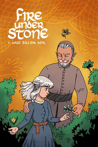
Looking for some feedback and/or suggestions; I'm definitely overthinking this. My comic isn't up yet, but I've been working on the first chapter for the past few months. Before I started drawing pages, I drew this chapter cover:

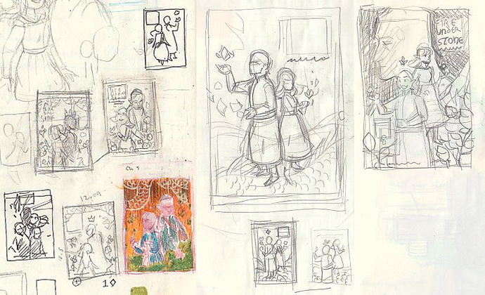
Feeling kinda meh about it tbh, definitely gotta tweak it because the character designs have shifted a bit, but I'm leaning towards redrawing it completely. Here are all the thumbnail sketches I've come up with so far:

I really wanted to do a montage kind of thing (see: movie posters, Hellboy covers), but having trouble picking one design and sticking with it. Important elements are my MC, her dad, plants for healing and :sparkles: symbolism :sparkles:, a hint of dragon. Cool but less important: a book, the king, royal summons, castle, sky. Any thoughts would be much appreciated!

  • created

    Aug '21
  • last reply

    Nov '21
  • 17

    replies

  • 929

    views

  • 9

    users

  • 18

    likes

  • 2

    links

I think this cover is really successful! The colors are bold, the silhouettes are distinct... The one thing I would suggest is making your title bigger, as it would be difficult to read when it's only an inch big on a phone screen (especially your subtitle).

I think it's really good, but I totally get wanting to redraw it after having finished the chapter and improving your drawing style. If you have the time and really want to do it. Tweaking my drawings never really works for me. I just do a complete redraw.

All your drafts look really nice.
The one on the top right draws my attention the most, but that's just a personal preference.

The sub title should be bigger, because I can barely read it, big is good and so is anatomy, maybe a bit more shading on the clothes as well while your @ it

Yesss the rightmost sketch is my fav too! I guess I'll see if I have the energy to do a whole new cover once the pages are done. It's very tempting.

You can do it!!! :grin:

I definitely recommend doing the chapter cover after completing a chapter, because you can stick small hints or Easter eggs, that you may not have considered before working on the story.

Yeah definitely going to adjust the text size on the final version! I'm trying to keep shading simple on this project, but still trying to find that sweet spot.

to me it looks good, but i need to tell you to ignore your "meh" felling because quite a lot of artists( comic and novels) redo their 1st chapter because its "meh" or "boring" or "stupid" , however i assure you it isnt bad

3 months later

Bump! New rough cover, loosely based on that last thumbnail. I'm much happier with this compared to my first cover. What do you think? Would you check out the comic if you saw a finished version of this?

I'd definitely check it out if I saw the finished cover, the composition is well-balanced and the text is large enough to read! The author name isn't the easiest to read in its current state, but I don't know if it'll look better once color is added.

WOW, truly a masterpiece in the making! I would definitely check it out! Anatomy is great, and so are the poses! Maybe try developing a background for the cover to go along with the sorties main setting? Just an idea. (Looking forward to final version!)

@oranges0da Thanks! I'm planning on white text against a dark background, so it should be much more legible in the final piece. It'll also be in a font as opposed to my messy handwriting.

@SagaHolmgaard Thank you! :smiley:

@MudKipper Thanks!! Yeah I'm not sure yet what to put in the background, but thanks for the suggestion. Maybe some sky or distant mountains.