given I use a tablet I sketch in my bubble and write in the script in the sketching stage so I know roughly how big to make them, then I draw them in with the lineart layer and color them on the flat colors layer. I usually erase any affects over the speech bubbles using the selection tool (Though admittedly on the page above I forgot to do that in one panel
For the text in the speach bubbles i use a separate text layer for each bubble and the text layers are above all the art layers
As of late, monocolor (including shading) converted into color. Like so:
Then after converting it to color, I add in highlights and fine tune the saturation, etc. If I want to do lineart, I usually do that last. Color palette is determined by mood I want to convey. Using this method, I don't really have a lot of layer, maybe 4 or 5 max?
I work in photoshop,
I use slices markup to define page size.
each panel is in group
I use separte layers for lineart and flat color.
Than I duplicate flat color - - increase saturation, decrease brightness, shift hue to warmer/cooler depending on the environment. Set it to multiply with 30-50 opacity - add mask filled with black. Than paint on MASK with WHITE to reveal wherer shadows are.
If there is special lighting in the scene i add colorfull rim light with screed\color doge blending for highlights and gradient of oppositee color with soft light
I start with text and bubbles to form the space for a drawing - I don't draw unneseccary part underneath bubbles "just in case" so not to waste time.
I merge whatever layers I can inside one panel and flatten laer styles to get smaller file size so there is no lags - with ability to change all that i need - I mean i do not merge line art with color, but i merge lineart from like different characters in the panel
As to color choise - i tried picking it from refs, but I can't find the ideal one ref for me. So I actually just bick basic solors from colorwheel (colorscheme designer) and pick complementary coolors to it.
I always check contrast value balance by having hsv layer on top of the page. to see if the characters is well distiguished from the background and the detals inside characters are notable
I found out how to make my comic the quickest for me personally and it's just sketching the characters (really badly) in one layer and slapping on the colors in a layer below. I only separate the background layers. Most the work is done using blending modes which is a bit hard to explain to beginners, but you can try googling it and the software you use to learn more! I work really minimalistic using as few layers as I can to avoid clutter.
My color palettes are also very simple and I tend to reuse them for multiple things and characters, I can just make the colors work together with blending modes in post. I prefer being a bit lazy to stay on schedule hahah
(i use clip studio paint)
I use procreate and this is the order I used
(Sketch- before turn it off)
Bubbles
Line art
Effects
Texture
Character/prop colors
Background Colors
Panels
I make use of clipping layers and alpha lock to make shading or details easier.
My comic if you want to see more of the final effect (totally not shameless self-promotion)
I do all the panels at once, section by section. I start with a rough thumbnail done many days ahead of time, then any perspective guides for the background; then I clean up the background, do anatomy sketches to make sure everyone is positioned correctly and has the right proportions, then the final sketch with outfits and everything. Then I move onto inking, sink into the depths of boredom for a few hours, flat it all, and do shading with Clip Studio Paint's default transparent watercolor and a custom square brush. Same with any lighting that might be needed, effects differ from type to type, and then I put down the text and move it all to Photoshop to create bubbles and adjustments.
It all comes from a lot of practice and learning what works though. Things like color theory took a lot of bad pages to get it right, as did learning the best brush to ink, making different brushes for objects and organics, etc. It's also good to share colors in the same scenes to have a sense of consistency even if it's a wall that appears repeatedly, I only noticed now I dropped my entire process instead of focusing on colors;;
What's cool about coloring comics is that everyone has a different system and I think even between each individual comic that the same artist makes will have a different pipeline as well, so it's good to try out stuff.
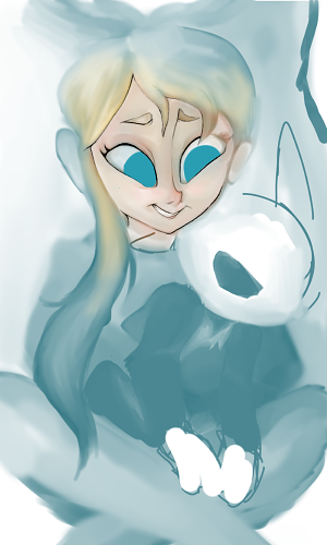
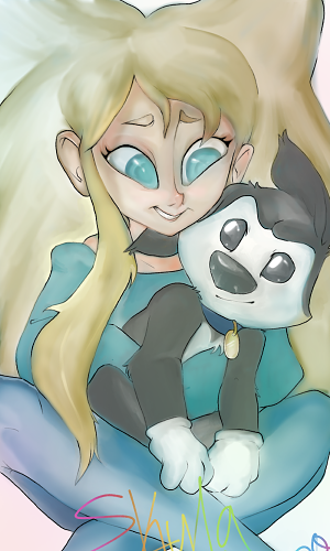
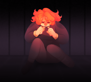
For painterly comics, I treat painting a comic exactly the same as I do painting a standalone illustration. I like to see the whole page as a large illustration rather than panel to panel. So I'll start with doing grayscale, and then doing a thumbnail of how the colors flow, and then coloring with big strokes so it all looks like one cohesive painting. It takes a while to do though, so I'd only do it for a project you like a whole real lot.
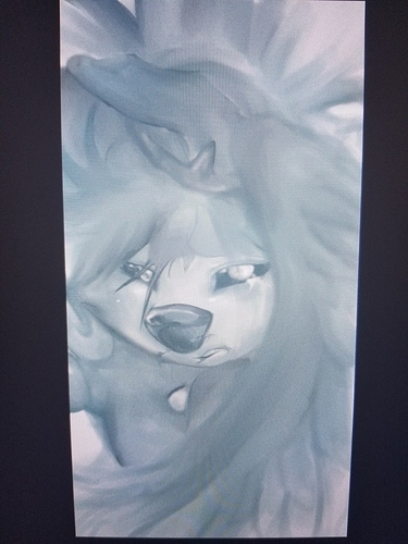
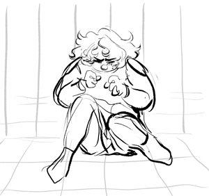
When I'm doing a lineart method, however, I save time by using Flatton (https://www.ayalpinkus.nl/cgi-bin/flatton.cgi) and what it does is you put in lineart and it puts out some computer-generated flats so you can make color selections. So I'll get this sort of thing from Flatton
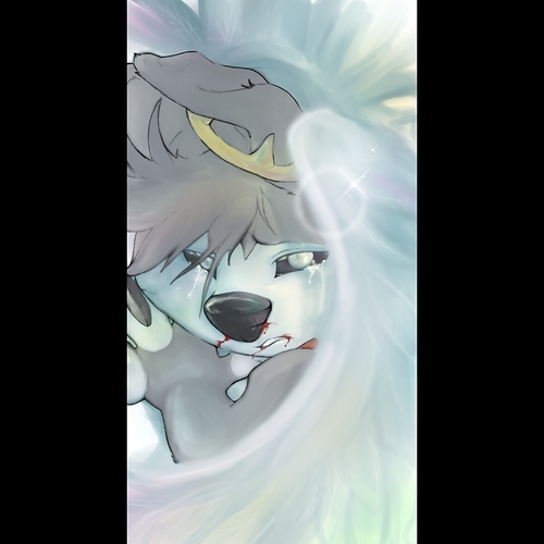
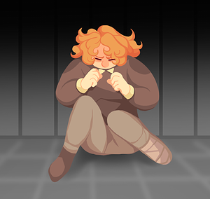
(And I usually have to fix some areas that flatton can't read, but if you have thick enough linework it works pretty well.) And then I can lock this layer so I don't accidentally modify it, and then, using the magic wand tool I can select from this layer and then do the fill for those selections on separate layers. So I can get to a finished place like this
In significantly less time. I pull all my colors from one defined palate I chose beforehand (and for a scroll comic like this one, I've already done a large color study of the whole strip, so I know what colors should be dominant where) It's a lot simpler than a full-painterly comic, despite the work being like 20+ layers by the time I'm done, but I also spend about 6 less hours making it so it's really good for something you want to do on a time budget.
It's a combination of taste, the current trends, color theory and years of trial and error. Every time I find an image online with a palette that I find interesting, I throw it in a folder for future reference. For me, it's usually movie or videoclip stills. I always try to think in terms of light and pretend I'm lightning a scene, not coloring a drawing. Otherwise I feel coloring can become a sort of paint by numbers thing. If you get stuck, or you feel you're repeating yourself, you can try a palette generator. And if all else fails, basic color theory is boring but it works. Complementary or tertiary colors are the safe bet..
Ah, I remember when I started out with digital art 5-6 years ago and I graduated from drawing MS Paint to a legit digital art program (Krita), I'd put it all in one layer. All the flats. In one layer. 10 year old azzy-m didn't know what she was doing and I can't say 16 year old azzy-m knows either.
Here is my process:
Sketching > Inking/Lining > Coloring > Shading and Lighting > Effects; for comics it'd be:
Thumbnails (rough stick figres to layout the flow of the episode) & Speech bubbles > Panels > Sketching > Lining/Inking > Coloring > Shading & Lighting > Backgrounds > Effects.
I do the speech bubbles in tandem with the thumbnails so I can properly sketch the panel (and make it match with the dialogue) without constantly switching to my Google Docs.
How I go through it specifically is kind of like... I will only go to the next step if ALL OF THE PANELS are x. For example, I only start inking my panels when I've sketched all of it.
Oh god, this really isn't a good explanation but - I just.... do it. Like I have a rough idea of what the characters would look like, and sometimes I'd do a trial-and-error and experiment with colors on sketches.
I'm gonna be real with you - I'm better at explaining anatomy (even though I'm no expert at anatomy either) than coloring. My coloring skills are fucking trash, lmao.
I use lots of layers while coloring- not a crazy amount, but I'll have one folder for Characters (and other foreground elements, might include objects on a table, or foreground foliage/other framing elements, etc.) and another for backgrounds, and within each of those a layer structure something like:
- highlights (for the pure white dots and lines on shiny things, eyes, metals, etc.)
- Light 1(for like the opposite of shade, areas catching the lighting in the space. Like the glow below, usually overlay or soft light layer style)
- Light 2 (if I want to use multiple layers of lighting)
- Glow (on some light layer setting, sometimes overlay, sometimes soft or hard light- this is mostly because I draw a lot of glowy magic xD)
- Shade 1 (multiply layer)
- Shade 2 (if I want to use multiple levels of shading)
- Flats
I like to use lots of layers while doing digital art partially because I shade similar to cel shading, and thus can get away with it, and also so that if I mess up on one layer I don't have to redo a bunch of stuff to fix the other parts. The easiest example to point to is the Shade layers... up until recently I would just do all of my shading on a single layer, but then if I accidentally colored too deep with a darker shade I'd have to grab the lighter one again to go back in and fix it, and with multiply on I couldn't just easily eye drop the layer without going back to normal mode and... eujkfld;sajk I'd rather just have 2 layers so I can just erase the darker shade without having to mess up the lighter one if I need to xD
I haven't done a lot of finished drawings lately... but here are some recent ones that I thought turned out nice
Suggested Topics
Topic | Category | Replies | Views | Activity |
---|---|---|---|---|
New Tapas Layout | Questions | 11 | 845 | May '24 |
Those of you who hit 50-100 views on your story, how do/did you feel? | Questions | 7 | 361 | Apr '24 |
How many stories/series do you usually work on at once? | Questions | 28 | 883 | May '24 |
How much is too much for a chapter? | Questions | 6 | 324 | Aug '24 |
Locked Chapters? | Questions | 0 | 125 | Aug '24 |