
That seems a lot simpler than what I thought, haha, I guess I'm just over-complicating it! That's a neat way to color!
( I use photshop but this should work with any comics that use layers)
I generally have a top layer thats my line art.1 layer for the flat color, a layer above that for shading and another layer if theres any lighting affects/ highlights
sometimes if my backgrounds are gradients or patterns I'll temporarily make an extra layer under the colors and then merge them once I have the background in.
so in short it looks like:
lineart
Effects
shading
Colors
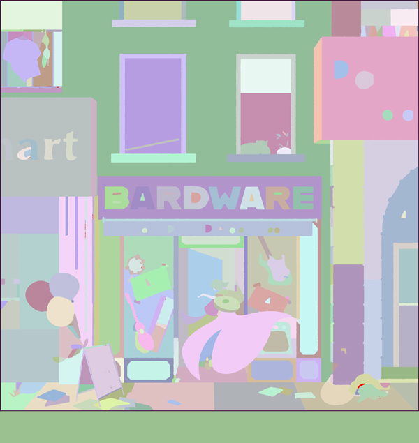
While all pages utilize this stategy heres one from my comic TLC that shows off all of them (As I don't always use effects)
Nice! (8 hours before liking again, ugh) thats super helpful, as a fellow photoshop-user, but when do you put in your text bubbles? So you sketch them out first, because thats what i did, but I don't really know where to go from there...
Layers are definitely your friend and make life a lot easier. The most important thing is a pipeline that looks decent but you can achieve in a reasonable amount of time. I know I'm never going to be able to have the kind of complex colouring seen in something like a Marvel comic with a dedicated colourist, but people seem to like the look I have going with my comic well enough.
I mostly use soft texture brushes in muted colours for my backgrounds and a light edge highlight on my scenery, then I have layers for non-scenery backgrounds that are just coloured textures (usually cloudy, grunge or hatching type textures). Finally my characters use flat colour fills, with shading only done on parts like the skin and eyes, with a layer above that is clipped to the character colour layer (in Photoshop, put the layer above your colours layer, alt-click the colours layer, in Clip Studio, it's one of the buttons in the layers palette that says "Clip to Layer Below") set on "add/glow" that's an edge highlight (my inspiration for this reliance on a strong edge highlight was the movie "Enter the Spider-Verse")
This leads to a look like:

Oh that's really cool! Thanks for telling me the brushes you used too, 'cause that was on my mind as well.
given I use a tablet I sketch in my bubble and write in the script in the sketching stage so I know roughly how big to make them, then I draw them in with the lineart layer and color them on the flat colors layer. I usually erase any affects over the speech bubbles using the selection tool (Though admittedly on the page above I forgot to do that in one panel
For the text in the speach bubbles i use a separate text layer for each bubble and the text layers are above all the art layers 
Thanks! For some reason I never really thought of just having a layer on top of the rest of them for speech bubbles, so that really helps!
But how did you guys determine which colors you were going to use? Like in general, throughout your whole comic.
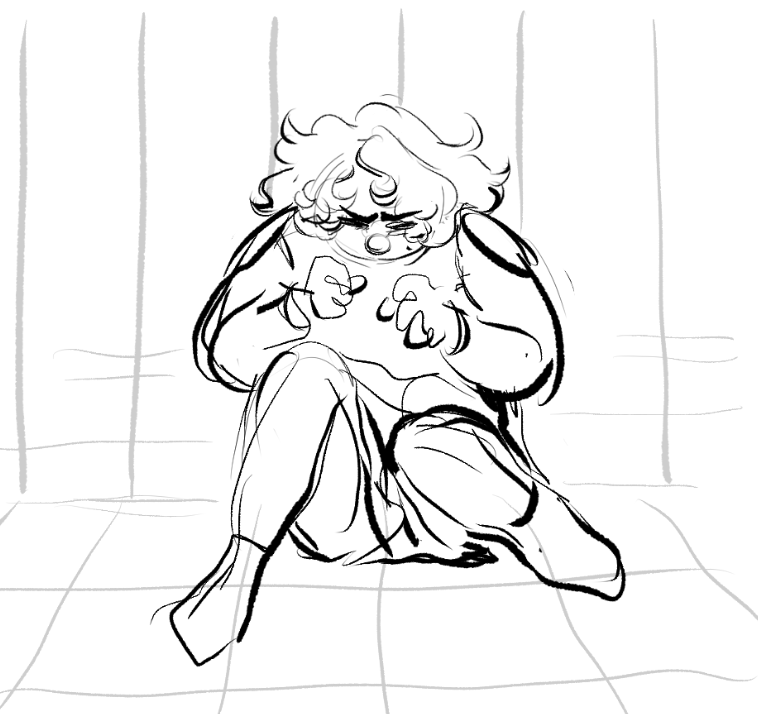
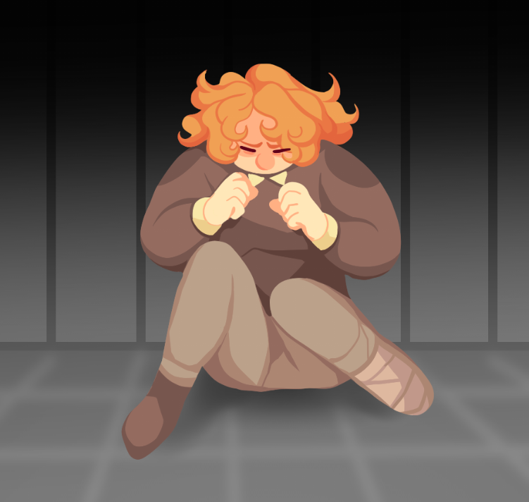
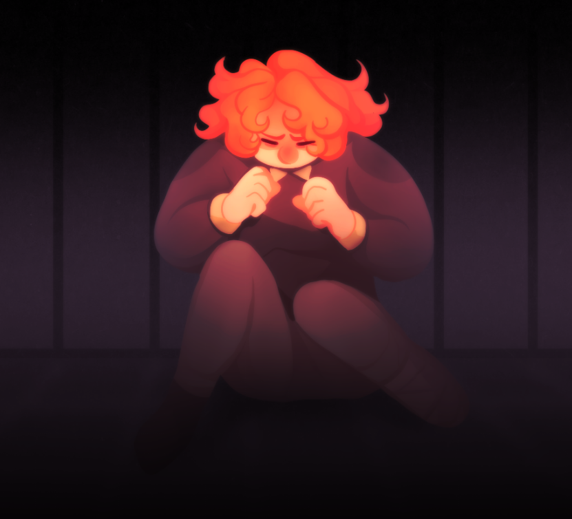
As of late, monocolor (including shading) converted into color. Like so:

Then after converting it to color, I add in highlights and fine tune the saturation, etc. If I want to do lineart, I usually do that last. Color palette is determined by mood I want to convey. Using this method, I don't really have a lot of layer, maybe 4 or 5 max?
I work in photoshop,
I use slices markup to define page size.
each panel is in group
I use separte layers for lineart and flat color.
Than I duplicate flat color - - increase saturation, decrease brightness, shift hue to warmer/cooler depending on the environment. Set it to multiply with 30-50 opacity - add mask filled with black. Than paint on MASK with WHITE to reveal wherer shadows are.
If there is special lighting in the scene i add colorfull rim light with screed\color doge blending for highlights and gradient of oppositee color with soft light
I start with text and bubbles to form the space for a drawing - I don't draw unneseccary part underneath bubbles "just in case" so not to waste time.
I merge whatever layers I can inside one panel and flatten laer styles to get smaller file size so there is no lags - with ability to change all that i need - I mean i do not merge line art with color, but i merge lineart from like different characters in the panel
As to color choise - i tried picking it from refs, but I can't find the ideal one ref for me. So I actually just bick basic solors from colorwheel (colorscheme designer) and pick complementary coolors to it.
I always check contrast value balance by having hsv layer on top of the page. to see if the characters is well distiguished from the background and the detals inside characters are notable
Nice! That's really helpful, especially the part about having little highlights on the edges of things.
I found out how to make my comic the quickest for me personally and it's just sketching the characters (really badly) in one layer and slapping on the colors in a layer below. I only separate the background layers. Most the work is done using blending modes which is a bit hard to explain to beginners, but you can try googling it and the software you use to learn more! I work really minimalistic using as few layers as I can to avoid clutter.
My color palettes are also very simple and I tend to reuse them for multiple things and characters, I can just make the colors work together with blending modes in post. I prefer being a bit lazy to stay on schedule hahah
(i use clip studio paint)
I use procreate and this is the order I used
(Sketch- before turn it off)
Bubbles
Line art
Effects
Texture
Character/prop colors
Background Colors
Panels
I make use of clipping layers and alpha lock to make shading or details easier.

My comic if you want to see more of the final effect (totally not shameless self-promotion)
I do all the panels at once, section by section. I start with a rough thumbnail done many days ahead of time, then any perspective guides for the background; then I clean up the background, do anatomy sketches to make sure everyone is positioned correctly and has the right proportions, then the final sketch with outfits and everything. Then I move onto inking, sink into the depths of boredom for a few hours, flat it all, and do shading with Clip Studio Paint's default transparent watercolor and a custom square brush. Same with any lighting that might be needed, effects differ from type to type, and then I put down the text and move it all to Photoshop to create bubbles and adjustments.
It all comes from a lot of practice and learning what works though. Things like color theory took a lot of bad pages to get it right, as did learning the best brush to ink, making different brushes for objects and organics, etc. It's also good to share colors in the same scenes to have a sense of consistency even if it's a wall that appears repeatedly, I only noticed now I dropped my entire process instead of focusing on colors;;
What's cool about coloring comics is that everyone has a different system and I think even between each individual comic that the same artist makes will have a different pipeline as well, so it's good to try out stuff.
For painterly comics, I treat painting a comic exactly the same as I do painting a standalone illustration. I like to see the whole page as a large illustration rather than panel to panel. So I'll start with doing grayscale, and then doing a thumbnail of how the colors flow, and then coloring with big strokes so it all looks like one cohesive painting. It takes a while to do though, so I'd only do it for a project you like a whole real lot.
When I'm doing a lineart method, however, I save time by using Flatton (https://www.ayalpinkus.nl/cgi-bin/flatton.cgi) and what it does is you put in lineart and it puts out some computer-generated flats so you can make color selections. So I'll get this sort of thing from Flatton
(And I usually have to fix some areas that flatton can't read, but if you have thick enough linework it works pretty well.) And then I can lock this layer so I don't accidentally modify it, and then, using the magic wand tool I can select from this layer and then do the fill for those selections on separate layers. So I can get to a finished place like this

In significantly less time. I pull all my colors from one defined palate I chose beforehand (and for a scroll comic like this one, I've already done a large color study of the whole strip, so I know what colors should be dominant where) It's a lot simpler than a full-painterly comic, despite the work being like 20+ layers by the time I'm done, but I also spend about 6 less hours making it so it's really good for something you want to do on a time budget.
It's a combination of taste, the current trends, color theory and years of trial and error. Every time I find an image online with a palette that I find interesting, I throw it in a folder for future reference. For me, it's usually movie or videoclip stills. I always try to think in terms of light and pretend I'm lightning a scene, not coloring a drawing. Otherwise I feel coloring can become a sort of paint by numbers thing. If you get stuck, or you feel you're repeating yourself, you can try a palette generator. And if all else fails, basic color theory is boring but it works. Complementary or tertiary colors are the safe bet..